Data analysis is a fundamental requirement in the Six Sigma methodology for identifying process inefficiencies and reducing defects. It helps identify root causes of process variation and defects, allowing organizations to address underlying issues rather than just symptoms.
Furthermore, data analysis enables data-driven decision-making, ensuring that decisions are based on evidence rather than assumptions. Data analysis also helps quantify the impact of process changes, allowing organizations to measure improvement objectively and track progress over time.
It enhances accountability and ensures that efforts are focused on improvement in the right direction. Hence, data analysis is essential in Six Sigma for identifying problems, guiding improvements, and ensuring desired outcomes to improve the process.

Why Data Analysis?
Why should we do data analysis? Brilliantly put in the movie Moneyball and applicable to Six Sigma, it’s so we can get past biases and to the truth. We must be careful. The goal isn’t to eliminate judgment. We want to use data to make better decisions.
Data analysis in DMAIC
Six Sigma team systematically examines the data collected in the Define and Measure phases to identify causes for variations in the process. During the Analyze phase, the team identifies the areas for process optimization and eliminating waste, to enhance efficiency and quality.
Moreover, data analysis plays a crucial role in evaluating the effectiveness of improvement initiatives during the Improve phase. In the control phase, ensuring that desired outcomes are sustained over time through the implementation of control mechanisms such as statistical process control (SPC).
By leveraging data analysis, organizations can predict future performance, identify challenges, and proactively address them. It helps organizations to focus on continuous improvement and enhance customer satisfaction.
Types of Data
Data is a set of values that can be either qualitative or quantitative. It may be a number, a measurement, an observation, or even a description.
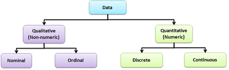
Qualitative data: Qualitative data, also known as non-numeric data, essentially describes the traits of a value or data point. It consists of a finite number of possible categories into which each data point may fall.
Types of Qualitative Data
- Nominal data: A type of descriptive data with more than two categories; it can refer to the names or labels of the data points. For example, Hair color – black, brown; Gender – male or female.
- Ordinal data: Ordinal data provides good information about the order of choices. In other words, it arranges information in a particular order without indicating a specific relationship between items. Example: pass or fail, customer service, good or bad, etc.
Quantitative data: It is also known as numerical data. The data points are counts or measurements. Unlike Qualitative data, it consists of an infinite number of possible categories into which each data point may fall. The Quantitative data is further divided into two data types:
- Discrete data: The data is discrete if the measurements are whole numbers or counts. For example, the number of customer complaints, weekly defects data, etc.
- Continuous data: The data is continuous if the measurement takes on any value, usually within some range. For example, Stack height, distance, cycle time, etc.
Discrete Data
Discrete data comprises distinct, separate values with clear boundaries between each possible value. It assumes specific, individual values and cannot be infinitely subdivided. Typically, discrete data is counted and often represented by whole numbers. Examples: Number of defects in a product, or number of red balls in a bowl.
Discrete Data analysis tools
Discrete data analysis involves techniques specifically tailored for data that consists of distinct, countable values. Here are some common tools used for analyzing discrete data:
Contingency Table
A contingency table, also known as cross-tabulation or a two-way frequency table, typically summarizes and analyzes the relationship between two categorical variables. Contingency tables are a type of table in a matrix format that displays the frequency distribution of the variables. In other words, contingency tables represent a 2-way classification table containing frequencies of how often things appear, and they can determine if two variables are independent or significantly associated.
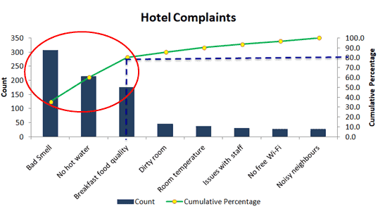
Pareto Chart
The Pareto Chart (Pareto Diagram) is a graphical tool that maps and grades business process problems from the most recurrent to the least frequent. In other words, it helps identify the most frequently occurring problems or separates the vital few from the trivial many. The Pareto Chart combines both a bar chart and a line chart. The bar chart shows the frequency of occurrence or defects, while the line graph displays the cumulative data percentage in descending order.
Attribute charts are a kind of control chart to display information about defects and defectives. They help you visualize the enemy–variation!
Defect:
A defect is a non-conformity that does not meet the customer’s requirements. A product or service may have one or more defects but is defective only if defects prevent the product from functioning.
Defect analysis is carried out based on the Poisson distribution (evaluates the rate of defects in the process) using the following methods.
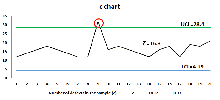
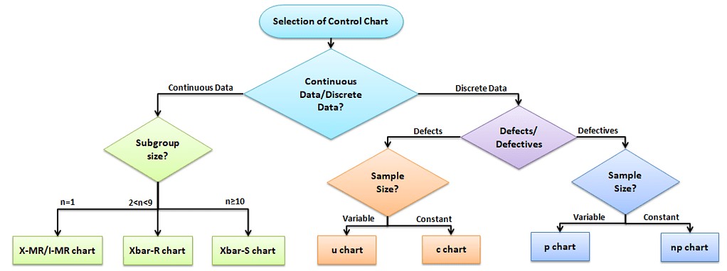
c chart: c chart also known as the control chart for defects (counting the number of defects), is generally used to monitor the number of defects in constant-sized units. There may be a single type of defect or several different types, but the c-chart tracks the total number of defects in each unit, assuming that the underlying data approximate the Poisson distribution.
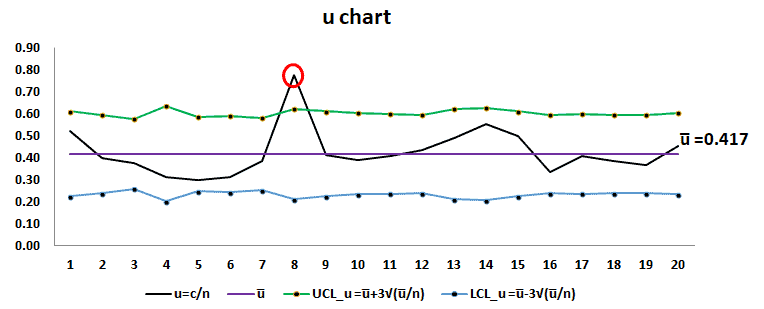
u chart: u chart is also known as the control chart for defects per unit chart. It is generally used to monitor the count type of data where the sample size is greater than one. There may be a single type of defect or several different types, but the u chart tracks the average number of defects per unit, and it assumes the underlying data approximate the Poisson distribution.
Defective:
A product or service that has one or more defects and it is not suitable for use. In other words, a product or service is defective if the defect(s) existing in it affects its functionality.
Using the following methods, a defective analysis is carried out based on Binomial distribution (evaluates the proportion of defectives in the process).
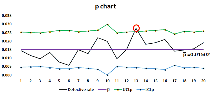
p chart: p chart is also known as the control chart for proportions. It is used to analyze the proportions of non-conforming or defective items in a process. It uses a Binomial Distribution to measure the proportion of defective or non-conforming units in a sample.
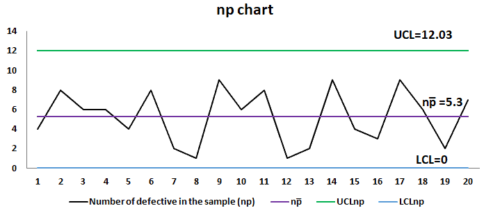
np chart: np chart is also known as the control chart for defectives (d-chart). It generally monitors the number of non-conforming or defective items in the measurement process. It uses binomial distribution to measure the number of defective or non-conforming units in a sample. An np chart is very similar to a p chart. np chart plots the number of items, while the p chart plots the proportion of defective items.
Continuous Data
Continuous data encompasses values that can take on any value within a given range and allows measurement to any level of precision. It is characterized by its infinite divisibility, lacking clear boundaries between adjacent values. Measurements or observations represented in fractional or decimal form fall under continuous data.
Examples: Height, weight, temperature, time, etc.
Continuous Data Analysis tools
Statistical techniques and tools often specifically address data capable of assuming any value within a given range in continuous data analysis. Following are the Continuous data analysis tools.
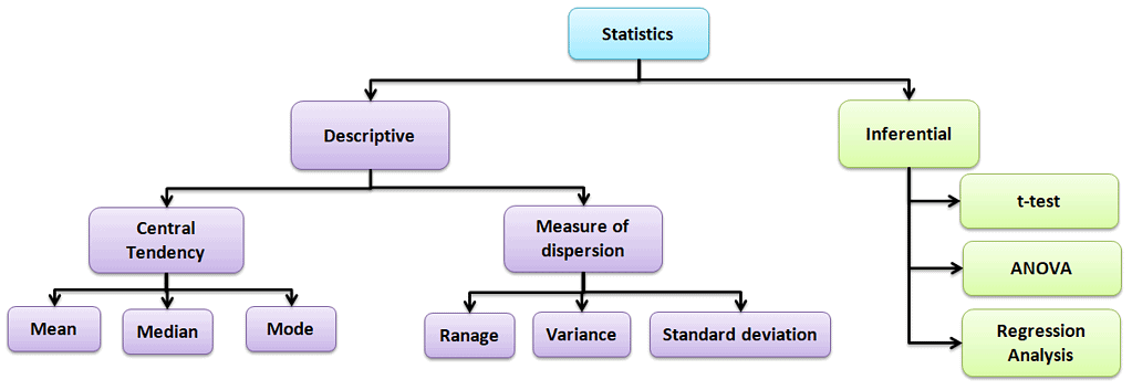
Descriptive statistics
Values that describe the traits of the sample or population. In other words, it provides a simple summary of the sample and the measures.
Central Tendency
Refers to the statistical measure used to determine the center of a distribution of a data set. Based on the situation, the measure of central tendency could be either Mean, Median, or Mode.
- Mean: The mean is the total of all data values divided by the number of data points.
- Median: The median is the middle value when the data is arranged in order from least to greatest or vice versa. If the data set has even values, the median is the average of the middle two values.
- Mode: The mode is the value that often occurs in the data set.
Measure of dispersion
Dispersion is the degree of variation in the data. Dispersion measures the extent to which different items tend to disperse from the central tendency.
Different types of measures of dispersion
Range: Range is the difference between the maximum and the minimum value.
Variance: Variance measures the dispersion of a set of data points around their mean value.
Standard Deviation: Standard deviation is the most popular measure of dispersion. The main purpose is to measure the amount of variation in a process. One of the most common measures of variability in a dataset or population is the Standard Deviation.
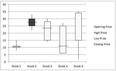
Box-and-Whisker Plot
Box-and-Whisker plot, also known as a Box and Whisker plot, is a pictorial representation of continuous data. Box plots show the Max, Min, median, interquartile range Q1, Q3, and outlier data.
Run Chart
Run charts, also known as Time Series Plots, plot data over time using line graphs. They help to identify the pattern of the data in the time series. Because they don’t use control limits, we cannot judge whether the process is stable or not. However, run chat shows how the process is behaving. The advantage of the run chart is that it identifies the special cause(s) in a process.
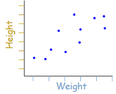
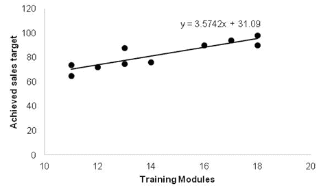
Scatter Diagram
Scatter diagrams, also known as Correlation Charts or XY Graphs, plot the relationship between two continuous variables. These can include the independent variable on the x-axis and the dependent variable on the y-axis.
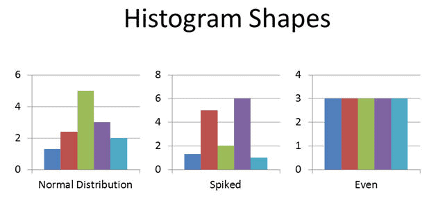
Histogram
A Histogram is the graphical representation of a frequency distribution. It is in the form of a rectangle with class intervals as the base and the corresponding frequencies as the height. Particularly, there are no gaps between any two successive rectangles.
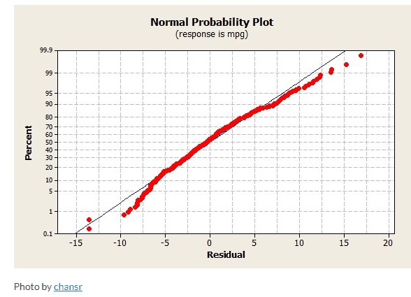
Normal Probability Plot
The Normal Probability Plot is a graphical method to assess whether the data set follows a normal distribution or not. This includes identifying outliers, skewness, etc. Furthermore, the Normal Probability Plot is one example of a Quantile-Quantile (Q-Q) plot.
Regression Analysis
A Regression Analysis is a method for assessing relationships between variables by examining system behavior. Researchers employ various analysis techniques to determine the relationship between dependent and independent variables, with Regression Analysis standing out as one of the most effective. For example, they can utilize transformations to mitigate higher-order terms within the model.
ANOVA
Analysis of Variance (ANOVA) is a parametric statistical technique used to compare data sets. This technique was invented by R.A. Fisher; hence, it is also referred to as Fisher’s ANOVA. It is similar to techniques such as t-test and z-test to compare means and also the relative variance between them.
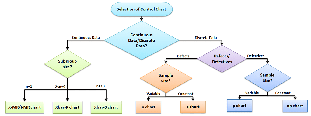
Data Analysis: Selection of Control chart for Discrete Data and Continuous Data
The control chart is a graph used to study how a process changes over time. A control chart always has a central line for the average, an upper line for the upper control limit, and a lower line for the lower control limit. The control limits are ±3σ from the centerline.
Selection of an appropriate control chart is very important in control chart mapping, otherwise ended up with inaccurate control limits for the data.
X̅ and R charts charts use measurable quantities such as length, weight, and height. Attribute control charts use attribute data. In other words, the data that counts the number of defective items or the number of defects per unit.
Advantages of Data Analysis
- Data analysis identifies inefficiencies and areas for improvement, enabling targeted problem-solving.
- Insights from data drive efficiency improvements, cost reductions, and resource optimization efforts.
- Data analysis supports evidence-based decision-making
- Analysis helps to get insights from data, trends, correlations, and predictive patterns.
- Data Analysis identifies and mitigates risks by examining historical data and helps to predict potential issues.
- Understanding customer data informs tailored strategies to meet customer needs and preferences effectively.
- Data Analysis tracks progress, evaluates performance against metrics, and assesses intervention effectiveness.
Using Data to Make Better Decisions
Great TED presentation on using data to make better decisions.