Attribute charts are a kind of control chart to display information about defects and defectives. They help you visualize the enemy–variation!
Just like the name would indicate, Attribution Charts are for attribute data–data that can be counted. In other words, the data that counts the number of defective items or the number of defects per unit. At the same time, variable charts like X̅ and R charts are used for measurable quantities such as length, weight, and height.
If your process can be measured in attribute data, then attribute charts can show you exactly where in the process you’re having problems, if any.
Defect vs. Defective
A defect is a non-conformity that does not meet the customer’s requirements. A product or service may have one or more defects but is defective only if defects prevent the product from functioning.
Defects are the subsets of defective and can be categorized as minor, medium, and major based on criticality. Often non-conformity is used to signify the defects. For example, dimension differences or the failure of visual, safety, and functional requirements, etc.
Defect analysis is carried out based on the Poisson distribution (evaluates the rate of defects in the process) using the following methods.
- 1 sample Poisson rate test
- 2 sample Poisson rate test
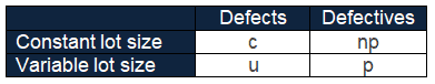
- c chart ( for constant sample size)
- u chart (for variable sample size)
- Poisson capability analysis
A product or service that has one or more defects and it is not suitable for use. In other words, a product or service is defective if the defect(s) existing in it affects its functionality.
Often non-conforming is used to signify the defectives—each product or service experiences only two choices, i.e., defective or not.
Using the following methods, a defective analysis is carried out based on Binomial distribution (evaluates the proportion of defectives in the process).
- 1 proportion test
- 2 proportion test
- p chart ( for variable sample size)
- np chart (for constant sample size)
- Binomial capability analysis

Selection of control chart
The control chart is a graph used to study how a process changes over time. A control chart always has a central line for the average, an upper line for the upper control limit, and the lower line for the lower control limit. The control limits are ±3σ from the centerline.
Selection of the appropriate control chart is very important in control charts mapping, otherwise ended up with inaccurate control limits for the data.
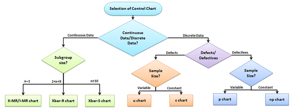
Using Attribute Charts
Attribute charts are used for charting either-or conditions over time for either static sample sizes (ex 10 samples every week) or varying sample sizes.
Six Sigma certification exams like to throw curveballs about how and when to apply certain attribute charts to different situations. Here’s a quick way for you to determine which chart to use in which situation.
Types of Attribute Charts
There are four types of Attribute Charts:
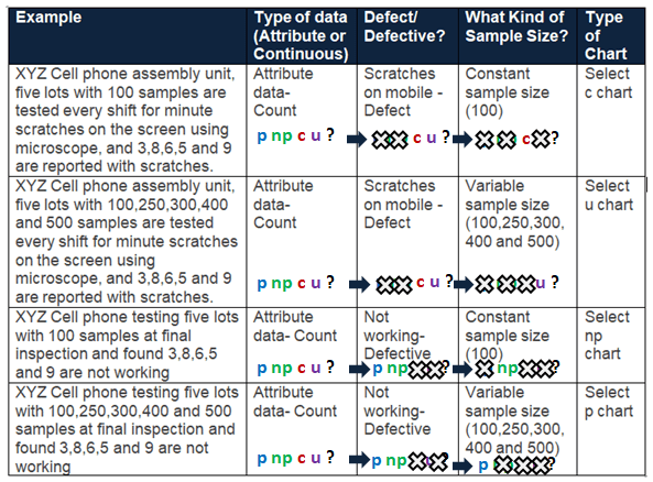
How to Pick Which Attribute Chart to Use for Defects or Defectives
Assuming that one or more defects in a product make the product entirely defective, you can use the following guide to pick which one to use. For example, If the Quality inspector monitors 100 bottles of information every shift, then it is a constant lot size. Similarly, if the quality inspection monitors 10% of bottle information from the production, the lot size varies based on the number of bottles produced on that particular shift.
Different Attribute Charts
There are four main attribute charts. Let’s take a close look at each.
| Type of Attribute Chart | What Gets Displayed? | What Kind of Sample Size? | Type of Data Used | Example |
| np | # times something happens | Constant size | happens/ does not happen | # transactions in a static sample set with one or more errors. |
| p | % of Samples in which something happens | Constant or Varying size | happens/ does not happen | Sum of all transactions with an error per month charted month-over-month. |
| c | # times total something happens | Constant size | has a condition OR has more than one condition | # errors in all transactions in a static sample set. (transactions can have more than one kind of error.) |
| u | % of total in which something happens | Constant or Varying size | has a condition OR has more than one condition | Sum of all errors across all transactions per month charted month-over-month. |
Attribute Charts: p Chart (proportion chart)
What is a p Chart:
p chart is also known as the control chart for proportions. It is generally used to analyze the ratios of non-conforming or defective items in a process. It uses a binomial distribution to measure the proportion of defective or non-conforming units in a sample.
- Evaluate the stability of a process when we evaluate the proportion of defects vs. in good order as a percentage.
- The plot shows the percentage of defectives.
When to Use a p Chart:
p chart is one of the quality control charts used to assess trends and patterns in counts of binary events (e.g., pass, fail) over time. p charts are used when the subgroups are not equal in size and compute control limits based on the binomial distribution.
- Sample sizes are NOT equal.
- Have discrete data.
How to Use a p Chart:
Step 1) Calculate each subgroup’s non-conformities rate= np/n
- Where np = number of defectives in the sample
- n= sample size
Step 2) Compute centerline p̅ = total number of defectives / total number of samples =Σnp/Σn
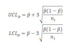
Step 3) Find Control Limits: Calculate the upper control limit (UCL) and lower control limit (LCL). If LCL is negative, then consider it as 0. Since the sample sizes are unequal, the control limits vary from sample interval to sample interval.
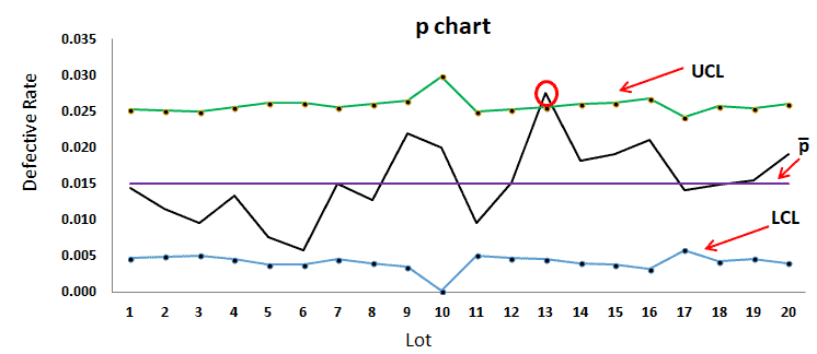
Step 4) Plot the graph with the proportions on the y-axis, Lots on the x-axis: Draw the centreline (p̅) and control limits (UCL and LCL). Interpret the data to determine whether the process is in control.
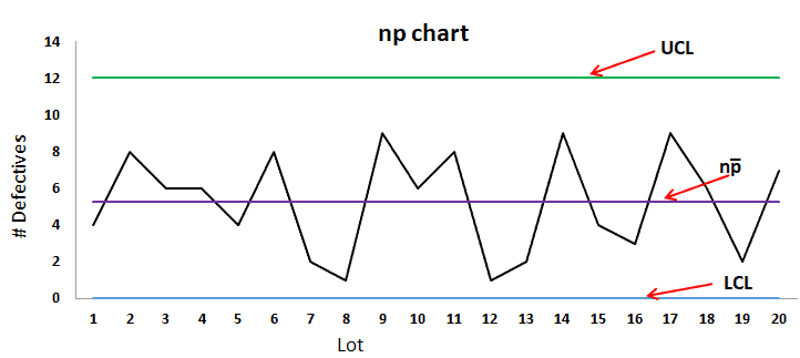
Attribute Charts: np Chart
What are np Charts:
np chart is also known as the control chart for defectives (d-chart). It generally monitors the number of non-conforming or defective items in the measurement process. It uses binomial distribution to measure the number of defectives or non-conforming units in a sample.
- Evaluates the stability of a process when we are evaluating the proportion of defects as a raw number.
- The plot shows the # of defectives.
When to Use np Charts:
np chart is one of the quality control charts used to assess trends and patterns in counts of binary events (e.g., pass, fail) over time. np chart requires that the sample size of each subgroup be the same and compute control limits based on the binomial distribution.
- Sample sizes are equal or constant.
- Subgroups are the same size.
- Attributes are discrete and binary (ex. yes vs. no; up vs. down)
How to Use np Charts:
Step 1) Count the number of defectives in each sample
Step 2) Compute p̅ = total number of defectives / total number of samples =Σnp/Σn
- Where np = total number of defectives in the samples
- n= sample size
Step 3) Calculate centreline np̅ = total number of defectives/no of lots = Σnp/k
- Where k = number of lots
Step 4) Calculate the control limits
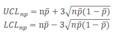
Step 5) Plot the graph with proportion on the y-axis and the number of samples on the x-axis: Draw the centreline (np̅) and control limits (UCL and LCL). Interpret the data to determine whether the process is in control.
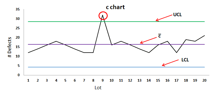
Attribute Charts: C Charts
What are c charts
c chart is also known as the control chart for defects (i.e., counting the number of defects). It generally monitors the number of defects in consistently sized units.
- Evaluates the stability of counted data
- The plot shows the # of defects.
When to Use c Chart:
c chart is one of the quality control charts used to track the number of defects in a product of a constant size
- Total opportunity population is large compared to # defects.
- When you cannot count “not a defect.”
- Data type is discrete, but each count has an equal opportunity of coming up.
How to Use c Charts:
Step 1) Count the number of defects in each sample
Step 2) Compute centreline c̅ = total number of defects / number of samples =Σc/k
- Where c = number of defects
- k= number of samples
Step 3) Calculate the control limits
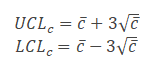
Step 4) Plot the graph with the number of defects on the y-axis and lots on the x-axis: Draw the centreline (c̅) and control limits (UCL and LCL). Interpret the data to determine whether the process is in control.
Attribute Charts: u Chart
What are u Charts:
u chart is also known as the control chart for defects per unit chart. It is generally used to monitor the count type of data where the sample size is greater than one.
- Evaluates the stability of counted data
- Measuring variable defects per unit. Helpful when you have lots of varying sample sizes.
- The plot shows defects per unit.
When to Use u Charts:
u chart is one of the quality control charts used to monitor the number of defects per unit of variable sample size.
- Sample size varies–ex. Multiple types of a defect.
How to use u Charts
Step 1) Calculate the number of defects per unit in each lot.
- u= number of defects in each lot/ lot size
Step 2) Compute centreline u̅= total number of defects / number of samples =Σc/Σn
- Where c = number of defects
- n= sample size
Step 3) Calculate Control limits: Since the sample sizes are unequal, the control limits vary from sample interval to sample interval.
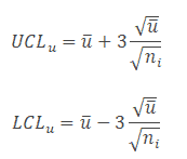
Step 4) Plot the graph with the number of defects per unit on the y-axis and lots on the x-axis: Draw the centreline (u̅) and control limits (UCL and LCL). Interpret the data to determine whether the process is in control.

Example to select an appropriate attribute chart
Videos about Attribute Charts
ASQ Six Sigma Black Belt Attribute Charts Questions
Question: Which of the following control charts is most appropriate for monitoring the number of defects on different sample sizes?
(A) u
(B) np
(C) c
(D) p
Answer:
ASQ Six Sigma Green Belt Attribute Chart Questions
Which of the following control charts is used to monitor discrete data?
(A) p
(B) I & mR
(C) X Bar
(D) X Bar – R
Answer:
When you’re ready, there are a few ways I can help:
First, join 30,000+ other Six Sigma professionals by subscribing to my email newsletter. A short read every Monday to start your work week off correctly. Always free.
—
If you’re looking to pass your Six Sigma Green Belt or Black Belt exams, I’d recommend starting with my affordable study guide:
1)→ 🟢Pass Your Six Sigma Green Belt
2)→ ⚫Pass Your Six Sigma Black Belt
You’ve spent so much effort learning Lean Six Sigma. Why leave passing your certification exam up to chance? This comprehensive study guide offers 1,000+ exam-like questions for Green Belts (2,000+ for Black Belts) with full answer walkthroughs, access to instructors, detailed study material, and more.

Comments (20)
Why sample size held constant for NP chart and varies for People chart?
The key difference lies in how the two charts handle and interpret sample size and the type of data they are designed to monitor. NP Chart (Number of Defectives Chart): Used when tracking the number of defective units (not defects) in a sample. Assumes a constant sample size because the control limits are calculated based on a fixed number of observations; varying the sample size would alter the distribution and compromise the validity of those control limits. The control limits are based on the binomial distribution, which requires a fixed number of trials (sample size) for accurate calculations. P Chart (Proportion Chart): Tracks the proportion of defective items in each sample, i.e., defective units divided by the total sample size. Allows for varying sample sizes because proportions inherently normalize the data. The control limits are recalculated for each point based on the sample size, so it accommodates variability while still maintaining statistical rigor. In summary: NP charts require a constant sample size to maintain stable control limits derived from the binomial distribution, whereas P charts adjust the control limits dynamically to reflect changing sample sizes since they are based on proportions.
Dear Ted,
thanks for your great website!
I assumed you meant the opposite in your above comment, right?
“An NP chart is for samples of varying size and a P chart is for samples of a fixed size”
should be:
“An NP chart is for samples of fixed size and a P chart is for samples of a varying size”.
Kind regards,
Thomas
You are correct, Thomas. We clearly mentioned the same in the article.
An NP chart is used when you have samples of a fixed size, and it monitors the number of defective items in each sample. Similarly, a P chart is used for samples of varying sizes, and it monitors the proportion of defective items in each sample.
Thanks
Is pre control tool useful for attributes inspection?
Well, I guess that depends on the precontrol tool you are using. An attribute chart is a kind of control chart where you display information on defects and defectives. This helps you visualize the enemy – variation!
If your pre-control helps you see variation better, then perhaps yes.
Hello, great article. While I understand “variation is the enemy,” I’m trying to wrap my head around that when displaying defects or defectives…in which case it would seem that decreasing is always good.
You’re absolutely right. When it comes to defects or defectives, less is always better. But the phrase “variation is the enemy” still applies, even here.
Iif your defect rate is high and unstable, it’s very hard to make meaningful improvements. But if it’s high and consistent, you can begin to analyze and reduce it systematically. The key is predictability.
In other words:
-Lower defect rates are good.
-Stable defect rates, even if they’re higher than we’d like, are easier to improve.
So “variation is the enemy” reminds us that unpredictable swings (even in bad performance) make it harder to diagnose root causes and make sustainable progress.
Under C chart and U chart you have that the purpose is to identify the # of defectives. From my notes, this statement is inaccurate, did you mean to state the # of defects for the C chart and the % of defects for the U chart?
Amy – I’ve clarified above. Hope this helps!
Hello Could some ONE helping me please, to solve the following Problem
A shop uses a control chart on maintenance workers based on maintenance errors per standard worker-hour. For each worker, a random sample of 5 items is taken daily and the statistic c/n is plotted on the worker’s control chart where c is the count of errors found in 5 assemblies and n is the total worker-hours required for the 5 assemblies.
(a) After the first 4 weeks, the record for one worker is c=22 and n=54. Determine the central line and the 3-sigma control limits.
(b) On a certain day during the 4-week period, the worker makes 2 errors in 4,3 standard worker-hour. Determine if the point for this day falls within control limits.
Let’s walk through the solution step by step for this control chart problem, which involves calculating a u-chart (used when defects per unit vary and the number of inspection units differs).
(a) Determine the central line and the 3-sigma control limits
Given:
Central line (ū) = ∑c / ∑n = 22 / 54 ≈ 0.407
The control limits for a u-chart are calculated as:
UCL = ū + 3 * √(ū / n) and LCL = ū – 3 * √(ū / n)
However, since n (worker-hours) can vary day to day, these limits will vary depending on that day’s n value.
(b) Determine if the point for this day falls within control limits
On a specific day:
Daily value of u = c / n = 2 / 4.3 ≈ 0.465
Now calculate control limits for n = 4.3:
Conclusion: The u value for the day (0.465) is between 0 and 1.3295, so this point is within control limits.
For more on u-charts and control chart interpretation, check out this article: u-Chart Overview.
Can you show the work for one of the question?
[Six Sigma Study Guide Support: Question moved to the PYSSGB member’s forum here: https://sixsigmastudyguide.com/forums/topic/can-you-show-the-work-for-one-of-the-question/ ]
The formula in the answer is different than in the page here
Note to all other audiences on this page – This question was from a member and was handled inside our member’s area.
If you’d like to study with thousands of practice questions with full, detailed walkthroughs and explanations as well as access to Six Sigma certified black belts for coaching, just enroll here.
What’s the difference between c and cbar in your Control limit equation for c charts?
There is no difference, Larry. Just a typo where the ‘bar’ was omitted from the original equation. Thanks for letting me know – all fixed now.
10. 19. 2020 Good morning… my challenge right now is working with the tables I’ve identified and struggling with how to do the actual problems/questions. Would you consider offering, in each module, sample examples of the details of the solutions to tough problems? My focus is on regression, hypotheticals, control charts, descriptive stats and capability indices… One of the film clips you have illustrated a man using Excel to access tables and fill in listings, than complete the problem. It took him a few minutes. This is intimidating… Can any Excel program do this? And I have this question for you: are you actively participating on some Six Sigma project teams now?
Hi Bobbie,
At the beginning of each Unit/Module in the member’s course are links to recommended resources where I step through my notes on the topics and usually several ways to attach common problems. There are also other practical notes for applying these techniques in the real world outside of certification, which is why you see that some videos have excel or other tools.
When you take the quiz questions in the member areas you can also see a full walkthrough for each problem showing you exactly how to do it.
can you help me about operating-characteristic function in attribute charts?
The Operating Characteristic (OC) function is a key concept in attribute charts, especially in acceptance sampling. It shows the probability that a given sampling plan will accept a lot, depending on the lot’s actual quality level.
In simple terms:
It helps you understand the risk of accepting bad lots or rejecting good ones.
The OC curve plots the probability of acceptance on the y-axis versus the true proportion of defects in the lot on the x-axis.
For example, if you’re using a c-chart or p-chart to monitor defects and set limits, the OC function helps you estimate how likely it is that a process shift will be caught—or missed—by your sampling method.