What is an np Chart?
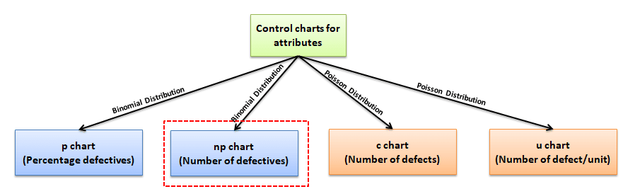
Attribute chart: np chart is also known as the control chart for defectives (d-chart). It generally monitors the number of non-conforming or defective items in the measurement process. It uses binomial distribution to measure the number of defective or non-conforming units in a sample. An np chart is very similar to the p chart. np chart plots the number of items, while the p chart plots the proportion of defective items.
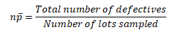
In the np-chart, the number of defectives is plotted on the y-axis, and the number of samples on the x-axis. The centerline of the np chart (np̅) is the total number of defectives or non-conforming units divided by the number of lots.
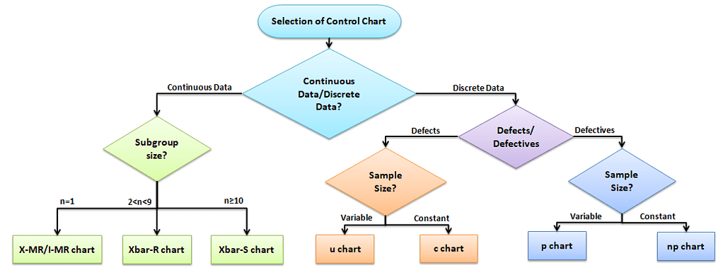
Selection of Control chart
The control chart is a graph used to study how a process changes over time. A control chart always has a central line for the average, an upper line for the upper control limit, and a lower line for the lower control limit. The control limits are ±3σ from the centerline.
Selection of an appropriate control chart is very important in control charts mapping, otherwise ended up with inaccurate control limits for the data.
X̅ and R charts are used for measurable quantities such as length, weight, and height. Attribute control charts are used for attribute data. In other words, the data that counts the number of defective items or the number of defects per unit. For example, the number of tubes failed on a shop floor. Unlike variable charts, only one chart is plotted for attributes.
Why and When do you use an np Chart?
An np chart is one of the quality control charts used to assess trends and patterns in counts of binary events (e.g., pass, fail) over time. This type of chart requires that the sample size of each subgroup be the same and compute control limits based on the binomial distribution.
There are basically four types of control charts that exist for attribute data. A u chart is for the number of defects per unit, c chart is for the number of defects, p chart plots the proportion of defective items. The np chart reflects integer numbers rather than proportions. The applications of the np chart are basically the same as the applications for the p chart.
Assumptions of Attribute charts: np chart
- The probability of non-conformance is the same for each item
- There should be two events (pass or fail), and they are mutually exclusive
- Each unit is independent of the other
- The testing procedure should be the same for each lot
np chart formulas
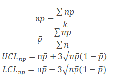
- Where np = total number of defectives in the samples
- k= number of lots
- n= sample size
How do you Create an np Chart?
- Determine the subgroup size. The subgroup size must be large enough for the np chart; otherwise, control limits may not be accurate when estimated from the data.
- Count the number of defectives in each sample.
- Compute p̅ = total number of defectives / total number of samples =Σnp/Σn.
- Calculate centreline np̅ = total number of defectives/no of lots = Σnp/k.
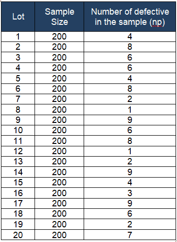
- Calculate the upper control limit (UCL) and low control limit (LCL), If LCL is negative, then consider it as 0.
- Plot the graph with defectives on the y-axis, and lots on the x-axis: Draw the centerline, UCL, and LCL. Use these limits to monitor the number of defectives or non-conforming going forward.
- Finally, interpret the data to determine whether the process is in control.
Example of using an np Chart in a Six Sigma project
Example: Smartbulbs Inc is a famous LED bulb manufacturer. The supervisor drew a randomly constant sample size of 200 bulbs every hour and reported the number of defective bulbs for each lot. Based on the given data, prepare the control chart for the number of defectives and determine whether the process is in statistical control.
- no of lots k = 20
- Σnp = 105
- Σn = 4000
Compute p̅ = total number of defectives / total number of samples =Σnp/Σn =105/4000= 0.0263
- 1- p̅ = 0.9738
Calculate centreline np̅ = total number of defectives/no of lots = Σnp/k =105/20 = 5.3
Calculate the upper control limit (UCL) and the lower control limit (LCL)
Plot the graph with the number of defectives on the y-axis and the number of samples on the x-axis. Draw the center line (np̅), UCL, and LCL.
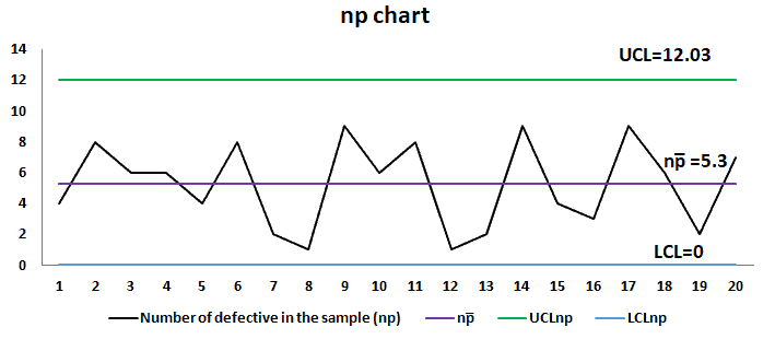
Interpret the chart: If any of the points in the chart are outside of ± 3σ limit, then consider the process is out of control. In the above example, all the points or number of defective bulbs within each lot are between the UCL and LCL.
NP Chart Excel Template
Uses of np chart
- To detect unexpected changes in the process, maybe a special cause in the process.
- Compare process performance before and after significant process improvements.
Videos of np Charts
Additional Helpful Links
When you’re ready, there are a few ways I can help:
First, join 30,000+ other Six Sigma professionals by subscribing to my email newsletter. A short read every Monday to start your work week off correctly. Always free.
—
If you’re looking to pass your Six Sigma Green Belt or Black Belt exams, I’d recommend starting with my affordable study guide:
1)→ 🟢Pass Your Six Sigma Green Belt
2)→ ⚫Pass Your Six Sigma Black Belt
You’ve spent so much effort learning Lean Six Sigma. Why leave passing your certification exam up to chance? This comprehensive study guide offers 1,000+ exam-like questions for Green Belts (2,000+ for Black Belts) with full answer walkthroughs, access to instructors, detailed study material, and more.