What is a p Chart?
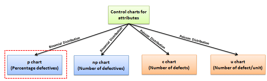
Attribute charts: p chart is also known as the control chart for proportions. It is used to analyze the proportions of non-conforming or defective items in a process. It uses a Binomial Distribution to measure the proportion of defective or non-conforming units in a sample.
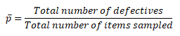
In the p-chart, proportions are plotted on the y-axis, and the number of samples is on the x-axis. The centerline of the p chart (p̅) is the total number of Defectives or non-conforming units divided by the total number of items sampled.
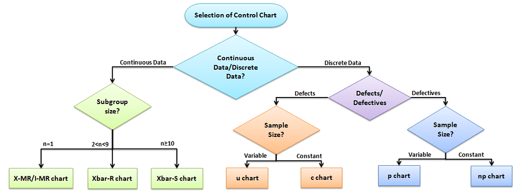
Selection of Control chart
The control chart is a graph used to study how a process changes over time. A control chart always has a central line for the average, an upper line for the upper control limit, and a lower line for the lower control limit. The control limits are ±3σ from the centerline.
Selection of an appropriate control chart is very important in control charts mapping, otherwise ended up with inaccurate control limits for the data.
X̅ and R charts are used for measurable quantities such as length, weight, and height. Attribute control charts are used for attribute data. In other words, the data that counts the number of defective items or the number of defects per unit. For example, the number of tubes failed on a shop floor. Unlike variable charts, only one chart is plotted for attributes.
Why and When do you use a p Chart?
p chart is one of the quality control charts used to assess trends and patterns in counts of binary events (e.g., pass, fail) over time. p charts are used when the subgroups are not equal in size and compute control limits based on the binomial distribution.
There are basically four types of control charts that exist for attribute data. np chart is for the number of defectives, and u chart is for the number of defects per unit, c chart is for the number of defects. Similarly, the p chart plots the proportion of defective items.
Assumptions of Attribute charts: p chart
- The probability of non-conformance is the same for each item
- There should be two events (pass or fail), and they are mutually exclusive
- Each unit is independent of the other
- The testing procedure should be the same for each lot
p Chart Formulas
Formula for Most Certification Organizations
- Where np = number of defectives in the sample
- k= number of lots
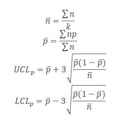
- n= sample size
Formula for the Real World
Exams may assume or state that sample size is constant.
In those cases, you may substitute nᵢ with n̄ or a constant n.
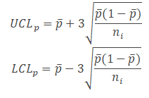
UCL = ̄p + 3 × √[ (̄p(1 − ̄p)) / ni ]
LCL = ̄p − 3 × √[ (̄p(1 − ̄p)) / ni ]
📌 Note on Sample Size in p-Chart Calculations
In real-world applications, when sample sizes vary across subgroups, it is more accurate to calculate control limits using the actual sample size for each subgroup (ni):
UCL = p̄ + 3 × √[ (p̄(1 − p̄)) / ni ]
LCL = p̄ − 3 × √[ (p̄(1 − p̄)) / ni ]
However, for exam preparation purposes, most Six Sigma certification bodies (like ASQ and CSSC) assume a constant or average sample size and use the simplified formula:
UCL = p̄ + 3 × √[ (p̄(1 − p̄)) / n̄ ]
LCL = p̄ − 3 × √[ (p̄(1 − p̄)) / n̄ ]
This article uses the simplified version to reflect the type of problems you’re most likely to encounter on certification exams. For practical implementation in variable sample size scenarios, consider using ni for more accurate results.
How do you Create a p Chart
- Determine the subgroup size. The subgroup size must be large enough for the p chart; otherwise, control limits may not be accurate when estimated from the data.
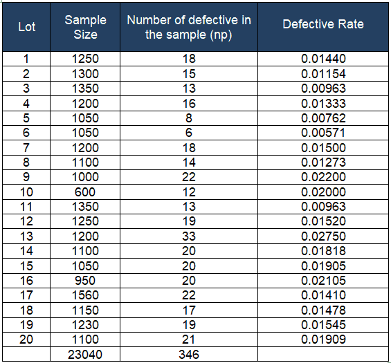
- Calculate each subgroup non-conformities rate= np/n.
- Compute p̅ = total number of defectives / total number of samples =Σnp/Σn.
- Calculate the upper control limit (UCL) and low control limit (LCL). If LCL is negative, then consider it as 0. Since the sample sizes are unequal, the control limits vary from sample interval to sample interval.
- Plot the graph with proportion on the y-axis, and lots on the x-axis: Draw the centerline, UCL, and LCL.
- Finally, interpret the data to determine whether the process is in control.
Example of using a p Chart in a Six Sigma project
Example: ABC Manufacturing produces thousands of tubes every day. A Quality inspector randomly draws samples for 20 days and reports the defective tubes for each sample size. Based on the given data, prepare the control chart for the fraction defective and determine the process in statistical control.
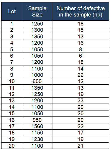
Calculate each subgroup’s non-conformities rate= np/n
- no of lots k = 20
- n̅=Σn/k = 23040 / 20 =1152
Compute p̅ = total number of defectives / total number of samples =Σnp/Σn = 346 / 23040 = 0.01502
- 1- p̅ = 0.98498
Calculate the upper control limit (UCL) and low control limit (LCL). Since the sample sizes are unequal, the control limits vary from sample interval to sample interval.
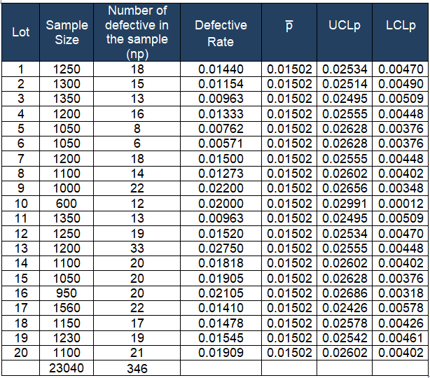
Plot the graph with the proportion on the y-axis and the number of samples on the x-axis. Draw a center line (p̅), UCL, and LCL.
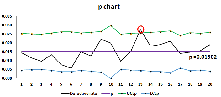
Interpret the chart: The proportion of defectives on day 13 is higher than the upper control limit (UCL). Therefore the process is out of control. Black belts or statisticians to identify the root cause for the cause and take appropriate corrective action to bring the process under control.
P Chart Excel Template
Uses of p chart
- To detect unexpected changes in the process, maybe a special cause in the process
- Monitor the process stability over time.
- Compare process performance before and after significant process improvements.

Comments (10)
This helped me a lot in my Quality Control Examination for Statistics . Thanks a lot .
That’s great to hear, Erison!
The formulas for UCL and LCL are incorrect, they should be divided by n, NOT nbar.
If the sample size is constant, just use n.
n =nbar, don’t waste your time.
if to the sample size is not a constant, you are going waste your time to calculate the useless nbar also, because you are not going to use the nbar in anywhere.
Thanks for your comment — you’re absolutely right from a technical standpoint.
When the sample size varies, the correct way to calculate control limits for a p-chart is to use the actual sample size
nifor each subgroup:That said, the version on this page uses
n̄(the average sample size) as a simplification, which assumes a roughly constant sample size across subgroups.We chose this approach intentionally, because our focus is helping students pass popular Six Sigma exams (like ASQ and CSSC). These exams frequently present questions using this simplified model — often assuming or directly stating that sample sizes are constant, or close enough that they can be treated as such.
Still, you’ve raised a great point. To support more advanced learners and practical applications, we’ll add a note clarifying when to use
niinstead ofn̄. Thanks for contributing to a better learning resource!Why would the formulas for a p-chart assume a constant sample size? In your flow chart, it says a p-chart should be used when sample sizes vary. In addition, you explicitly write, “p charts are used when the subgroups are not equal in size and compute control limits based on the binomial distribution.” Then you proceed to show formulas assuming constant sample size. If you’re going to use a p-chart for constant sample size despite saying they are for non-constant sample size, don’t assume the reader can read your mind. You need to write that out.
Furthermore, you provide an example afterwards, and then you change the formula to n_i and don’t explain yourself.
I agree with the original commenter and I don’t understand why you would take an average if it’s constant, anyway. If you used n_i in the formula, that formula is valid for any sample size, including constant. Change it to n_i to be consistent with the rest of what you have written.
Thank you for your detailed and thoughtful feedback — it’s very much appreciated.
You’re absolutely right that p-charts are typically used when sample sizes vary, and that control limits should ideally be calculated using the actual subgroup sizes (
ni). The formulas based on a constant or average sample size (n̄) are indeed a simplification.We’ve included that simplification because many Six Sigma certification exams (including ASQ and CSSC) often present problems using either constant sample sizes or assume sample sizes that can reasonably be approximated as constant. In those contexts, the simplified formula reflects how students are expected to approach such questions under exam conditions.
That said, your point is well taken. To reduce confusion, we’ll:
n̄might be used for exam prep versusniin practiceThanks again for helping us improve the quality and clarity of this resource!
Please explain the topic sampling size determination for all control charts
Hi Zainab Rafique
Determining the appropriate sample size for control charts involves considering various factors such as the type of control chart, desired level of sensitivity, process stability, and the acceptable risk of failure to detect process shifts.
In general, larger sample sizes provide more accurate control limits and are more likely to detect a shift in the process. However, larger sample sizes also require more data to be collected, which can be costly.
• For the X-Bar and R Control Chart, a recommended sample size is generally a minimum of 4-5 subgroups, with each subgroup consisting of at least 5 individual measurements. This results in a total sample size of 20-25 data points.
• Similarly, for the X-Bar and S Control Chart, a minimum of 10 subgroups, each containing at least 5 individual measurements, is often recommended.
• In the case of an Individual Moving Range (MR) chart, the sample size refers to the number of measurements taken at each time point or subgroup. The standard practice for an Individual MR chart is to have a sample size of 1 measurement per subgroup. This means that you would collect a single measurement at each time point or subgroup.
Thanks
I am new to Six Sigma. So might sound a little daft here.
would this chart be sufficient for a production line that varies on input? for example, each time we run, we have different sizes of input ranging from 100,000 to 3,000,000. With this, the defects also vary quite a lot.
Good question. This is a very common scenario in production environments.
Short answer is yes. A p-chart is appropriate for your situation. A p-chart tracks the proportion defective<, not the total defects; which allows you to fairly compare runs with widely varying sample sizes, from 100,000 to 3,000,000 units. Note that your control limits will vary by sample size. Larger runs will have tighter limits, smaller runs wider limits. This is expected and correct behavior. If you starte tracking defects per unit, rather than defective units, a u-chart may be more appropriate.