A run chart is a line chart of data plotted over time. In other words, a run chart graphically depicts the process performance or data values in time order. Viewing data over time gives a more accurate conclusion rather than just summary statistics.
A run chart is also known as a trend chart or a time series plot. Usually, run charts are used in the measure phase of the DMAIC project and it helps to identify trends or shifts in the process and allows testing for randomness in the process.
Difference between Run chart and control chart
Control charts are used to monitor the stability of the process. In other words, they measure any type of output variable over time. The goal is to see the results consistently fall within the control limits. On the control chart, both upper and control limits are defined. Typically, control limits are defined as three standard deviations from the mean. If the results fall within the control limits, then the process is stable; otherwise, it suggests that the process is not stable.
A run chart is similar to a control chart, but the key difference is it can reveal shifts and trends, not the process stability. Since the run chart does not have control limits, it cannot detect out-of-control conditions. However, it will graphically depict how the process is running. You can turn a run chart into a control chart by adding upper and lower control limits. A pattern or trend indicates the presence of special cause variation in the process.
Why use a run chart
A run chart is used to determine whether or not the central tendency of the process is changing. Following are a few reasons to use a run chart
- Easy to construct
- It does not require too many calculations or software’ for analysis.
- Easy to interpret the results
- Minimum statistical knowledge is sufficient to draw and interpret the chart
When to use run charts
- To visually depict how the process is performing
- Effectively track and communicate improvements (and determine success)
- To identify process variation and avoid unbiased actions
- Display outputs to look for stability or instability
Key components of Run Chart
- Time- series: the specific time period of the output (hours, days, weeks, months); plotted on the horizontal (X) axis
- Output: The data measurement from the completed process; plotted on the vertical (Y) axis
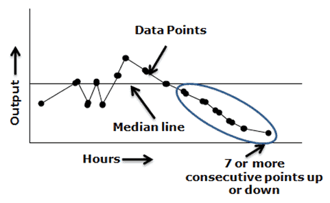
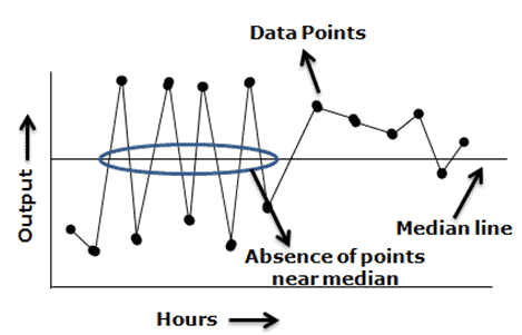
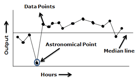
- Data points: output values plotted on the chart
- Median line: the line on the graph that shows the average of all the output measure.
Run chart interpretation rules
The following paragraphs are the run chart decision rules used to avoid inaccurate analysis and initiate appropriate improvement actions:
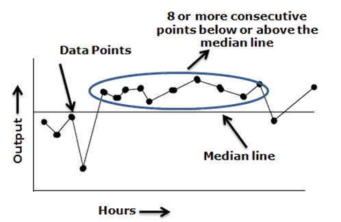
Shift: – Seven or eight values in succession above or below the median line is a shift. Do not consider the points that fall on the median line as they are not toward or against the shift. A shift indicates a dramatic change in the process.
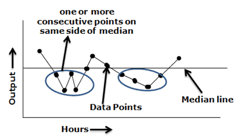
Runs – Too many or too few runs in the data displayed on the chart. In other words, one or more consecutive points are all lying on the same side of the line. Ignore the points exactly on the line!
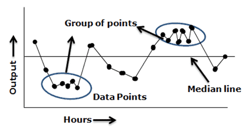
Clustering – Too few runs or groups of points in one or more areas of the plot. It indicates measurement or sampling problems.
Trend – Seven or more consecutive points are increasing or decreasing. A basic rule of thumb is when a run chart exhibits seven or eight points successively up or down, then a trend is clearly present in the data and needs process improvement. This rule does not care whether the consecutive points are above, below, or crossing the median.
Mixtures – Too many runs in a chart with absences of points near the median line.
Astronomical Point – Astronomical points occur when there is one value that is very different from the other data values on the chart. It would be a value that is highly unlikely to occur again and would appear as an outlier.
Counting Runs
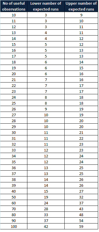
A non-random pattern is signaled by too few or too many runs, or crossings of the median line. A run is a series of points in a row on one side of the median. In other words, one or more consecutive points are all lying on the same side of the line. If only chance is influencing the process being measured with a run chart, then there should be a regularity at which data points go above and below the median to satisfy this condition. Some points can fall exactly on the median line, which makes it hard to decide which run these points belong to. Hence, ignore if the value is exactly on the median line.
To apply the above-mentioned interpretation of the rules, we first need to identify the useful values/observations in the data set. This can be achieved by counting the number of runs and avoiding the values on the median line.
If you observe a greater or fewer number of runs than expected in the chart, that means there is a non-random pattern in the process. Swed and Eisenhart developed a chart in 1943 to determine the minimum and the maximum number of runs required for each data point to follow the random variation in the process. In other words, no special cause existed in the process.
How to create run chart
- Determine the data to be measured
- Obtain the data – collect a minimum of 10 to 15 data points in a time sequence.
- Plot a graph with a time sequence in the horizontal x-axis (like, hours, days, weeks) and a vertical y-axis with measuring variables.
- Plot the data values in a time sequence
- Compute the mean/median and draw a horizontal line in the graph
- Analyze the graph, and observe the trends and patterns to detect special cause variation in the process
Run Chart Excel Template
Example:
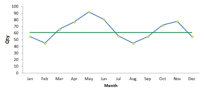
Draw and interpret the following weekly mobile charger rejection data using the run chart.
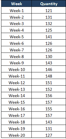
Solution
- Enter the weeks data in one column and quantity in next column
- Plot a graph with weeks in horizontal x-axis, and a vertical y-axis with quantity
- Compute median value for the quantity and draw horizontal axis
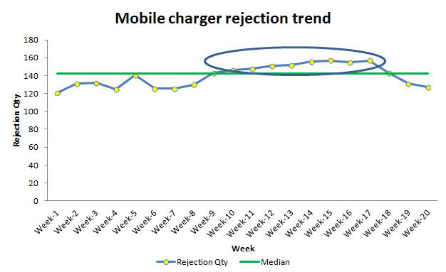
- Interpret the results: From week 10 to week 17, consecutive values are in an upward trend.
Benefits
- Easy to identify an early change in process and useful for analysis of the simple process.
- It is easy to draw and interpret the results
- Identify changes/ trends over time
- The run chart will depict the effects or results of the process improvements graphically.
Limitations
The formation of a run chart is based on the input values. It does not help identify unexpected or surprise events.
It cannot identify the stability of the process as it does not have control limits.
Every process will have some inherent variation. Often, normal process variation concludes that a trend or cycle exists in the process.
Helpful Videos
Other Helpful Links
When you’re ready, there are a few ways I can help:
First, join 30,000+ other Six Sigma professionals by subscribing to my email newsletter. A short read every Monday to start your work week off correctly. Always free.
—
If you’re looking to pass your Six Sigma Green Belt or Black Belt exams, I’d recommend starting with my affordable study guide:
1)→ 🟢Pass Your Six Sigma Green Belt
2)→ ⚫Pass Your Six Sigma Black Belt
You’ve spent so much effort learning Lean Six Sigma. Why leave passing your certification exam up to chance? This comprehensive study guide offers 1,000+ exam-like questions for Green Belts (2,000+ for Black Belts) with full answer walkthroughs, access to instructors, detailed study material, and more.

Comments (12)
Is there perhaps some SAS code that would create the graph in step 5 above. I see that the SAS support document refers to Shewhart Charts.
Sorry, Jacques. I’m not familiar with SAS code.
How many data points a run chart should include before applying
any of the decision rules ?
I like having 15 or more data points, Arthur.
If the 6 consecutive points come below or above mean line. Then it is trend or not?
I think you’re looking for the rule of 7 here, Hunny.
Hi Ted. When do you use MEAN/MEDIAN/MODE as your central tendency? If you can give examples, would be wonderful.
Good question, Cesar.
Here’s a great resource.
Best, Ted,
Great stuff, Ted! The article filled some gaps as to how a run chart should be interpreted.
Appreciate the warm comments!
Hi Ted,
Just to clarify the reason behind in this statement: “A run is defined as if the previous and next values are on opposite sides of median line and ignore if the value is on median line”
Why we should ignore the values if it is on the median line?
Hello Enrique,
Updated the paragraph for better clarity.
A non-random pattern is signalled by too few or too many runs, or crossings of the median line. A run is a series of points in a row on one side of the median. If only chance is influencing the process being measured with a run chart, then there should be a regularity at which data points go above and below the median to satisfy this condition. Some points can fall exactly on the median line, which makes it hard to decide which run these points belong to. Hence ignore if the value is exactly on the median line.
Thanks