Control charts are among the hardest things to understand for those studying Six Sigma. Here’s an easy Control Charts Study Guide for you.
While studying for the Six Sigma Black Belt Exam, I noticed many questions on the control charts. Besides that, I noticed that there were a lot of different types of control charts. You had to use one for certain kinds of data or the number of units in the sample, and then you had to use other control charts in different instances.
Beyond that, different distribution types are associated with several of the data sets. Something you take for granted when asked a question specifically geared to data, but I found it was easy to get tripped up on the exam when combined with control chart questions.
Very confusing, right????
So, in the spirit of continuous improvement, we made the following control charts study guide.
Control Charts Study Guide Overview
Control Chart: A control chart is one of the primary techniques of statistical process control (SPC). The control chart is a graphical display of quality characteristics that have been measured or computed from a sample versus the sample number or time. The control chart was invented by Walter Shewhart at Bell Labs in 1920.
Statistical Process Control: Statistical Process Control (SPC) is a statistical method to measure, monitor, and control a process. In other words, SPC is a quality control method that employs statistical methods to measure, monitor, and control a process.
Common Cause: A cause of variation in the process is due to chance but not assignable to any factor. It is the variation that is inherent in the process. A process under the influence of a common cause will always be stable and predictable.
Assignable Cause (“Special Cause”): The variation in a process that is not due to chance can be identified and eliminated. A process under the influence of a special cause will not be stable and predictable.
Rational Sub-Grouping: Rational sub-grouping is the process of organizing the data into groups produced under the same conditions. Rational subgroups help in the estimation process of short-term variations. Thus, rational subgrouping is the basis for operating control charts in a successful manner. These variations later help us predict the long-term variations and their control limits, depending o the type of causes for the variation (special or common).
Control Charts by Data Type Study Guide
The control chart is a graph used to study how a process changes over time. A control chart always has a central line for the average, an upper line for the upper control limit, and a lower line for the lower control limit. The control limits are ±3σ from the centerline.
Selecting an appropriate control chart is very important in control chart mapping. Otherwise, we end up with inaccurate control limits for the data. Not all control charts are the same. Different Data Types require different charts.
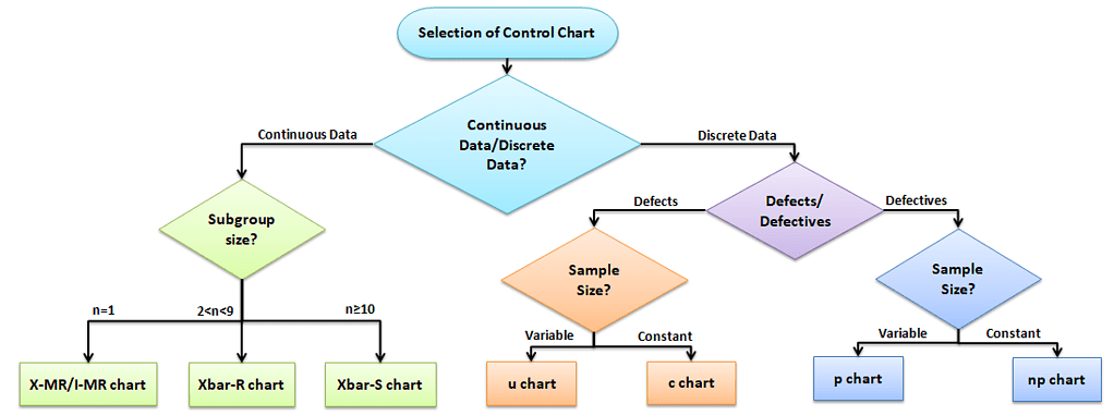
Control Charts for Continuous Data
Measure the output on a continuous scale. It is possible to measure the quality characteristics of a product. Once you know that you are making a control chart for continuous data, you need to determine if your population is normal or not and the sample size (n) you are charting.
No matter what you decide, I think you could start off just making a basic Run chart and seeing where that brings you. It is just a basic graph that displays data values in a time order. It can be useful for identifying trends or shifts in the process but also allows you to test for randomness in the process.
The Data is Normal
Subgroup size n = 1, then use an X-MR or I-MR chart: An Individual moving range (I-MR ) chart is used when data is continuous and not collected in subgroups. In other words, collect a single observation at a time. An I-MR chart provides process variation over time in a graphical method.
If 1 < n < 10, then use an X bar-R chart. It is used to monitor the process performance of continuous data and the data to be collected in subgroups at set time periods. Since n is small, use the range to estimate the process variation. It consists of two plots to monitor the process mean and the process variation over time.
Else, If n >= 10, then use an X bar-S chart. It is often used to examine the process mean and standard deviation over time. Use the X bar-S chart when the subgroups have a large sample size, and also S chart provides a better understanding of the spread of subgroup data than the range.
Special Note: If your data is Not Normal
Note that there is some robust conversation in the industry on this. For your application purposes, I suggest you read the following and make your own decisions (if you’re just studying for certification, you can probably skip):
- https://www.spcforexcel.com/knowledge/variable-control-charts/control-charts-and-non-normal-data
- https://www.qimacros.com/free-excel-tips/control-charts-and-normality/
- https://www.isixsigma.com/tools-templates/control-charts/non-normal-data-needs-alternate-control-chart-approach/
Control Charts for Discrete / Attribute Data Study Guide
Attribute control charts are used for attribute data. In other words, the data that counts the number of defective items or the number of defects per unit. For example, the number of tubes failed on a shop floor. Unlike variable charts, only one chart is plotted for attributes.
Four types of control charts exist for attribute data. P charts plot the proportion of defective items, and np charts are for the number of defectives. U charts are for the average number of defects per unit, and C charts are for the number of defects.

When there are Multiple Defects (i.e., chances of being defective): It computes control limits based on the Poisson distribution.
C chart-control chart for defects. It is generally used to monitor the number of defects in constant-size units.
U chart-control chart for defects per unit. It is generally used to monitor the count type of data where the sample size is greater than one. Plots the average number of defects per sample unit.
When there are NOT Multiple Defects:
This population sorts defects into two piles (it’s Binomial). Samples are either good or bad, positive or negative, right or wrong.
np chart-control chart for defectives. It generally monitors the number of non-conforming or defective items in the measurement process.
p chart-control chart for proportions. It is generally used to analyze the proportions of non-conforming or defective items in a process.
Significance of Central Limit Theorem
The Central Limit Theorem is important for inferential statistics because it allows us to safely assume that the sampling distribution of the mean will be normal in most cases. This means that we can take advantage of statistical techniques that assume a normal distribution.
The Central Limit Theorem is one of the most profound and useful statistical and probability results. The large samples (more than 30) from any distribution of the sample means will follow a normal distribution. The central limit theorem is vital in statistics for two main reasons—the normality assumption and the precision of the estimates.
The spread of the sample means is less (narrower) than the spread of the population you’re sampling from. So, it does not matter how the original population is skewed.
- The means of the sampling distribution of the mean is equal to the population mean µx̅ =µX
- The standard deviation of the sample means equals the standard deviation of the population divided by the square root of the sample size: σ(x̅) = σ(x) / √(n)
Central Limit Theorem allows using confidence intervals, hypothesis testing, DOE, regression analysis, and other analytical techniques. Many statistics have approximately normal distributions for large sample sizes, even when we are sampling from a non-normal distribution.
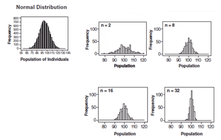
Control charts and the central limit theorem
In the above graph, subgroup sizes of 2, 8, 16, and 32 were used in this analysis. We can see the impact of the subgrouping. In figure 2 (n=8), the histogram is not as wide and looks more “normally” distributed than Figure 1. Figure 3 shows the histogram for subgroup averages when n = 16, it is even more narrow, and it looks more normally distributed. Figures 1 through 4 show, that as n increases, the distribution becomes narrower and more bell-shaped -just as the central limit theorem says. This means that we can often use well-developed statistical inference procedures and probability calculations that are based on a normal distribution, even if we are sampling from a population that is not normal, provided we have a large sample size.
Control Chart Analysis Study Guide
The main purpose of a control chart is to improve the process. It provides a “voice of the process” that helps teams to identify special causes of variation in the process. By removing the special cause from the process, the process becomes more stable and consistent.
Out-of-control: A process is “out-of-control,” meaning special causes exist in either the average chart, range chart, or both. Teams must identify and eliminate special causes to achieve a stable process. We can say the process is out-of-control if any point in the control chart is out of control limits or has abnormal patterns of variability.
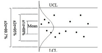
Control limits are three standard deviations above and below the mean. If the process is in control, 99.73% of the averages will fall within these limits. The same is true for the range control limits because there are two components to every control chart–the average and the range.
Four possible conditions may occur in any process.
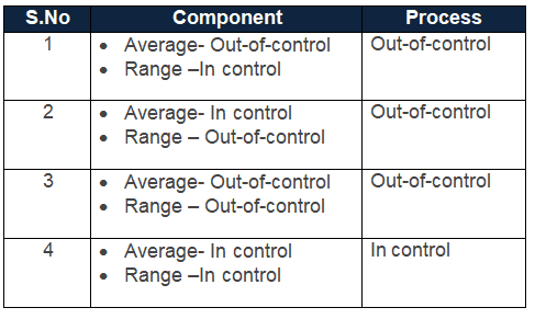
Average stable, Variation changing (Example)

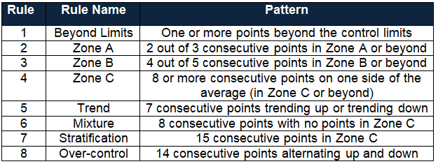
Five Common Rules for Control Chart Interpretation
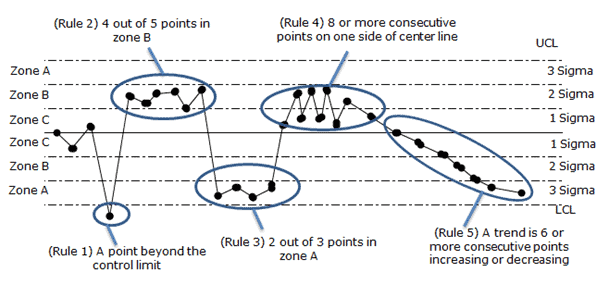
Control Chart Rules
Control Charts Study Guide Videos
Other Helpful Articles
I love MoreSteam’s visual that shows the layering of multiple tools here.
Practical Notes on Using Control Charts and Control Limits to Make Process Improvements

Here are some Practical Notes on Using Control Charts and Control Limits to Make Process Improvements. I recently got into a great discussion on LinkedIn, and before replying to a post, I wanted to clarify my thoughts. Well, 1300 words later and a lot of digging around on forums, this is what I discovered. Hope this helps bring clarity on practical uses of Control Charts – it was a fun Sunday morning exercise!
Why should you use Control Charts to Map your Process?
Charting the process will give you the tools to verify the performance–see if a process is under statistical control. It also helps you monitor the effects of improvement efforts.
Why do you want your Process to be under Statistical Control?
Once you reach an acceptable level of stability, you can feel confident that the process will perform consistently. It is meaningless to say that the process IS 4.5 sigma if its behavior IS NOT consistent over time or is unstable.
Also, once a Process is under statistical control, you can begin to apply some of the other tools to improve performance. Trying to improve performance before a process is under control can actually make things worse. See the Quincunx demonstration for a great visual on this.
Why you would want Control Limits less than 3 Sigma?
Control charts aim to reflect process stability, or an equivalent behavior, over time. Given a normal distribution, 99.73% of your distribution would lay inside six standard deviations or sigmas. On a control chart, half would be above and half below. Thus, positive three sigmas for the UCL – Upper Control Limit and negative three sigmas for the LCL – Lower Control Limit.
The name of the game here is to use control limits to decide not only if something is broken in your process but also to determine if it is a special event or a common event – because that dictates your next actions. (See below).
A point outside of that Six Sigma band–above the UCL or below the LCL means that the process is out of control. The reasoning is that it is so unlikely that a point would be delivered by the process behaving as usual that you could reasonably suspect that the process is no longer under control.
Too Few Sigmas
If you use control limits at too few sigmas, you are reducing the percent likelihood that a point will land in the band. Thus, any small shift in the process behavior will be detected, but you will also have too many points outside the limits just by chance when there is no special cause to address, giving you many false alarms.
Too Many Sigmas
If you use control limits at too many sigmas, you are increasing the chances of a point landing in the bands. Virtually the whole population will fall within the limits, and then there will be no false alarms, but you’ll miss most shifts in the process. That leads to missed opportunities for improvement – in which case, why are you charting the process in the first place?
The Perfect Balance
The key here is cost/risk management. We are trying to find the economic trade-off between the act of charting the process and investigating vs. the cost of missing an instance of variation that would cause financial issues – the cost of poor quality. Control limits at three sigmas were found (and are widely accepted) to be a good balance.
Control limits are based on historical data and process variation. As your process capability improves, the control limits must be recalculated.
When Should I Recalculate My Control Limits?
The short answer is once the control charts cease to have meaningful business applications. This could be either that you have improved or altered the original practice so much that you have, in effect, a new and different process than what you started with.
What does this look like in practice? After your process has reached a point of statistical control, you should have a good data history. Then you can begin using trend analysis.
Basic trend analysis:
- Lack of plotted points near the control limits
- Points avoiding the outer zones and various other out-of-control conditions.
As a result of the reduced variation in your process, the new sigma is less than the original sigma. That is, the spread of the new +/- 3 sigma limits will be less than the previous limits.
Can Control Charts tell me the Sigma Level of my Process?
Control charts do NOT measure the sigma level of an overall process. They measure whether a process is in statistical control, i.e., does the process generally follow a normal distribution?
“3 sigma control limits” refers to stability-or equality of behavior over time. “Operating at n sigma” refers to performance.
Since +/- 3 sigma encapsulates 99.73% of the data in a normal distribution, if your process falls within that limit, you have a process that is in statistical control.
The sigma calculation is used to measure the performance or effectiveness of a process at the end of the project. Today, many industries aim for much stricter quality standards, again driven by business.
Performance is how well your process meets the specifications. Note that “specification” is not used in control charts because it has nothing to do with stability. A process operating at six sigma means that the process average is three sigmas away from the closest specification limit–3 from the UCL and 3 from the LCL. Thus, virtually no output is out of specification.
Another way to look at this is that the process is what it is regardless of whether you chart it or not, what your control limits are, or what your graph looks like. Changing the control limits does not change your process performance and hence does not change the “sigmas” at which your process operates.
The control chart and sigma calculations are separate measurements and should always be treated as such.
What do you do if a Point falls outside the Control Limits? Ex Above the Upper Control Limit or Below the Lower Control Limit?
This depends on the history of your process.
If you are just getting started and there are points outside the limits, you must get your process under control first. Lower the center and spread of your process values by eliminating or reducing variation.
If a process was under statistical control and then you find a single point outside of the, there is a special cause of variation. First, be sure this is a special, one-time-only variation. Then try to set controls in place to eliminate or prevent it from coming back. Using a prioritization tool like FMEA helps. Note that if you change your standardized process to account for the special cause variation, you’ll need to re-calculate your control limits as you now have a new process in place.
If you find multiple points outside the control limits, there is probably a common cause variation. This is when you should apply six sigma methodologies like DMAIC to reduce the variation in your process.
When you’re ready, there are a few ways I can help:
First, join 30,000+ other Six Sigma professionals by subscribing to my email newsletter. A short read every Monday to start your work week off correctly. Always free.
—
If you’re looking to pass your Six Sigma Green Belt or Black Belt exams, I’d recommend starting with my affordable study guide:
1)→ 🟢Pass Your Six Sigma Green Belt
2)→ ⚫Pass Your Six Sigma Black Belt
You’ve spent so much effort learning Lean Six Sigma. Why leave passing your certification exam up to chance? This comprehensive study guide offers 1,000+ exam-like questions for Green Belts (2,000+ for Black Belts) with full answer walkthroughs, access to instructors, detailed study material, and more.


Comments (9)
YOU ARE A BLESSING! THANK YOU!!!
I’m taking the green belt test next week and the class was an accelerated class (6 weeks)! Ninety percent lecture. I have yet determined a project.
Glad to be of help, ddw! Let me know how else I can assist. Be sure to start taking practice exams to prepare for the test.
I so agree. This is so concise and perfect for revision. Thank you so much Ted! If I were not married, I would have professed my love for your work 🙂
Hah! I appreciate the note, Swetha. I’m glad it helped. And I’d be remiss if I didn’t share credit with Ramana who contributed heavily to this article – especially the helpful graphics!
Please correct this :
If your data is Not Normal
Use a Run chart.
If your data is “Not” Normal You want to said : Your data is Normal
Thank you
Thanks for bringing this up, Rachid. There were a number of errors on the page that I’ve found and updated thanks to your comment.
Please check out the new section on non-normal control charts and let me know your thoughts.
Hello Ted,
I like your website and I am visiting it from time to time.
Well, I have a small question, I can’t find its answer either in your website or in other books.
Could you help me to answer it?
Select the best option
Question- A percent defective control chart designed for
Option One- Reduce variation of project
Option Two- Identify the cause of variation that lies out the system
Option Three- Ensure that variation of output is due to common causes
Option Four- Detect the existence at special causes of variation
BR,
Icomon
Icom,
Thank you for submitting the question. We have thousands of practice questions and exams available in our membership program where we walk through exactly how to solve each.
We don’t support questions outside our test bank, but this article should direct you to where you need to go to answer this question.
Best, Ted