What are X Bar S Control Charts?
X Bar S charts often use control charts to examine the process mean and standard deviation over time. These charts are used when the subgroups have large sample sizes. Conversely, the S charts provide a better understanding of the spread of subgroup data than the range.
X bar S charts are also similar to X Bar R Control charts. The basic difference is that X bar S charts plot the subgroup standard deviation, whereas R charts plot the subgroup range.
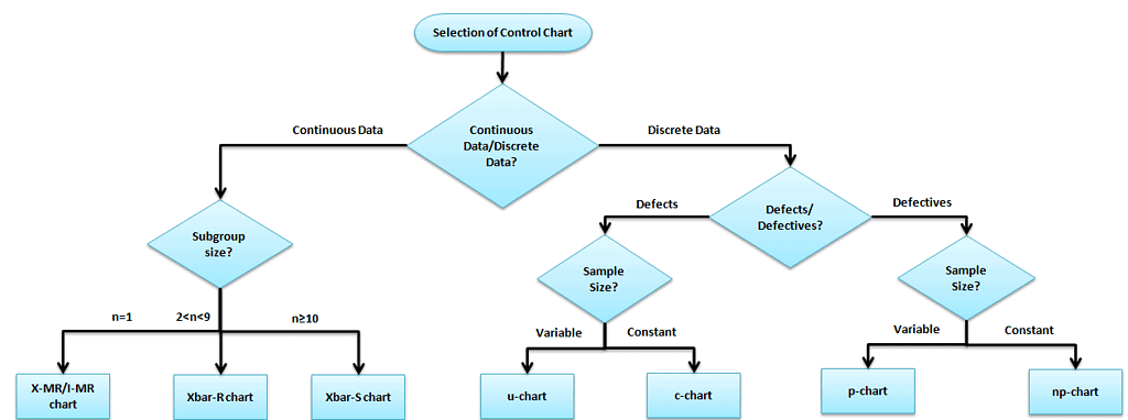
Selection of an appropriate control chart is very important in control chart mapping, otherwise ended up with inaccurate control limits for the data.
Manually, it is very easy to compute the X Bar R Control chart, whereas the sigma chart may be difficult due to tedious calculations and large sample sizes. With a large sample size in the subgroup, the standard deviation is a better measure of variation than the range because it considers all the data, not just minimum and maximum values.
It is actually two plots to monitor the process mean and the process range (as described by standard deviation) over time. Additionally, it is an example of statistical process control. These combination charts help to understand the stability of processes and detect the presence of special cause variation.
The cumulative sum (CUSUM) and the exponentially weighted moving average (EWMA) charts also monitor the mean of the process. But the basic difference is that, unlike the X bar chart, they consider the previous value means at each point. Moreover, these charts are considered a reliable estimate when a correct standard deviation exists.
X Bar S Control Chart Definitions
X-bar chart: The mean or average change in the process over time from subgroup values. The control limits on the X-Bar consider the sample’s mean and center.
S-chart: The standard deviation of the process over time from subgroups values. This monitors the process standard deviation (as approximated by the sample moving range)
Notation Used in X-bar S Charts
- m = Number of subgroups
- n = Number of observations per subgroup
- X̄ = Mean of one subgroup
- X̄̄ = Grand mean (average of all X̄ values)
- S = Standard deviation of one subgroup
- ẞ̄ = Average of subgroup standard deviations
For example, if you measure 5 parts each day for 25 days:
- n = 5
- m = 25
Use X Bar S Control Charts When:
- The sampling procedure is the same for each sample and is carried out consistently.
- When the data is assumed to be normally distributed.
- The X bar S chart is to be used when rationally collecting measurements in a subgroup size is more than 10.
- X Bar R chart is to be considered if the subgroup size is between two and ten observations. For the I-MR chart, the subgroup size is one only.
- When the collected data is continuous (i.e., Length, Weight), etc. and captures in time order.
How to Interpret the X Bar S Control Charts
- To correctly interpret the X bar S chart, always examine the S chart first.
- The X bar chart control limits are derived from the values of S bar (average standard deviation). If the values are out of control in the S chart, the X bar chart control limits are inaccurate.
- If the points are out of control in the S chart, then stop the process. Identify the special cause and address the issue. Remove those subgroups from the calculations.
- Once the S chart is in control, then review the X bar chart. Afterward, you should interpret the points against the control limits.
- All the points are to be interpreted against the control limits but not specification limits.
- If any point is out of control in X bar chat. Identify the special cause and address the issue.
Steps to follow for X bar S chart
Objective of the chart and subgroup size
- Determine the objective of the chart and choose the important variables
- Choose the appropriate subgroup size and the sampling frequency
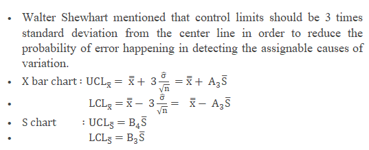
- Shewhart suggested collecting 20 to 25 sets of samples with a subgroup size of 10 and above
Note: To demonstrate an example, we just took subgroup size 4 in the below example. But, it is always recommended to take ten and above for the X bar S chart.
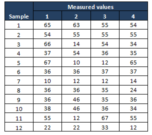
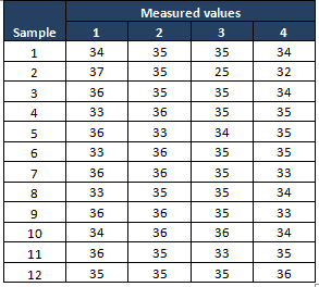
Example: A packing organization monitoring the performance of a packing machine, each container should weigh 35 lb, during the Measure phase, the project team performed the process capability study and identified that the process is not capable(less than one sigma). In Analyze phase collected 12 sets of container weights with a subgroup size of 4.
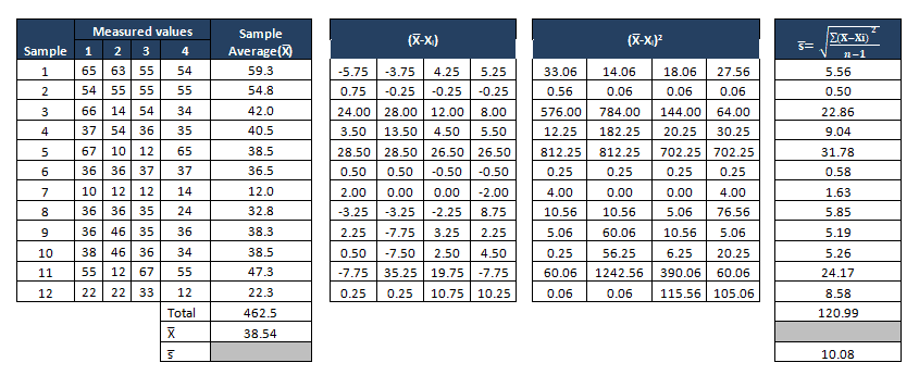
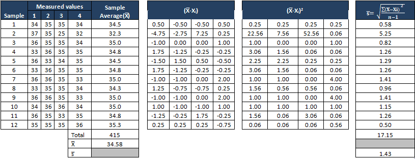
Compute X bar and S values
- Measure the average of each subgroup i.e X bar, then compute the grand average of all X bar values. This will be the center line for the X bar chart.
- Compute the standard deviation of each subgroup, then measure grand averages of all standard values ie S bar, and this will be the center line for the S chart.
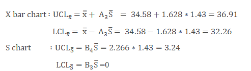
Determine the Control Limits
The first set of subgroups to determine the process mean and standard deviation. These values are to be considered for the creation of control limits for both the standard deviation and mean of each subgroup.
The process is to be in control in the early phase of production. Special causes are to be identified if any of the points are out of control during the initial phase. Also, the subgroup has to be removed for calculation.
Sometimes in the initial phase, it would also be good to have a few points out of control on the x-bar portion. Otherwise, if all the values are within the control limits may be because of a slope in the measurement system, the team won’t focus on it. Identify appropriate Measurement System Evaluation (MSE).
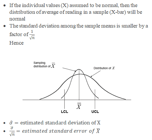
- Where
- X is the individual value (data)
- n is the sample size
- X bar is the average of reading in a sample
- S is the standard deviation
- S bar is the average of all the standard deviations.
- UCL is the Upper control limit
- LCL is Lower control limit
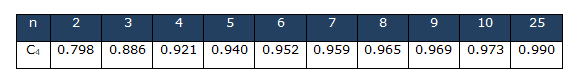
The below control chart constants are approximate values to measure the control limits for the X bar S chart and other control charts based on subgroup size.
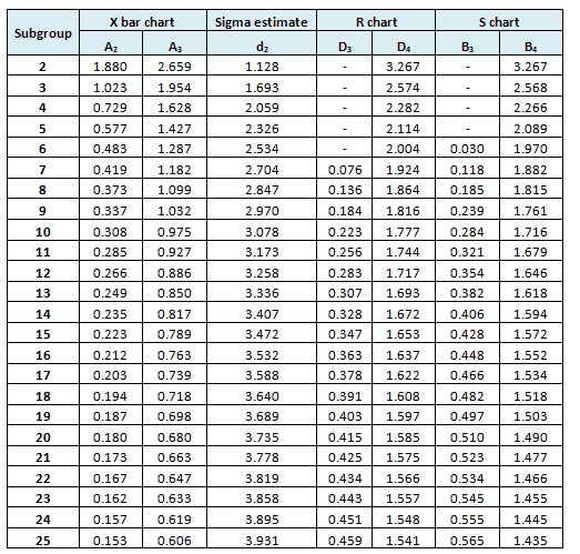
- Refer to common factors for various control charts
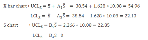
Example cont: In the above example n=4
Interpret X bar and S chart
- Plot both the X bar and S chart and identify the assignable causes
Example Cont: Use the above values and plot the X bar and Sigma chart
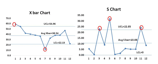
From both the X bar and S charts, it is clearly evident that most of the values are out of control. Hence the process is not stable
Monitor the process after improvement
Once the process stabilizes and control limits are in place, monitor the process performance over time.
Example cont: Control Phase – Once the process is improved and matured, the team identified the X bar S chart as one of the control methods in the Control plan to monitor the process performance over the time period.
The following are the measurement values in the Control phase of the project:
Compute X bar and Sigma
Find the control limits
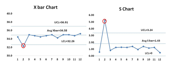
From the both X bar and S charts it is clearly evident that the process is almost stable. During the initial setup of 2nd data set both the S chart and X bar chart values are out of control, the team has to perform the root cause analysis for the special cause and also the process smoothing out from data set number 4. If that continued, the chart would need new control limits from that point.
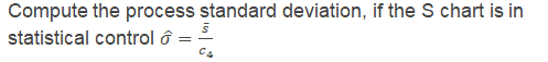
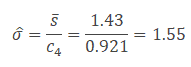
- Since the S chart is in statistical control, calculate the process standard deviation
- After the process is stabilized, if any point still goes out of control limits, it indicates an assignable cause exists in the process that needs to be addressed. This is an ongoing process to monitor the process performance.
Important notes on X Bar S Control Charts
- A process is “in control” which indicates means of the process is stable, and it can be predictable.
- A process is stable that does not mean it’s a zero-defect process.
- Remember to NEVER put specifications on any kind of control chart.
- The points on the chart are comprised of averages, not individuals. Specification limits are based on individuals, not averages.
- The operator might tend not to react to a point out of control when the point is within the specification limits.
- X bar S chart helps to avoid unnecessary adjustments in the process
X Bar S Control Chart Videos
https://www.youtube.com/watch?v=-O9Q4Z-nmfI
When you’re ready, there are a few ways I can help:
First, join 30,000+ other Six Sigma professionals by subscribing to my email newsletter. A short read every Monday to start your work week off correctly. Always free.
—
If you’re looking to pass your Six Sigma Green Belt or Black Belt exams, I’d recommend starting with my affordable study guide:
1)→ 🟢Pass Your Six Sigma Green Belt
2)→ ⚫Pass Your Six Sigma Black Belt
You’ve spent so much effort learning Lean Six Sigma. Why leave passing your certification exam up to chance? This comprehensive study guide offers 1,000+ exam-like questions for Green Belts (2,000+ for Black Belts) with full answer walkthroughs, access to instructors, detailed study material, and more.

Comments (20)
I am working on a project and not sure how to create the x bar and s chart with the data provided.
Hi Sabrina,
Thanks for reaching out. What’s the problem with the data?
Best, Ted
Please help me how I can make evaluation of the results in lab and also how can I evaluate the competence oof operators
Sounds like you want to either do a Designed Experiment or a Hypothesis test.
Hi Mr. Hessing,
Thank you for this wonderful explanation about X bar and sigma charts. I have few doubts if you could please explain me:
1. For the C4 factor why the sample 2,3,4,5,6,7,8,9,10 &25 are selected?
2. If the X bar chart show no special cause but in Sigma chart there are special causes. What does it mean for the process?
Thank you in advance.
Regards
Kunchok
Hi Kunchok,
Thank you for your thoughtful questions and kind words!
Great observation. Those samples were probably selected because they represent data collected after addressing earlier special causes, reflecting a more stable process. In practice, you want to calculate control limits using data that reflects in-control conditions, so excluding early or outlier samples helps set more reliable baselines.
This indicates that while the average of your subgroups may be consistent, the variation within them is unstable. Since X bar limits depend on the standard deviation (S chart), if the S chart is out of control, the X bar chart’s control limits may be invalid. Always interpret the S chart first—if it’s not in control, don’t trust the X bar chart yet.
Keep up the great work exploring these charts—they’re powerful tools for diagnosing and stabilizing processes. Let me know if you’d like more detail or a walk-through example!
Hi ,
I just wanted to know can the LSL for X Bar chart be zero
Hi Adityasaich,
Thanks for reaching out. Before helping you answer I want to draw your attention to a commonly-missed aspect of control charts; LSL is not the same as LCL.
Here’s a good write up:
Think about your question again with that understanding. Can the LSL be zero?
Best, Ted
Hi Mr. Hessing:
Thank you for this wonderful explanation.
Regards,
Jorge Zimeri
Glad it’s helpful, Jorge! Thank you for the warm comments.
Hi
I want to make X Bar S Control Chart in my hospital for waiting time for (sepsis patient) in Emergency , I collected data for each month as subgroup , but each month I have different number of patients ,
how I can calculate the UCL & LCL , if the subgroup number changed each month.
Regards,
Zobaidi
Good question, Zobaidi.
I like the guidance suggested here:
(Source)
Hi,thanks for your explanation.
May I know, what can I do when the data obtain does not achieve assumption(normality)? After I transform my data using Johnson Transformation,I don’t have idea to continue my x-bar and s chart.
Can you please help me to solve this problem? Thanks a lot.
Hi,
I think you ultimately want to keep trying other types of transformations (eg logarithmic, box cox, etc) until you find something that helps your data approach normality.
Best, Ted.
In the X Bar R Control Chart article the example has a sample size of 20 and a subgroup size of 4. However, in this article for X Bar S Control Charts the example has a sample size of 12 and a subgroup size of 4. Shouldn’t the subgroup size by greater than or equal to 10 for using X Bar S Control Chart?
You are absolutely right Gabriel Smith, to demonstrate an example, we just took a subgroup of 4 in the example, but it is always recommended to take 10 and above subgroup size for X bar S chart. I have included the note in the article.
Thanks
Ramana
Hi,
I am confused, because i thought UCL and LCL were 3 std deviations from the center line. Is there a way to compute sigma and multiply it by 3 to get the UCL and LCL, or am i better off just memorizing the formula and using the tables?
Hello Ross Bryant,
Steps to calculate control limits
• First calculate the Center Line. The Center Line equals either the average or median of your data.
• Second calculate sigma. The formula for sigma varies depending on the type of data you have.
• Third, calculate the sigma lines. These are simply ± 1 sigma, ± 2 sigma and ± 3 sigma from the center line.
+ 3 sigma = Upper Control Limit (UCL)
– 3 sigma = Lower Control Limit (LCL)
The formula for sigma depends on the type of data you have:
• Is it continuous or discrete?
• What is the sample size?
• Is the sample size constant?
Each type of data has its own distinct formula for sigma and, therefore, its own type of control chart. Hence we need to refer to the control limits formulas based on the type of data.
Thanks
hey i want to collect the data of a company for x bar s chart but i am confused which company to choose and how can i get 10 or more observations per day please help me with my project
Hi Steve,
Typically you start data collection based off the problem you are trying to solve. What are you trying to solve?