This is Jeremy Garrett’s second guest post for Six Sigma Study Guide on how he was able to apply Lean Six Sigma techniques to teaching. Judging by the page views, comments, and interaction, the reception has been great. We’ll keep working to bring more articles about Six Sigma in Real Life. If you’ve got a story that you’d like to share, let me know in the comments or email me. I’d love to publish it for you.
Now, back to Jeremy.
In my original post, I shared a general overview of how Lean Six Sigma saved my teaching career. This is the first of a series of posts designed to share the details, and joys, of how that happened. In this post, I will describe how some easily constructed “control charts” greatly improved my teaching and my own awareness of the impacts of my decisions. The increase in information, alertness, and the resulting improvements in self-confidence and responsiveness to my students’ needs further improved my experiences as a teacher. Before I began this journey I was plagued with negativity, criticism, unpleasant parent conferences, and just about all of the things that teachers complain about.
Here is a quote from my immediate supervisor (our math department head) describing the changes from her point of view:
Our department would not be the same without you in it! I have seen the change in your classroom over the years and it is definitely better for you and the students.
Although control charting was not the only portion of Lean Six Sigma that contributed to my quick and remarkable change, it was one of the most important and I want to share that part of my journey with you today – in future posts I will share other portions of my journey by explaining how and why I used advanced control charting, histograms, root cause analysis, fishbone diagrams, Pareto charts, 5S, and more.
Before continuing though, I want to point out that I am aware that many of my readers are new to Lean Six Sigma. For such readers, I have provided links and a glossary of relevant terms at the very end of this article. If Lean Six Sigma or control charting is completely new to you, I recommend jumping down to the glossary and then resuming the article at this point or at least being aware of its presence as you read this post. Of course, you can use the search feature on the SixSigmaStudyGuide.com website to find more details.
Formative Assessment
In education, as in manufacturing, it is easy to get caught up in looking at “the bottom line.” In manufacturing that might be the number of failures per million opportunities, the sigma level, or the amount of profit. In education, this usually takes the form of final exam grades, ACT or SAT scores, or the number of scholarships received. I too fell into that trap and it made me a miserable man.
Lean Six Sigma helped me to understand that there were true, meaningful, and life-changing benefits of using and analyzing formative assessment. In order to explain, it is probably easiest if I begin by explaining what “cumulative assessment” is.
Cumulative assessment is any assessment (measuring tool) that measures the final or cumulative result, these are the “bottom line” measurements just described. In contrast, “formative assessment” is a smaller, faster-measuring device that provides feedback on what to do next. There is a trap here too though. I had always been taught that formative assessment was meant to inform the students and their parents what they should do next. While that certainly is true, my over-emphasis on that interpretation made me and my students miserable.
Lean Six Sigma helped me understand that I could view my own actions as a moldable, changeable process and that my own actions could be formed scientifically from the formative assessment that I was already providing to my students. The joy that I got from that gradual but life-changing discovery is what I want to share with you today. Furthermore, I want to empower you to apply these same skills in your own lives – even if you are not a fellow teacher, technician, or engineer.
As stated, it is my belief that effective formative assessment should help to form the teacher’s next actions as much as the students’ next actions. This however requires very special awareness of the patterns (or changes in patterns) in the student’s grades and students’ behaviors. Such awareness provides information on three critical things:
- What the class as a whole would most benefit from.
- Which students are suddenly performing differently than before?
- (by inference) Whether the teacher has an unexpected chance to improve his/her actions.
The use of “control charts” that plot grades or average grades is one of the most important and powerful ways of gaining these three critical insights, and that is the focus of today’s article. (In the next article I will explain how histograms and control charts containing derived quantities, such as standard deviations, can provide further critical insights.)
Class Average Control Charts
As stated, an understanding of the patterns within the grades is critical. Plotting each student’s grade would be possible, but that would be overwhelming due to the vast number of data points and the amount of time required to make such a graph. More importantly, though, the “noise” (the typical and expected fluctuations/changes that aren’t part of any overall pattern) would almost certainly hide the overall pattern that the teacher is trying to find. As a result, I have graphed my class work averages for an entire week for each class period, with the average grade on the vertical axis and time on the horizontal axis. In so doing, I have created what the quality assurance industry calls an X-bar chart. Such charts can easily be constructed in MS Excel, Google Sheets, etc.; in fact, most grade book programs such as Blackboard, INOW, and others automatically calculate these averages.
Please note that the data in this chart has been calculated from actual class work grades in the “Algebra 2 with Trig” classes that I taught during the 2014-15 year – this is not simulated data.
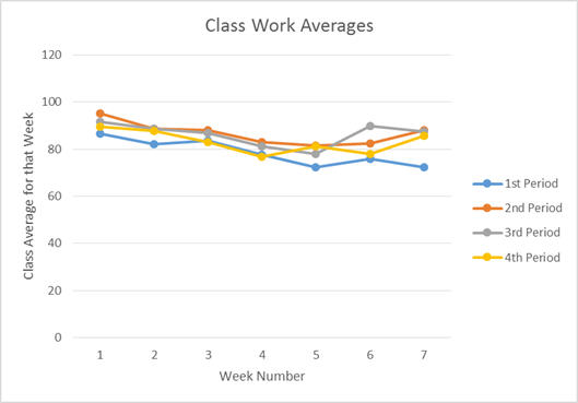
(Please note that since this graph does not contain any control limits, it is currently only a “run chart.”)
Control Chart Analysis
From this chart, we can see several patterns fairly quickly. First, we can see that all four classes have a nearly perfectly linear (straight) downward trend from week 1 to week 5 (the only exception being that the 4th period came back up slightly during week 5). We can also see that, during weeks 6 & 7, three of the four classes raised their averages almost all of the way back up to their original level.
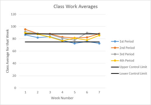
In spite of the clarity of these trends, this graph by itself doesn’t tell us what caused those shifts in class averages or even whether the shifts are significant. In order to determine the importance of these changes we must first identify the highest and lowest values that would be acceptable; in manufacturing these would be the “user specifications.” In teaching, this would be the highest and lowest averages that we could have and still receive support from the principals and school board. Using this last definition I would have 95% and 65% as our extreme limits (my “user specifications”) for the class averages. It is important to understand that such limits do not describe “acceptable” values, meaning that the averages should stay as far from those limits as possible (the “Taguchi Loss Function” provides great insights into this topic).
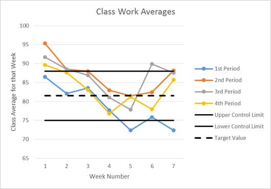
Since no one wants to make products that fail and I did not want to get in trouble with my principal or my school board (again), it was important for me to create my own “control limits” that would alert me to potential problems before those problems become too severe. In manufacturing these limits are frequently calculated using three times the standard deviation, but that requires a consistent, highly controlled, highly repeatable process. In education, we must set these limits based on experience and our personal grading philosophies. As such, I have set my control limits at 75% and 88% for class-wide classwork weekly averages. I set the limits much lower for weekly homework averages and for the test grade averages. Adding those upper and lower control limits produced the following chart. A target value can also be graphed; it is normally the average of the upper and lower control limits – the dashed line in the second graph is the “target level.”
Zooming in on the vertical axis makes the patterns and potential problem areas stand out more clearly. But one must be very careful when changing the axis scales because zooming in too much will cause the “noise” (the expected, acceptable variations) to suddenly and artificially appear to be important. Using the upper and lower control limits can prevent this misunderstanding by drawing lines showing what is and isn’t significant.
Control Chart Analysis
In this new chart, we can see that three of four classes had an average that was “too high” during week one. It also shows that 1st Period had grades that were clearly “too low” for two weeks and borderline “too low” during one more. This also shows that something unusual happened to the 3rd Period class during week six.
At this point in an analysis, it is very tempting to guess at a cause and move on – this is one of the most significant weaknesses of the current state of research within the U.S. education system. With experience and intuition, many people can often correctly identify at least one valid cause of the problems that we have seen so far. But, even the most seasoned quality professionals cannot guess all of the causes immediately, nor can they immediately guess which causes are the most important. So it is important to keep an open mind and not guess – not YET.
In my next post, I will explain how have used control charts that displayed standard deviation data to look for sudden changes in the spread of the data and how such insights radically changed my teaching and grading procedures, and how they can empower you to reach new heights in your career as well. In the next article, I will also share how I used histograms to gain an understanding and proof of the types of students that I had and what those students needed from me as a teacher. In future posts, I will then explain how a “root cause analysis” and “fishbone diagram” can be used to find the true cause of a problem and thus allow teachers and administrators to react to the true cause of a problem rather than wasting time reacting to an intermediate symptom as we so often do.
How Control Charts Made Me a Better Teacher
For now, however, please let me tell you more about how using control charts changed my career and how it can empower you as well. As previously stated, the control charts showed several directly useful pieces of information. First, it showed changes from week to week in classwork averages. Since different topics are covered at each week, this chart can provide information on how students responded to each topic. When combined with other information (such as direct observations of student behavior) this type of chart has told me when I needed to loop back and reteach a particular topic before a test or major exam. In other cases, it has given me very precise data on when to “curve the grades” (for detail on the best way to curve the grades I also used a histogram). Being better informed about which topics to reteach clearly makes me a better teacher. Being more consistent with the final averages can be part of being a good teacher – the students certainly think so.
That type of chart also allows the different class periods to be compared to each other; this too is a powerful tool. I have used it (again with observational data) to inform more specific decisions about what to teach and when to teach or reteach it. As a specific example, one of my afternoon classes was performing lower than my other classes, especially on the topic of multi-step trigonometric problems. So I used the information from these kinds of charts to justify (to my department head) my decision to change 4 problems on their last test and to change 2 problems on their final exam for only that one class period.
Similarly, this data has driven decisions to make equally small changes to how the grades are “curved” for each class. Here is a specific example, when we covered logarithms for the first time I found that the first period’s average was down relative to the other classes. That difference made me mentally review my teaching for the day. Doing so I found that I had both changed and added to my examples throughout the day and that my 1st Period class received the lowest quality presentation of the day. By the time the test came around, I had sufficiently reviewed the material with all of my classes, but 1st Period’s class work and homework were still low on that one day. So to correct their grades I simply added a few points to the class work average for only 1st Period.
Ways in Which Control Charts Make Teaching EASIER!
For me, one of the most immediate benefits of using these charts was a sudden increase in my self-confidence. The improved presentation of my content knowledge and the increase in the “fairness” of my grading was more gradual. Furthermore, the use of these charts and my description of these charts to my students created a reputation as being a well-informed teacher who thoroughly checked his own work in an effort to be “fair” to all of his students. The combination of those things DRAMATICALLY decreased the number of parent conferences that I had AND dramatically improved the conferences that remained. Those things sometimes changed the way the parents approached me, which was truly awesome. More commonly though it allowed me to strut into a parent conference, thank the parent for being there (even when I had just finished praying that they would not show up), and then explain in mathematical detail what the situation was. Clearly, avoiding and shortening parent conferences is not a teacher’s only goal, but it is an important one in terms of shortening and easing the job. Other benefits include peace of mind, and respect from students, parents, and coworkers – simply knowing and being known for “tough but fair grading” can go a long way.
Conclusion and Call for Help
These Lean Six Sigma techniques have truly improved my life, and I know that I am not alone. If you have examples of using control charts in your own life please let us know. Perhaps someone has used these techniques to discover ways to save money on electric bills or credit card bills.
Similarly, the included glossary only contains a few of the most important vocabulary words and it is impossible for me personally to include them all. If you have additional definitions that you believe would be helpful, then please share them with us as well.
Likewise, if you have questions or comments for me, please post those as well.
Glossary
A chart or table (such as a seating chart) that allows for quick identification of observational data – using a seating chart or a roll sheet to record attendance is an example of using a check sheet.
A “common cause” variation is much as its name implies, a change in the data that is caused by something that is common throughout the entire process. In teaching an example of a common cause would be a previous class teaching a topic that was not expected by the current teacher, and thus all of the students perform above expectations and have a wider spread of grades than expected. Another common cause could be a poorly written test question that many (but not all) of the students’ grades, thus increasing the spread of the grades.
A “control chart” is a chart that has time on the horizontal axis (often called the “x-axis”) and a measurement or derived quantity that will help you control a process on the vertical axis (often called the “y-axis”). The vertical axis data can be almost anything that is helpful. In the article above, I used the class period’s weekly average classwork grade.
Derived Quantity:
A “derived quantity” is a number that is calculated from the original measurements; examples include range and standard deviation.
Encoding data:
In industry and in education qualitative (observational) data is often encoded as quantitative data. This makes record-keeping much easier but decreases the amount of information recorded about each event. Here is an example, if a student shows up late for class crying most teachers would make a note of the arrival time, the crying, and other related information. Later however the teacher would be required to report how many times that student had been tardy. This is an example of encoding qualitative data as quantitative data.
Lean:
“Lean” is a systematic elimination of “waste” – wasted time, wasted space, wasted money, etc.
Six Sigma:
“Six Sigma” is one of several quality systems available for maximizing the quality of a product or system. Six Sigma is different from other systems in several ways, but one of the most famous features is its use of projects in an effort to create revolutionary change. Other systems, like the “Toyota Production System,” place a higher emphasis on slow, continuous improvements and slow, smooth responses to change. Another famous attribute of Six Sigma is the use of “Green Belts” and “Black Belts.” “Green belts” are essentially the employees who actually collect the data while the “black belts” are essentially the employees who structure the projects and analyze the data. Six Sigma also normally includes “master black belts” who teach the black belts. Similarly one of the additional duties of black belts is to teach and mentor current and future green belts.
Statistical Process Control (SPC):
“Statistical process control” is a title for a large category of methods that help people know how to control a process by arranging and displaying measurements and derived quantities. Control charts and histograms are among the most common types of charts created and used within “statistical process control.”
Special Cause Variation:
A “special cause” would be something that affected only a small portion of the data due to a “special” event (outside of the process/test/classroom/etc.) that did not affect all of the measurements (or in my case, all of the students). An example of a special cause would be six students staying up late for a party and then being too sleepy to perform well on a test.
Qualitative Data:
“Qualitative data” is non-numerical data such as observations of student behavior.
Quantitative Data:
“Quantitative data” means numerical measurements; examples include length, voltage, or a homework grade.
Stakeholder:
A “stakeholder” is anyone who is involved in, benefits from, or could be harmed by a process or product. In the case of K-12 education, this includes the students and their parents as “primary stakeholders” and various members of the community as “secondary stakeholders.” If a school produces good, highly educated students, then local industries will have a more educated workforce to higher from, and vice-versa, thus local employers become secondary stakeholders.
Variations:
All data will contain “variation,” which simply means changes from one data point to the next or from one measurement to the next. In manufacturing these variations are split into two main types, “common cause” and “special cause.”

Comments (2)
This is a good example of how L6S can be applied to a service industry. I think a valuable lesson could be generated from your data to help teach critical thinking to students. Using your data, you could teach the concepts of L6S to students and ask them to help think of reasons as to why the process may be in control or out of control.
Jeffrey,
Hey, that’s a good idea! In some of my classes I have a significant number of illiterate students with behavior problems (mostly to disguise the fact that they can’t read instructions). In rest of my classes this though could be a good way to teach the state standards (graphing & modeling) AND a great way to get the students involved and give them a sense of ownership.
This is exactly the kind of feedback and comments that we need. I look forward to seeing more feedback from yourself and others in the days and weeks ahead.
Once again, thank you.
Jeremy Garrett