A Histogram is a bar graph that shows the frequency with which data occurs within a certain interval. In other words, it is a bar chart showing the number of times an outcome is repeated. In Six Sigma, we can use a histogram to visualize what is going on. It can reflect the voice of the process.
A Histogram is a popular statistical method for showing a visual model of a continuous series or a class interval frequency distribution. A bar graph is used for categorical data.
Why Use a Histogram?
A histogram is one of the 7 Quality tools that are often used to assess process behavior and demonstrate if the data follows a normal distribution. The purpose of a histogram is to graphically summarize the distribution of a univariate data set. It shows the center, the spread, the skewness of the data, the presence of outliers, and the presence of multiple modes in the data.
While a normal histogram tells you information about the data, a properly made histogram tells you more than the raw data. A normal histogram helps you understand the normal distribution, dispersion, and central tendencies of the data. In contrast, a great histogram helps to visualize the VOC. In addition, you can include the specification limits to reflect the needs of the customer.
When to use a Histogram
Six Sigma uses histograms when the data is numerical and continuous. Histograms are used to view the overall traits of the data distribution and peaks of the distribution in the data set. Furthermore, it can be used to identify whether the distribution is skewed or symmetric and to show the outliers. Histograms help to determine if the process meets the needs of the customer, and it also helps to identify the process changes over time.
Differences between frequency distributions and Histogram
Frequency distributions set up raw data, also known as observations, in a way that is easy to read, and they represent the data with x’s or check marks, whereas a histogram is a continuous relative frequency graph. You can think of it as the bar graph version of a frequency diagram.
How to analyze the Histogram
Six Sigma users can apply the pattern seen in the histogram to discern a process variation. It is a frequency distribution graph in which the class interval is plotted on the X- axis and their respective frequencies on the Y- axis. It is a two-dimensional diagram.
- The width of each bar displays the interval size
- The height of each bar displays the frequency of the interval
- There are no gaps between bars that are next to one another
- Continues nature of quantitate data
The height or length of each rectangle shows the frequency of the class, and the breadth shows the size of the class interval. Therefore, the total area covered by the histogram represents the total number of times the data point occurs.
Different shapes of Histogram
When reading a histogram, we want to ask: How many peaks are there? Are there any outliers in the data? Does it look near symmetrical and bell-shaped?
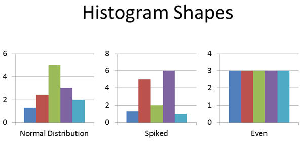
Bell-Shaped :
If there is a bell shape, your data is normally distributed, and hence, no variation (or influence from other factors like the 6Ms).
Spiked
If there are multiple spikes in the chart, there is likely variation in the process.
Even
On the other hand, if all of the bars are at the same level, we are not likely correctly measuring the process.
Doing statistical analysis usually includes the following:
- Measuring the central tendency.
- Measuring the variation.
Steps to Create a Histogram
The construction of a histogram starts with the division of a frequency distribution into equal classes, and each class is a vertical bar. It is used to plot data density, especially continuous data like weight or height.
- Collect the data
- Arrange the data points in order and assign categories
- Find the lowest and highest value
- Find the number of intervals
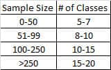
- Use 2^k = N where k = # of categories (smallest positive integer) and N = # of data.
- Compute the intervals with covering the entire range of the data set
- Find the frequency of occurrence for each of the data points as per the interval
- Draw the bar chart preserving counts and categories
Example
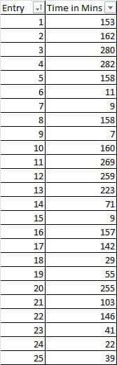
Ex. Delay times in minutes for an airline
1) Get Data
Use continuous data– data collection from a frequency distribution check sheet.
Step 2: Order it and Assign Categories
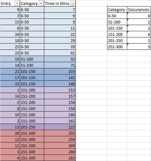
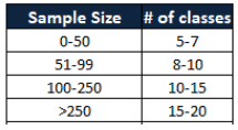
- Note: The number of cells (columns) affects the shape – so choose wisely!
- Could use 2^k = N where k = # of categories (smallest positive integer) and N = # of data.
Step 3: Create a Bar Chart Preserving Counts and Categories
Advantages
- You can visualize the distribution of the data.
- It summarizes the large data set graphically.
- It helps to make future decisions based on data.
- You can use it to assist in decision making.
- Simple to understand and also easy to communicate with the team.
Disadvantages
- It uses only continuous data.
- More difficult to compare two data sets.
- Difficult to read values because data is grouped into data sets.

Comments (4)
how to make histogram
Khalid, this article shows you exactly how to make a histogram. I don’t understand your question. Have you tried to follow these steps?
Use a data analyzer add-in with excel
Thanks, Laura. Add-ins certainly make things easier.