What is an I-MR Chart?
The I-MR chart was introduced by Walter Shewhart; hence control charts are also called Shewart Charts. I-MR chart, also called an X-MR chart, is a combination of two charts (Individual and Moving Range) to track the process variability based on the samples taken from a process over a period of time.
An Individual moving range (I-MR ) chart is used when continuous data is not collected in subgroups. In other words, collect a single observation at a time. An I-MR chart provides process variation over time in a graphical method. A graphical I-MR chart helps identify when the process goes out of control and indicates where to focus on the source of the assignable cause.
I-MR Definition
An I-MR chart is basically two separate charts–the Individuals (I) chart and the Moving Range (MR) chart. The combination of the two charts provides a complete picture of process behavior.
I-Chart: Individual chart displays the individual data points and monitors the mean and shifts in the process when the data points are collected at regular intervals of time. This chart will help to identify the common and assignable causes in the process, if any.
MR Chart: While the Individual chart monitors the process mean, the Moving Range chart monitors the process variation when the data points are collected at regular intervals of time. In other words, the moving range chart tracks the absolute difference between each measurement to its previous measurement.
An I-MR used for:
- To check any indications of assignable causes in the process that may lead to the process being out of control.
- To monitor the process performance before and after the implementation of process improvements.
- When the production rate is very slow on the shop floor and difficult to wait for more samples.
- The measurement systems are too expensive (like destructive testing).
- Mostly used for batch process.
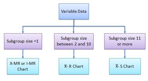
How is an I-MR chart different than the X̅-R chart?
An Individual chart displays the individual data points and monitors shifts in the process, whereas X̅ monitors mean change over time.
A Moving Range chart monitors the absolute difference between each measurement to its previous measurement. The Range Chart monitors the subgroup’s range change over time.
When would you use one over the other?
X̅ – R chart is to be used when large data is readily available, whereas an I-MR chart is to be used in case of limited data. I-MR chart is to be used when the subgroup size is one, while the X̅ – R chart is to be considered when the subgroup size is between two & ten, and use X̅ -S chart if the subgroup size is eleven or more.
How to use an I-MR Chart
In the initial phase, values are used to evaluate the process mean and standard deviation to effectively monitor any process. These will establish the control limits for individuals and ranges. During this phase, monitor any points that are moving out of control, identify the special cause for variation, and try to eliminate those causes to keep the process under control. Once the process is in control and control limits for Individual and moving range charts are in place, use these control limits and collect the data points at regular intervals of time to monitor the process variation. Identify the special cause if the process is out of control.
How to build an I-MR Chart
- First of all, calculate the Moving range (MR), which is the absolute value of the difference between consecutive measurements.
- Calculate the process average (x̅) and the average of the moving range (M̅R̅).
- For the I-MR chart, n is always equal to 2 (because we are calculating the moving average of two consecutive points, in other words, it is basically comparing the current state with the previous state).
- Finally, construct the control charts for the Individual and Moving range.
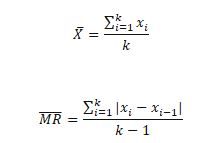
- Where xi = value at point i
- k= number of subgroups
The formula for center line, Lower, and Upper control limits for Individuals are:
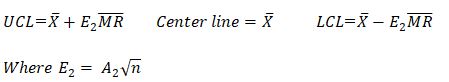
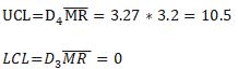
The formula for the center line, Lower, and Upper control limits for the Moving range are:

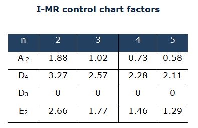
Where, D3, D4, and E2 are control chart constants.
E2 being the constant for I-MR Chart: http://web.mit.edu/2.810/www/files/readings/ControlChartConstantsAndFormulae.pdf
Important notes on I-MR charts
- I-MR data points should always be in time sequence order. In other words, capture the data in the same order when it happened.
- The cumulative sum (CUSUM) and exponentially weighted moving average (EWMA) charts monitor the mean of the process, but they consider the cumulative information, whereas the Individual chart considers just current values. Hence they are more sensitive when compared to Individual charts for minor shifts in the process.
- Individual charts can be interpreted like X̅ charts. While Moving range charts cannot be created like X̅ -R charts.
- I-MR charts are to monitor individual observation rather than subgroup averages.
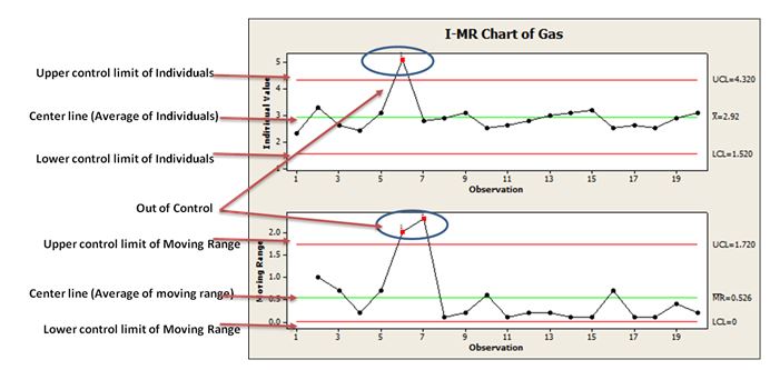
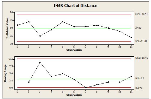
Example of an I-MR Chart
A salesperson travels to various shops in the city to deliver the sample products. Below is the distance traveled data (in miles) for the last 11 months. Calculate the control limits for the I-MR chart.
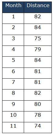
First, calculate the Moving Range:

Calculate the X̅ and M̅R̅:
- k=11
- X̅ = 880/11= 80
- M̅R̅ =32/10 =3.2
- n=2 (comparing the current state with the previous state)
E2 = A2 √n = 1.88* √2 = 2.66
Calculate the Control limits for the Individual Chart:

Calculate the Control limits for the Moving Average Chart:
Example of Using an I-MR Chart in a DMAIC Project
I-MR control charts are used when the subgroup size is equal to 1. Example: Monthly reporting data (like customer complaints, Inventory, monthly sales data, etc.). Usually, for any process, assignable causes will be taken care of during the Analyze and Improve phases of DMAIC using different types of statistical tools like Regression, Design of Experiments, etc.
The variation of the process due to common causes still exists while the process is under control. And I-MR control chart helps to identify the process abnormality due to assignable causes promptly in the Control Phase of DMAIC. These charts will only signal that there is a problem in the process.
Let’s say that the Project was chartered to run a DMAIC process with the stated goal of increasing customer satisfaction via Net Promoter Scores. Throughout the Measure Phase, customer complaints were measured to get a baseline. An I-MR Chart could be used to show trends in customer complaints.
Later, the Analyze Phase could have determined ways to remove several causes of variation. In the Improve phase, changes could have then been made to the process and piloted. You could use an I-MR chart, and then see what the effects of the pilot were. Also, in the Control Phase, you might make continual monitoring of the I-MR Chart part of your control plan.
The Six Sigma team has to identify the cause of the problem and appropriate corrective action to be initiated. This is an iterative procedure for continuous improvement of the process.
What You Need to Know for Certification
Six Sigma Green Belts
The IASSC Six Sigma Green Belt BOK lists knowledge of I-MR charts under its control phase
The ASQ Six Sigma Green Belt BOK requires:
Selection and application of control charts Identify, select, construct, and apply the following types of control charts: X Bar−R, X Bar−s, individuals and moving range (ImR / XmR), median (), p, np, c, and u. (Apply)
Six Sigma Black Belts
The ASQ Six Sigma Black Belt BOK Requires:
Select and use the following control charts in various situations: X¯ – R, X¯ – s, individual and moving range (ImR), attribute charts (p, np, c, u), short-run SPC and moving average. (Apply)
The IASSC Six Sigma Black Belt BOK lists knowledge of I-MR charts under its control phase.
The Villanova Six Sigma Black Belt BOK requires the following
Advanced statistical process control
Understand appropriate uses of short-run SPC, EWMA, CuSum, and moving average.
Six Sigma Black Belt Certification I-MR Chart Test Questions:
Question: Which of the following control charts to be used when the rational sub-group size is one?
(A) X̅ -R Chart
(B) p Chart
(C) I-MR Chart
(D) c Chart
When you’re ready, there are a few ways I can help:
First, join 30,000+ other Six Sigma professionals by subscribing to my email newsletter. A short read every Monday to start your work week off correctly. Always free.
—
If you’re looking to pass your Six Sigma Green Belt or Black Belt exams, I’d recommend starting with my affordable study guide:
1)→ 🟢Pass Your Six Sigma Green Belt
2)→ ⚫Pass Your Six Sigma Black Belt
You’ve spent so much effort learning Lean Six Sigma. Why leave passing your certification exam up to chance? This comprehensive study guide offers 1,000+ exam-like questions for Green Belts (2,000+ for Black Belts) with full answer walkthroughs, access to instructors, detailed study material, and more.

Comments (6)
Where did you mention about E2 being the constant for ImR Chart?
Here’s a good reference, Henry: http://web.mit.edu/2.810/www/files/readings/ControlChartConstantsAndFormulae.pdf
What is the Difference Between C -Chart& P-Chart ?
Can Pls Explain with Example
Hi Nagarajan,
We’ve done a lot of work on attribute charts here. Check that out.
Best, Ted.
c chart is for constant sample size whereas p chart is for variable size sample
You’re absolutely right, and that’s a key distinction in attribute control charts: