Graphical analysis is one of the best ways to analyze problems in Six Sigma projects. It is an effective way to visualize data patterns and provides key insights into the data.
Generally, in any manufacturing or business process, Six Sigma teams deal with a vast amount of data, and it is impossible to convey the information effectively with the raw data. Thus, it is recommended to segregate and plot the data to analyze the problems.
The graphical analysis creates pictures of the data, which will help to understand the patterns and the correlation between process parameters. Often graphical analysis is the starting point for any problem-solving method.
Graphical tools are readily available in Excel and statistical software such as Minitab, and they are very easy to use and can quickly plot graphs.
Walkthrough of Graphical Analysis Tools
Different graphical tools depict different data features such as trend, frequency, dispersion, and distribution shape. Below are a few graphical analysis tools.
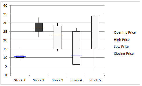
Box-and-Whisker Plot
Box-and-Whisker plot, also known as a Box and Whisker plot, is a pictorial representation of continuous data. Box plots show the Max, Min, median, interquartile range Q1, Q3, and outlier data.
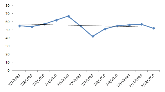
Run Chart
Run charts, also known as Time Series Plots, are line graphs of data plotted over time. They help to identify the pattern of the data in the time series. Because they don’t use control limits, we cannot judge whether the process is stable or not. However, run chat shows how the process is behaving. The advantage of the run chart is that it identifies the special cause(s) in a process.
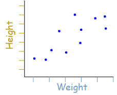
Scatter Diagram
Scatter diagrams, also known as Correlation Charts or XY Graphs, plot the relationship between two continuous variables. These can include the independent variable on the x-axis and the dependent variable on the y-axis.
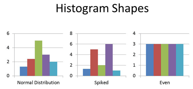
Histogram
A Histogram is the graphical representation of a frequency distribution. It is in the form of a rectangle with class intervals as the base and the corresponding frequencies as the height. Particularly, there are no gaps between any two successive rectangles.
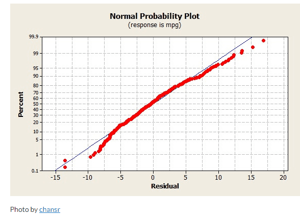
Normal Probability Plot
The Normal Probability Plot is a graphical method to assess whether the data set follows a normal distribution or not. This includes identifying outliers, skewness, etc. Furthermore, the Normal Probability Plot is one example of a Quantile-Quantile (Q-Q) plot.
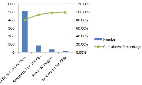
Pareto Chart
A Pareto Chart is also known as the 80-20 rule. It is a combination of a bar chart and a line chart. The actual data is in descending order and uses a bar chart and cumulative data in ascending order on a line graph.
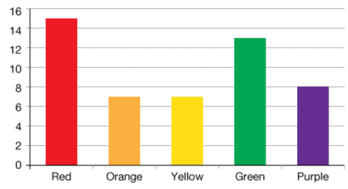
Bar Chart
A Bar Chart displays the frequency on one axis and the values of the categorical variable on the other axis. In a bar graph, bars of uniform widths are drawn with various heights. However, the height of the bars represents the frequency of the corresponding observation.
Why Use Graphical Analysis Tools
Six Sigma teams apply a wide range of graphical tools in each phase of DMAIC.
Define
The main purpose of the Define Phase is to define the problem, identify customer requirements, and also summarize the project plan.
The project team uses various six sigma tools in the Define Phase like SIPOC (Supplier-Input-Process-Output-Customer), Process maps, value stream mapping, Project charter, SWOT analysis, and Voice of Customer.
The Six Sigma team uses graphical analysis tools. For example, they use a Bar Chart to understand a process trend, revenue loss, etc. Then, they use a Run chart to monitor customer complaints or defects over a period of time. Similarly, A Box Plot graphically represents the voice of the customer (pictorially depicts customer satisfaction with various attributes).
Measure
Measure the process performance. In fact, the main purpose of the measure phase is to collect the data that covers the project scope and also to determine what data distribution you are working with.
The project team uses various Six Sigma tools like a process flow chart, Gage R&R, Pareto Chart, and a process capability analysis in the measure phase.
Graphical tools like the Pareto Chart are used to analyze the frequency of problems and identify the majority (80%) of issues. Similarly, the Process Capability Analysis is used to assess the ability of the process to perform according to the specification.
Analyze
The main purpose of Analyze phase is to understand the root cause of the problem. Furthermore, to identify the opportunity for improvement.
Above all Six Sigma team uses most of the graphical tools in Analyze phase. Few examples like a Histogram, Scatter Diagram, Multi-Vari Chart, Time Series Chart, Normal Probability Plot, etc.
Improve
The main purpose of Improve phase is to eliminate the root causes and implement the improvements. Additionally, design the action plan to monitor the improvements.
In fact, graphical tools like statistical control charts (I-MR chart, u-chart, p-chart, and c-chart) help to monitor progress and to make necessary adjustments.
How to Pick Which Tool to Use?
The selection of graphical tools depends on the type of data and the project’s objective. The picture below helps identify the right graphical tools based on the scenario. However, statistical analysis is required before drawing any conclusions.
How to Understand what the tools are telling you?
Often, the biggest challenge for Six Sigma teams is to understand the graph and make conclusions. In fact, it is difficult to understand the message from the graph right away. The Six Sigma team has to take time to interpret the graphs.
Each graph provides different messages like trend, frequency, dispersion, and distribution shape.
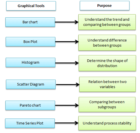
Box-and-Whisker plot is to understand the difference between the groups, outliers in the process, and maximum and minimum values. Is there any difference between the subgroup’s median?
A Histogram is used to understand the shape of the distribution. Is it symmetrical or skewed?
Scatter diagrams are to understand the relationship between two continuous variables. Is there any correlation between factors?
Time series plots are to understand the trend over time. Is the process stable over time?
Pareto Charts are to understand the frequency of the problem as well as their cumulative impact.
I originally created SixSigmaStudyGuide.com to help me prepare for my own Black belt exams. Overtime I've grown the site to help tens of thousands of Six Sigma belt candidates prepare for their Green Belt & Black Belt exams. Go here to learn how to pass your Six Sigma exam the 1st time through!

Comments (6)
Links no longer working at the end. FYI
Should be all set now, Luke. Thanks for the head’s up.
Very helpful! Thanks a lot Ted!
Glad you like it, Guillermo.
Thank you for the warm comments!
Best, Ted.
Hi Ted Hessing
Good and precise description on graphical tools. It would be better if you add few limitations
Thank you for the suggestion!