The third guest post in a series from Jeremy Garret.
In my first article I explained how Lean Six Sigma literally saved my teaching career, and shared a few general insights into how Lean Six Sigma can be used in other careers. Manufacturing, computer programming, and more recently even human resources have used Lean Six Sigma and other related quality assurance systems to increase efficiency, decrease product or process failures, save time, save money, and even increase profit. The public school systems in the United States are in desperate need of those same improvements.
Budget cuts are pressuring schools to accomplish more with less funds at the same time that changes in technology are rapidly raising the minimum education needed to get a good, stable job. Broad unemployment and international competition are further pressuring U.S. schools to improve. Unfortunately state and local leaders are seldom trained in the use of quality assurance systems such as Lean Six Sigma. Even if a principal or superintendent was trained in Lean Six Sigma support would be needed from both above and below within the rest of the school administration. While introducing Lean Six Sigma to state departments of education would almost certainly produce tremendous benefits, we don’t have to wait – individuals can (and should) apply the fundamental skills Lean Six Sigma within their own careers.
Studying and applying the principles of Lean Six Sigma has indeed changed my life and my career! During my studies of Lean Six Sigma I learned that my own teaching methods could be treated much like a manufacturing process – that I could continuously tweak my teaching and grading processes by using a scientific analysis of my students’ grades and behaviors. Prior to that realization, my instructional plans were far too rigid and I was too eager to blame my students and our government – in short, I was bad and unhappy. Changing my perspective and a few of my behaviors has made me a happier and more successful teacher; it is that path to success that I want to continue to share with you in this post.
Here is a quote from my immediate supervisor (our math department head) describing the changes from her point of view:
Our department would not be the same without you in it! I have seen the change in your classroom over the years and it is definitely better for you and the students.
In my second post I explained how control charts displaying class grade averages on the vertical axis (or “y-axis”) and time on the horizontal axis (or “x-axis”) allowed me to see with great detail when I needed to: 1) reteach a subject, 2) change my grading on an assignment, or 3) both. That level of information and my response to it greatly decreased the number of parent conferences and greatly improved the ones that remained. The change in parent conferences combined with other improvements greatly improved how my supervisors thought of me and how they reviewed my performance. The techniques discussed in this and other posts can be used in a great many settings; it is my belief that you too can apply these techniques in your job or in your life. If you have already used such techniques or intend to do so, please help us by sharing your experiences with us (by using the comment section below).
Unfortunately the level of information provided by the basic control charts was not enough to tell how grading systems should be modified – such charts only indicated when modifications are needed. In order to determine how grading should best be done (or redone) I had to know what the distribution of the grades was and when those distributions changed. I measured the change in the distributions by using a type of control chart that showed a class’s standard deviation on the vertical axis and time on the horizontal axis. I could tell when special problems had arisen by simply looking for times at which a class’s standard deviation was different from the others or when it had suddenly changed. To gain a deep insight into situation I then used a histogram that showed how many students earned each letter grade (A, B, C, etc). In this article I will show the types of special problems that the standard deviation control chart (or “S chart”) can find. I will explain how histograms showed the severity and nature of the problems that had been found by the control chart. I will conclude by explaining how I used that information to create “fair, data-driven, scientific grading curves.”
Basic Control Charts
Before demonstrating the standard deviation control chart, I want to pause for just a moment to show you the “regular” class average control that was discussed in the previous article. (As stated in previous articles, all of the data shown in these graphs come from actually classes that I taught during the 2013-14 school year and represent actual problems that I faced and addressed using these techniques.)
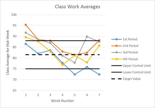
In this chart, the upper and lower control limits were created using a combination of personal experience and feedback from administrators. In manufacturing these limits would normally be set by calculating three times the standard deviation that was observed during initial testing; in both cases, these control limits must be well within the user specification limits (which are generally not shown on a control chart). The dotted line shows the target value; it is nearly always just an average of the two control limits.
In this chart we can see that three of four classes had an average that was “too high” during week one. It also shows that 1st Period had grades that were clearly “too low” for two weeks and borderline “too low” during one more. This also shows that something unusual seems to have happened to the 3rd Period class during week six.
Standard Deviation Control Charts
In spite of the power of that chart, we are still unable to tell what caused the changes. Additional information can be gained by looking at the standard deviations of the classes’ classwork averages. These standard deviations can tell us how spread out the individual student’s grades were from each other. Given that our data is actually classwork grades, we should expect to have at least one student with a 100% and at least one at or near a 0%, thus the class-wide range would not be particularly useful. The standard deviation however can tell us if the “weak students” are performing only a little below the “strong students” (a small standard deviation) or if the performance of the two groups is dramatically different (a large standard deviation). It should be noted that “a little below” and “dramatically different” must be determined by the teacher’s experience; in industry however there are very precise tables and equations for calculating these values.
Creating a control chart with the class period standard deviations (measuring the variance between students within each class) produced the following chart.
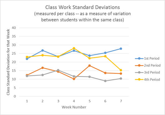
(Technically, this is a “run chart” instead of a “control chart” since no control limits have been added to the graph.)
The first thing that most people notice from this graph is that 1st and 4th period consistently had a larger standard deviation than 2nd and 3rd period. This means that the grades were more spread out in 1st and 4th than they were in 2nd and 3rd. We can also see that during week seven 4th period had a drop in the spread of the grades.
At this point in an analysis it is very tempting to guess at a cause and move on. With experience and intuition many people can correctly identify at least one valid cause of the variation (in this case the spread of the grades) – but even the most seasoned quality professionals cannot guess all of the causes immediately and even they cannot immediately guess which cause is the most important. So it is important to keep an open mind and not guess — not yet. (Guessing at a solution without adequate data is one of the biggest reasons for the large inefficiencies found in the U.S. education system.) In this situation, a histogram can tell us a LOT more about our students, their needs, and what options might help them the most.
Comparisons to Graphs Used in Industry
Before moving further, it is important to compare the analyses that we’ve done so far to those used in industry. The first two types of charts that we made form a set called “X-bar and S,” where “X-bar” is an abbreviation for the average of a set of measurements and “S” is an abbreviation for standard deviation. It should be noted however that the “X-bar and S” charts that we have created are different from the most commonly used types in a very important way. In manufacturing “X-Bar” normally indicates measurements that were averaged over time, for example you might take a measurement every few seconds and then average the last 20 data points. Similarly, “S” would thus be a standard deviation of those last twenty measurements.
In our graphs we averaged across twenty to thirty students who completed tasks all at the same time; this is equivalent to measuring multiple machines running at the same time. This type of analysis is also commonly used in industry to compare employees and machines that were all running at the same time, but it is important to be aware that this is different from what is normally meant by the term “X-bar and S” graphs. The most important difference is the type of information revealed. The more common type of “X-bar and S” graphs could be used to measure day to day changes for each student; as a teacher I feel that I can capture this information more easily using qualitative data (which I will cover in a later post). In contrast, my concern is the class period to class period differences and the differences in overall grades from one day to the next, both of which will be revealed with the types of analysis being demonstrated in this post.
Histograms
A histogram chart can be generated on individual assignments (individual processes in industry) or on aggregate data such as semester or course grades. Over the last ten years of teaching I have had three different administrators require me and my fellow teachers to analyze our exam grades and semester grades by using histograms. Due to the high value of the information generated I recommend (and even beg) that histograms be used on all nine-week overall grades and on all uniquely important grades (such as final exams).
In the following example, the grades for 1st period class work from week 1 has been used. There are plugins for MS Excel that make the creation of histograms quick to generate, and there are many other programs can also be used. Without a plugin or advanced program, simply counting the number of grades in each category (or letter grade) is fairly quick and easy.
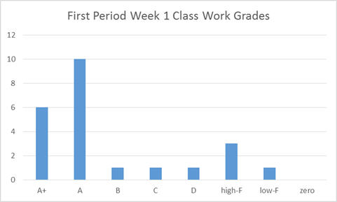
Several things can be seen quite quickly from this graph. First, the grades do not have a “normal” or “bell curve” distribution or even a Rayleigh distribution. Instead the grades are clustered in the A’s and A+’s with no meaningful “tail” in the B’s & C’s – bell curve and Rayleigh distributions both gradually decrease rather than immediately dropping to almost zero. Furthermore we see a second small grouping of grades centered in the high-F range. This data shows a “bi-modal” distribution.
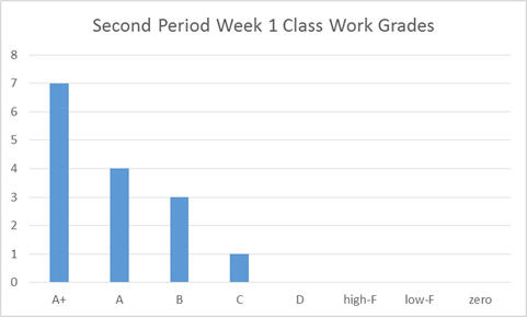
In the chart above the grades from 2nd Period were used. Please remember that in the standard deviation control chart we saw that second period had a much smaller standard deviation than 1st Period. By comparing the histograms we can see a great deal of additional information. In 2nd Period the grades are all grouped around the A’s, with a significant number of students earning grades over 100%. Unlike 1st Period’s graph, this graph does show a “tail” (gradually decreasing numbers) as we move to the right (toward the lower grades). Experienced teachers can already guess which of these two classes had the fewest discipline problems and other problems, but even with accurate intuition it is important to wait to guess at the causes.
Applications and Grading Techniques
Although the standard deviation control charts are more abstract than simple average grade control charts they are correspondingly more powerful. The main reasons why is that the standard deviation is actually more sensitive to the types of problems that I am most concerned with. I have found that my strongest students perform well even on days when I, the teacher, do not. This can result from the strongest students already knowing the material or from their ability to learn it quickly in a wider range of environments.
In contrast however, I find that my weaker students are much more effected by both my performance and the type of content being taught. The weaker students are more easily distracted than the stronger students. Additionally, when the teacher is not “entertaining enough” or not providing strong classroom management then the weaker students will be off task sooner and longer than the stronger students. The weaker students also need more and better examples. Thus the weaker students will be more negatively impacted by a presentation that only has a few bad examples and only a few “you try” problems (class work problems with immediate feedback). As a result, days or weeks in which the instruction and/or classroom management are bad, the class average will drop some — but only a little, because the strong students will still have high grades. The standard deviation however will increase dramatically in these situations – because the standard deviation is a measure of the spread of the data. Thus the standard deviation chart can point to days in which weak students and strong students performed at close to the same level and when they performed at very different levels. When combined with other data (primarily qualitative, observational data) this can show when the teacher needs to focus more on classroom management, increasing the number of examples, or finding a way to be more “entertaining.”
Furthermore, since the standard deviation is an indication of the spread of the data it partially indicates the type of “curve” that is best at different times. For important grades (such as 9-week grades or a final exam), I always use a histogram to fully understand the needs of the students. For less critical situations (like a unit test or a quiz) I use the following guidelines — if the standard deviation is “small” and the average is “low” then a simple “shift” (adding a few points) is a good technique, but when the standard deviation is “high” and the average is “low” then a slightly more complicated approach is nearly always better. In these situations I have been using (and teaching my fellow teachers to use) this procedure: multiply the grades by a number slightly below one (typically 0.9 to 0.8) and then add a number that both compensates for that multiplication and that provides a small additional shift (typically 10% to 30%). For example, on most of my tests I configured my gradebook software (“INOW”) to multiply by 0.8 and to then add 30%. This techniques takes a grade of 10% and turns it into a 38% while taking a 100% and turning it into a 110%.
It should be noted that each of these benefits has its own equivalent in manufacturing and other industries. A decreased need for final product checks, a decreased need for expensive product and process audits, and a strong reputation can all result. As practical examples, Craftsman tools cost more than online generic tools, but many people (including myself) buy the more expensive ones whenever possible. Other people feel the same way about Sony and Toyota. In fact, Toyota is famous for the “Toyota Production System” or the “Toyota Method” which is built upon and contains the techniques in this article (along with many techniques not yet covered). General Electric is also famous for Six Sigma which also includes the techniques described in this (and future) chapters.
Conclusion
As demonstrated, the quantitative tools used in the quality assurance industry to improve tasks in manufacturing can be transferred to nearly any industry. Kindergarten through 12th grade education is currently suffering from cuts in funding while simultaneously being pressured to increase the amount of results. “No Child Left Behind,” increased need for high education, and even the need for more thoroughly literate “unskilled” workers have all added to the demand for increased scores on standardized tests. The combination of decreased funding and increased pressure for output produces a need for dramatic improvements in efficiency and in the quality of the schools’ internal processes. As we have seen in other industries (such as the automotive, electronic, and now software development industries) such changes are possible, practical, and even profitable! It is now time for the education industry to follow the examples set by other industries! In each of those successful industries the principles used within Lean Six Sigma have been the key. To complete the kind of transformation that our schools need and that our children deserve, Lean Six Sigma (or another quality assurance system) needs to be applied at both the state and local levels with involvement and leadership coming from state departments of education. But individual teachers and principals do not have to wait and hope for these changes – they can begin making some of these changes within their own classrooms.
One of the major components of successful quality assurance work is the correct use of control charts and histograms. In the case of K-12 education teachers can and should use these techniques to identify times when material should be retaught and times when grades should be “curved.” Doing so does involve an initial investment of time, but doing so creates a reputation for high quality teaching and fair grading in addition to the actual improvement in the curriculum and knowledge transfer. In today’s education market with law suits, private schools, vouchers, and school transfers, a school’s reputation truly does affect that school’s budget, further increasing the need for immediate improvements.
In my next post, I will explain how “root-cause analysis” using “fishbone diagrams” (also called Ishikawa diagrams) form the foundation of Lean Six Sigma (and other quality assurance systems) by empowering people to find the “real” or most important cause of a problem. Root-cause analysis is thus one of the most important tools for anyone to know! Please join our discussion on this and other upcoming topics.
The techniques shown in this post (and my other posts) are not limited to manufacturing or to teaching. They can be even be used in our daily lives. If you have a story or experience with such techniques, please help us by telling us your story (by using the comment section below). Similarly please let me know if you have questions. If you like what you see or have a topic that you would like to read more about, then please let us know that too.

Comments (2)
Hi –
It’s interesting to see SPC being used to analyze data in different settings.
I’m confused by this, though:
“the upper and lower control limits were created using a combination of personal experience and feedback from administrators”
Control limits are supposed to be calculated from the inherent variation in the baseline data… they aren’t supposed to be “chosen” or involve judgment.
What do you mean by “personal feedback and feedback” instead of just doing the math? Were administrators setting specification limits instead of control limits?
Thanks…
Hi Mark,
Thanks for your insightful observation, You’re absolutely right to point out the distinction between control limits and specification limits. In traditional Statistical Process Control (SPC), control limits are indeed calculated from historical process data and represent the process’s natural variability. They’re statistically derived, typically at ±3 standard deviations from the mean, and are independent of external opinions.
What Jeremy described above (using “a combination of personal experience and feedback from administrators” to set the limits) blurs that line and leans toward specification limits, which are set based on expectations, goals, or stakeholder input rather than inherent process behavior.
It’s a valid argument. In this educational context, Jeremy adapted Lean Six Sigma tools in a more practical and illustrative way to drive classroom improvement, even if that meant combining SPC elements with performance expectations. So, while the charts used “control chart” structure and visualizations, the boundaries described were closer in spirit to specification limits . That reflects desired performance levels, rather than statistical control limits.
This is a good reminder of the importance of keeping control limits strictly data-driven when adhering to SPC methodology.
Thanks again for the great discussion!