What are X Bar R Control Charts?
X Bar R charts are widely used control charts for variable data to examine process stability in many industries (e.g., hospital patients’ blood pressure over time, customer call handle times, length of a part in a production process).
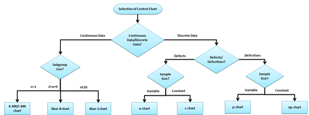
Selection of the appropriate control chart is essential in control chart mapping; otherwise, you will end up with inaccurate control limits for the data.
The X-bar R chart is used to monitor the process performance of continuous data. You can also use it to collect data from subgroups at set time periods. It is actually two plots to monitor the process mean and the process variation over time and is an example of statistical process control. These combination charts help to understand the stability of processes and detect special-cause variation.
The cumulative sum (CUSUM) and the exponentially weighted moving average (EWMA) charts also monitor the process’s mean, but the primary difference is unlike the X bar chart. They consider the previous value means at each point.
X Bar R Control Chart Definitions
X bar chart: The mean or average change in a process over time from subgroup values. The control limits on the X bar consider the sample’s mean and center.
R chart: The range of the process over time from subgroup values. This monitors the spread of the process over time.
Use X Bar R Control Charts When:
- Even a very stable process may have some minor variations which cause instability. An X-bar R chart will help identify these variations over time.
- When the data is assumed to be normally distributed.
- An X-bar R chart is for a subgroup size of more than one (for an I-MR chart, the subgroup size is one only), and it is generally used when rationally collecting measurements in a subgroup size between two and ten observations.
- The X Bar S Control chart should be considered when the subgroup size is more than 10.
- When the collected data is continuous (i.e., Length, Weight), it captures data in time order.
How to Interpret the X Bar R Control Charts
- To correctly interpret an X-bar R chart, always examine the R chart first.
- The X bar chart controls limits derived from the R bar (average range) values. If the R chart’s values are out of control, the X bar chart control limits are inaccurate.
- If the points in the R chart are out of control, stop the process. Identify the special cause and address the issue. Then, remove those subgroups from the calculations.
- Once the R bar chart is in control, review the X bar chart and interpret the points against the control limits.
- All the points must be interpreted against the control limits but not specification limits. The customer or management provides specification limits, whereas control limits are derived from the average and range values of the subgroups.
- Process capability studies can only be performed after the X bar and R chart values are within the control limits. They are not necessary for an unstable process.
Steps to follow for X bar R chart
The objective of the chart and subgroup size
- Determine the aim of the chart and choose the essential variables.
- Choose the appropriate subgroup size and the sampling frequency.
- Collect a minimum of 20 to 25 sets of samples in the time sequence.
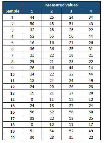
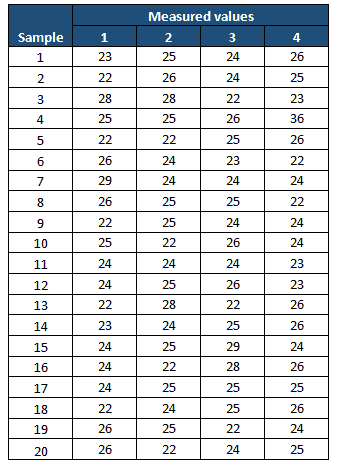
Example: In the manufacturing industry, plate thickness is one of the CTQ factors. During the Measure phase, the project team performed the process capability study and identified that the process was not capable (less than two sigmas). In the Analyze phase, they collected 20 sets of plate thickness samples with a subgroup size of 4.
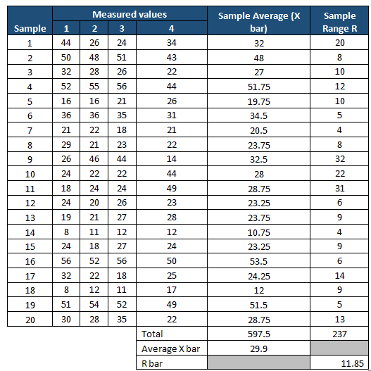
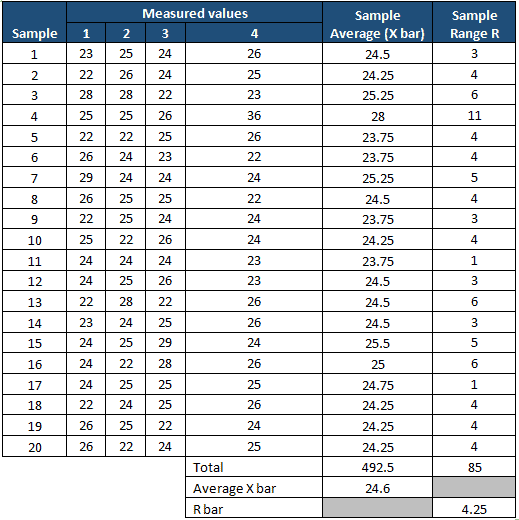
Compute X bar and R values.
- Measure the average of each subgroup, i.e., X-bar, and then compute the grand average of all X-bar values. This will be the center line for the X-bar chart.
- Compute the range of each subgroup, i.e., Range, then measure the grand averages of all range values, i.e., R bar. This will be the center line for the R chart.
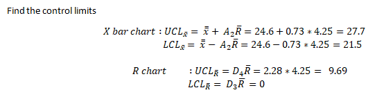
Determine the Control Limits
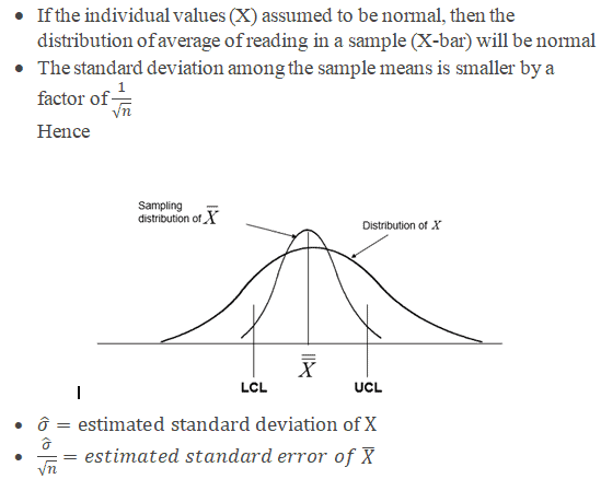
- The first set of subgroups determines the process mean and standard deviation. These values are to be considered for creating control limits for both ranges and the mean of each subgroup.
- The process is to be under control in the early phase of production. If any of the points are out of control during the initial phase, you must identify any special causes. Also, you should remove the subgroup before the calculation.
- Sometimes, having a few points out of control on the x-bar portion would also be good in the initial phase. Otherwise, if all the values are within the control limits, it may be because of the slop in the measurement system, and the team won’t focus on it. Identify the appropriate Measurement System Evaluation (MSE).
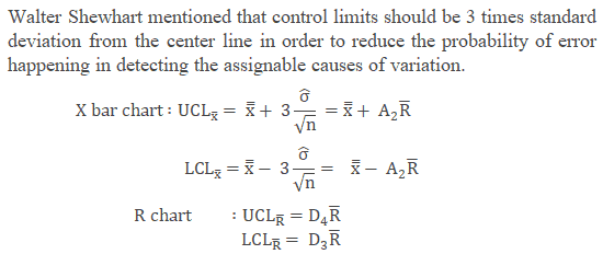
- Where
- X is the individual value (data)
- n is the sample size (subgroup size)
- X bar is the average reading in a sample
- R is the Range, in other words, the difference between the largest and smallest value in each sample.
- R-bar is the average of all the ranges.
- UCL is the Upper control limit
- LCL is the Lower control limit
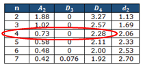
The control chart constants below are the approximate values used to measure the control limits for the X-bar R chart and other control charts based on subgroup size.
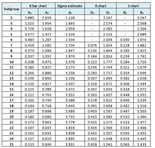
Refer to common factors for various control charts.
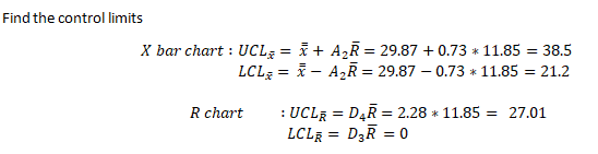
Example cont: In the above example, n=4
Interpret X bar and R chart
- Plot both the X bar and R chart and identify the assignable causes
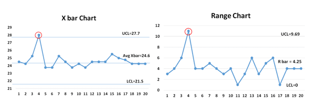
Example Cont: Use the above values and plot the X bar and Range chart
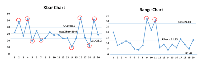
From both the X-bar and R charts, it is evident that most of the values are out of control; hence, the process is not stable.
Monitor the process after improvement.
- Once the process stabilizes and control limits are in place, monitor the process performance over a set period.
Example cont: Control Phase—Once the process is improved and matured, the team identifies the X-bar R chart as one of the control methods in the Control plan, which is used to monitor process performance over time.
The following are the measurement values in the Control phase of the project.
Compute X-bar and Range
Both the X-bar and R charts clearly show that the process is almost stable. During the initial phase, one value is out of control, so the team has to perform a root cause analysis for the special cause. It also seems that the process is smoothing out from data set number 16. If that continued, the chart would need new control limits from that point.
- After the process is stabilized, even if any point goes out of the control limits, it indicates an assignable cause that needs to be addressed. This is an ongoing process to monitor process performance.
https://www.youtube.com/watch?v=djEMQLS7VCc
Important notes
- A process that is “in control” means that the process is stable and predictable.
- Just because a process is stable does not mean it has a zero-defect process.
- Remember NEVER to put specifications on any control chart.
- The points on the chart are comprised of averages, not individuals. Specification limits are based on individuals, not averages.
- The operator might be prone to not reacting to a point that is out of control when the point is within the specification limits.
- X bar R chart helps to avoid unnecessary adjustments in the process.
X Bar R Control Chart Videos
When you’re ready, there are a few ways I can help:
First, join 30,000+ other Six Sigma professionals by subscribing to my email newsletter. A short read every Monday to start your work week off correctly. Always free.
—
If you’re looking to pass your Six Sigma Green Belt or Black Belt exams, I’d recommend starting with my affordable study guide:
1)→ 🟢Pass Your Six Sigma Green Belt
2)→ ⚫Pass Your Six Sigma Black Belt
You’ve spent so much effort learning Lean Six Sigma. Why leave passing your certification exam up to chance? This comprehensive study guide offers 1,000+ exam-like questions for Green Belts (2,000+ for Black Belts) with full answer walkthroughs, access to instructors, detailed study material, and more.

Comments (37)
Can you provide a location of where all the constants for different control charts?
Here’s a good reference, Henry: http://web.mit.edu/2.810/www/files/readings/ControlChartConstantsAndFormulae.pdf
You state you want most of the points to be out of control on the X bar chart? Can you please tell me why that is?
Hi Brian,
Updated the article for greater clarity. Thanks for pointing that out!
Best, Ted.
Hi, if one or two points are out of the control limits does it mean the process is Not capable?
Kerubina,
I like the following quote:
Try this article for calculating process capability.
Applying the method of first video results totally different.
Hi Hung,
Can you share what you’re doing so I can see?
Best, Ted.
Sorry for late respond.
I took the data set of your first example
measure1 measure2 measure3 measure4
44 26 24 34
50 48 51 43
32 28 26 22
52 55 56 44
16 16 21 26
36 36 35 31
21 22 18 21
29 21 23 22
26 46 44 14
24 22 22 44
18 24 24 49
24 20 26 23
19 21 27 28
8 11 12 12
24 18 27 24
56 52 56 50
32 22 18 25
8 12 11 17
51 54 52 49
30 28 35 22
apply instruction in first video (https://www.youtube.com/watch?v=krowVMzxecI)
I calculated averages of each subgroup.
32
48
27
51.75
19.75
34.5
20.5
23.75
32.5
28
28.75
23.25
23.75
10.75
23.25
53.5
24.25
12
51.5
28.75
then estimated standard deviation of above 20 subgroup’s averages (in excel use formula STDEV.S(…))
I got 12.4605957870569
then calculated standard error of X.bar = 12.46/sqrt(n)= 12.46/sqrt(4)= 6.23
then UCL=X.doublebar+3* standard error of X.bar=29.875+3*6.23=48.566
your UCL by R.bar above is 38.5
Quite big gap, right?
Hung,
It looks like you are trying to calculate UCL just using the standard deviation. You need to use the values from the control chart constants table.
X Double Bar+ A2*R Bar = 29.875+ 0.729(11.89) = 38.51
yes, I calculated UCL using standard deviation, that’s instruction from the first video which Ramana PV attached to main topic.
I mean that 2 instructions from 2 video in main topic, one calculating by using standard deviation, one by using control chart constants table, lead to 2 different results.
Hung,
You make a good point, but I think it is important to remember, the writers of the Six Sigma exams are not out to tricky with multiple valid solution options. If there are multiple valid ways to solve a problem, only one will match an answer option you are given.
Question: I do not see it mentioned above, but why would and Xbar-R chart have gaps in the sample range section? I have not seen it before and am looking to see if anyone has a simple explanation to help me understand. Thank you
Dee,
I’m not sure what you mean here, can you elaborate?
Are you trying to interpret a control chart that has breaks in data? If so, perhaps the measurements were stopped for some period of time?
Best, Ted
Can you help me how to show the USL and LSL in the control chart in minitab software. Thanks so much.
Trung Nguyen, Vietnam.
Try this article here, Trung.
Hi, there were 3 questions in the module test about which charts test for Within vs Between and I didn’t see any content regarding this. I found this article which may help others:
https://www.spcforexcel.com/knowledge/variable-control-charts/xbar-mr-r-betweenwithin-control-chart
Thanks for letting us know, Andy. And thank you for finding and sharing an applicable resource!
We’ll add expanding our articles to cover this concept to our improvements list.
hello sir,
can you please clear subgroup size of control chart like
X bar R chart- you mention different somewhere 2-9 & somewhere 2-10 .
which one is correct.
Hello Sunil Kumar,
A subgroup is a group of units that are created under the same set of conditions. Subgroups (or rational subgroups) represent a “snapshot” of the process. Therefore, the measurements within a subgroup must be taken close together in time but still be independent of each other.
In X bar S chart, S chart shows the standard deviation of the subgroup size. S chart provides better understanding of the spread of subgroup data than range. Often, the subgroup size is selected without much thought. If the subgroup size is not large enough, then meaningful process shifts may go undetected. A large total number of observations is clearly advantageous because you can learn more about process performance. However, a large subgroup size is not necessarily better. You have to consider the period of time in which these large numbers of observations are obtained. Hence, if subgroup size is less than 10 use Xbar – R chart.
Thanks
p>Great question; the ideal subgroup size for an X̄-R chart generally ranges from 2 to 10, but the most common and practical range is 2 to 9. The slight variation you noticed comes from different sources or practitioners choosing different cutoffs based on specific industry needs or empirical results.
Here’s how to interpret it:
So, both “2–9” and “2–10” can be technically correct; the key is consistency and practicality for your specific application. If your process allows for subgroup sizes up to 10, go for it. But if data collection is costly or difficult, 4 or 5 is a solid choice.
Dear Ted,
Appreciate your kind consideration to share study material, its a great value add for us.
We have 2 bending fixture (BF) and multiple part mounting fixture (MF). Each mounting fixture has 50 parts mounted for bending in any one of bending fixture for production. The Quality inspector randomly picks a MF twice in day from each BF and selects randomly 5 parts from this MF fixture for inspection of 2 parameters (Bend length and Angle).
This we have done for 5 days and had 9 samples (9×5 = 45 observations for each bend length and angle) of data for each BF, in this case we should plot I-MR Control Chart or X bar Control Chart or X bar S Control Chart.
The reason I am asking is we need to review and understand root cause for dimensional (Bend length and Angle) variation in production after bending and identify root cause and control these ultimately.
Will be happy to share further details if needed, if you can share email.
Looking forward to your guidance.
Cheers,
Digvijay Singh Jodha
Founder, The Bicycle Monk
Hi Digvijay,
I appreciate the kind words about the site. I’m not set up to do consulting engagements at this time. However, if you would like, I would be happy to pass your contact information to Six Sigma consultants who may be able to assist.
Best, Ted.
When R chart does not apply?
Correct Answer:
A & B.
All Possible Answers:
Subgroup size > 10.
Between-group variation.
Subgroup size < 10.
A & B.
Explanation: Answer: D. A & B.
R charts apply when the subgroup is < 10 and within-group variation is observed.
The explanation refers to "within-group variation", answer option B however refers to "between group variation"
Hello Wiebke Zuch,
The answer option and explanation both are accurate, actually, the question is When R chart does not apply?
• The range chart examines the variation within a subgroup
• The X chart examines the variation between subgroups
The X-bar chart measures between-sample variation (signal), while the R chart measures within-sample variation (noise)
Hence Answer: D. A & B. is correct. R charts apply when the subgroup is < 10 and within-group variation is observed. Thanks
How can I create the R/Xbar chart if my subgroups have different sizes?
If a new batch/study comes in, how can I add it to the R/Xbar chart of varying sizes?
Hello Matthew Cserhati
For varying subgroup sizes, IMR chart is the best option. However, the Standardization of Shewhart Control Charts (Nelson, Lloyd S.(1989, ASQC)) has provided some guidance on Xbar R chart varying subgroup size.
When subgroup sizes differ there are three approaches usually recommended.
1. Draw the actual control limits for each subgroup separately.
2. Use the average of the subgroup sizes and calculate limits based on this >average size, and calculate the exact limit whenever doubt exists.
3. Standardize the statistic to be plotted and plot the results on a chart with >a centerline of zero and limits at ±3.
Thanks
If average range of 10 sample of size 4 is 40 then find UCL and LCL for R chart
To calculate the Upper Control Limit (UCL) and Lower Control Limit (LCL) for an R chart when using a sample size of 4, you’ll use the following formulas:
Where:
For a sample size (n) of 4, the constants are:
Now, plug the values into the formulas:
Answer:
Additionally, if you’re interested in preparing for Six Sigma certification exams, our courses are designed to align with both IASSC and ASQ bodies of knowledge:
These resources provide in-depth coverage of measurement system analysis and other key Six Sigma concepts.
Hello Dear Ted,
Thank you for this very useful article.
I have a question: X bar R control chart can be implemented as ajn on-line inspection ? If it is on line in the screen of the machine, after each period (ex. 10mins), one more sample of subgroup is added, for the chart in the screen, the UCL and LCL lines, average Xbar, Rbar, etc. need to be calculated again and updated accordingly, as the number of subgroups increases. Am I right ?
Many thanks in anticipation. Best regards,
Hello C Shu,
Yes, your assumption is correct. The control limits (UCL, LCL), averages (X-bar, R-bar), and other parameters would need to be recalculated and updated as the number of subgroups increases (If a new subgroup is added every 10 minutes,).
However, in a real-time manufacturing setup, once you have enough data, control limits may not need to change significantly once enough data is available to stabilize the process.
Thanks
For R-chart, the UCL & LCL are defined by D4R and D3R. These are listed as control chart constants based on n. But where is this table? How would I calculate that?
Hello Patricia Lee,
We have already listed the table in the article. Also, see the section titled ‘Refer to common factors for various control charts”.
Thanks
When I click on the link for CUSUM it takes me to my member profile
Thanks for the head’s up, Lillian. I’ve fixed the link.
Best, Ted.
regarding our sample 30Pcs from 6 sub group
correctly we refer d2 = 2.534 for standard deviation(sigma) calculation parameter on Cpk data formular? or we must calculate from
thanks ,
Thanks for your question! When calculating process capability indices like Cpk using data from subgroups, it’s important to estimate the process standard deviation (σ) correctly.
If you have 6 subgroups and each subgroup contains 5 samples (which I’m assuming from your reference to d₂ = 2.534), then yes — you can use that d₂ value to estimate σ. The d₂ constant is used to convert the average range (R̄) of your subgroups into an estimate of the process standard deviation using the formula:
σ = R̄ / d₂
So, for a subgroup size of n = 5, d₂ = 2.326; for n = 6, d₂ = 2.534. Make sure you’re using the correct value based on your actual subgroup size.