

Frequency plots are helpful for monitoring the spread of continuous data. A frequency plot is a graph showing a variable’s distributional information. In other words, it summarizes the data by plotting how frequently a particular value occurs.
Frequency plots allow you to summarize lots of data in a graphical manner making it easy to see the distribution of that data and process capability, especially when compared to specifications. For example, is our data normally distributed or not?
Frequency Plots can tell us a lot about a data set or a process. For instance, the quantity of occurrences of the response variable is computed for each interval. Now that we have this information, we can create a graph that consists of frequencies on the vertical axis and response variables on the horizontal axis.
Why Frequency Plots
Frequency plots reveal the spread, kinds of variation, and center of the data without making us do calculations. They also help detect overlapping processes and sometimes measurement errors.
You generally need 50 data points of continuous, non-time-ordered data. In other words, should NOT use time-ordered data in frequency plots.
Types of Frequency Plots
Histogram
A Histogram is the graphical representation of a frequency distribution. It is in the form of a rectangle with class intervals as bases and the corresponding frequencies as heights. Particularly, there is no gap between any two successive rectangles.
In a Histogram, each bar or column represents the frequency of occurrence of continuous quantitative variables.
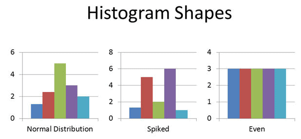
The basic advantage of Histograms is to display a large amount of data graphically that are difficult to interpret in a tabular form. In addition, it shows the process’s central tendency.
How to Make a Box and Whisker Plot?
- Firstly, collect the data
- Secondly, arrange the data points in order and assign categories
- Thirdly, find the lowest and highest value
- Fourthly, find the number of intervals
- You could use 2^k = N where k = # of categories (smallest positive integer) and N = # of data.
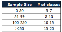
- Now, compute the intervals by covering the entire range of the data set
- Then, find the frequency of occurrence of each data point as per the interval
- Finally, draw the bar chart preserving counts and categories
Example: Following are the 15 student’s marks in a science subject. Compute the Histogram
94,72,78,73,82,42,62,56,85,64,75,66,68,76,58
- Arrange the data in order
42,56,58,62,64,66,68,72,73,75,76,78,82,85,94
- Find the intervals
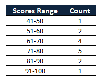
- Finally, draw the bar chart preserving counts and categories
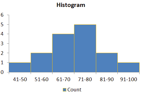
Histogram Excel Template
Benefits of Frequency Plots
- Easy to review lots of data in a graphical manner.
- It provides the shape, center, and range of the data.
- Frequency plots also help to identify where the data is located relative to the process specifications or targets.
- It helps to predict the future performance of the process.
Frequency Plot Videos
When you’re ready, there are a few ways I can help:
First, join 12,000+ other Six Sigma professionals by subscribing to my email newsletter. A short read every Monday to start your work week off correctly. Always free.
* * *
If you’re looking to pass your Six Sigma Green Belt or Black Belt exams, I’d recommend starting with my affordable study guide:
1)→ 🟢Pass Your Six Sigma Green Belt: a study guide organized by the exam Body of Knowledge, 1,000+ practice questions with detailed answer explanations, and 8 full-length mock exams
2)→ ⚫Pass Your Six Sigma Black Belt: the full Black Belt Body of Knowledge, 2,000+ practice questions with detailed answer explanations, and 8 full-length mock exams
You’ve spent so much effort learning Lean Six Sigma. Why leave passing your certification exam up to chance? This comprehensive study guide offers 1,000+ exam-like questions for Green Belts (2,000+ for Black Belts) with full answer walkthroughs, access to instructors, detailed study material, and more.
Thousands have used this system to prepare. Join them here.

Comments (6)
I dont really know what to search
I am trying to find documentation that a 1.4% frequency rate would be considered infrequent. Obviously to a logical mind this seems infrequent but i am not dealing with a logical entity
Lori – could you help provide more context? If you are talking about the output of some process – and by your writing I’m guessing you’re trying to illustrate that a defect / failure rate of 1.4% is infrequent – you could benchmark it against something else?
For example, based on external sources (like news), one might feel that gun related homicide is frequent (not saying it is or not, just an example.) But when charted vs other forms of preventable death (heart disease, etc), it is relatively infrequent.
Sometimes when you’re working with an irrational entity emotion-based appeals backed by science can help win the day rather than pure logic.
Are the Q1, Q3 values shown correct?
Yes Richard, we even cross-check with the ASQ template.
Thanks
Dear Ted,
I want to ask a question by referring to the template of the box and whisker plot:
My logic understands that; in the Q1 calculation, 0.25 was added in the formula considering Q1 corresponds to 25% of the data value and subsequently Q3 has 0.75 in the calculation with the same logic. Is it correct understanding?
But when it comes to whisker plot calculation, I couldn’t understand why 1.5 is added to the formula.
Could you please clarify for me?
Thanks, Eda
Dear Eda,
Thank you for your thoughtful question about box and whisker plots.
You’re right about how quartiles work: Q1 marks the 25th percentile and Q3 the 75th. These values help divide your data into four equal parts and give a quick view of the data’s spread.
As for the 1.5 in the whisker formula, that’s used to spot outliers. Any point more than 1.5 times the interquartile range (IQR) below Q1 or above Q3 is flagged as an outlier. The IQR is just the difference between Q3 and Q1 and shows the range of the middle 50% of your data.
This 1.5×IQR rule is a standard way to catch values that are far from the norm without overreacting to small variations. It’s widely used, especially when you don’t know the exact shape of your data distribution.
If you’d like to dive deeper, this link is a great resource: Identifying outliers with the 1.5×IQR rule.