The 7M Tools/ 7 Management Tools are used for qualitative data analysis, planning, and managing operations effectively. The basic purpose of the 7M tools is to guide managers in planning, analyzing, and decision-making.
The 7M tools belong to Operation Research and Japan’s Total Quality Management philosophy. The formal research on seven management tools started in 1972, often called seven new QC tools.
The 7M Tools/7 Management tools are an important Six Sigma family of analytical tools that include:
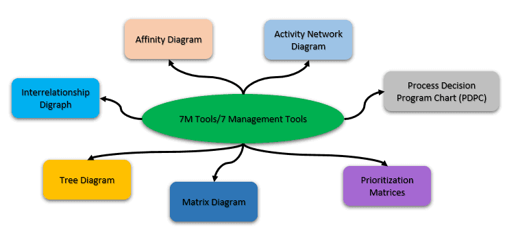
Different individuals invented parts of the 7M Tools/ 7 Management tools for various purposes. These tools were organized and combined over time to achieve efficient planning and decision-making.
Why 7M Tools/ 7 Management Tools?
- Total Quality Control requires not only quantitative data but also qualitative data.
- Voice of the customer (VOC) provides both quantitative and qualitative data. The basic purpose of 7M Tools is to analyze qualitative data and apply suitable methods to develop an improvement plan.
- Each of the 7M tools can be applied in operation research, value engineering, and other fields.
- 7M tools help to plan and manage various management operations effectively.
Affinity Diagrams
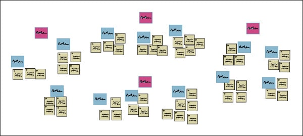
Affinity Diagrams reduce larger processes to a few key steps. Possibly invented by Jiro Kawakita and thus sometimes referred to as the K-J method, an affinity diagram is a good technique for identifying & displaying potential root causes for unfamiliar problems.
The affinity diagram requires the least amount of preliminary knowledge compared to other management tools. Matrix diagrams, prioritization matrices, and activity network diagrams all require significant prior knowledge.
How to Create an Affinity Diagram?
- Gather Ideas- Quietly, individually, the team gathers a bunch of ideas. It could be on Post-it notes or in private survey results. The idea is that no one team member influences the others – as opposed to brainstorming.
- Organize – Now we organize the ideas into large groupings. Group all the ones that sound similar until you get a critical mass.
- Label groupings- Put Affinity titles on the groupings. You have to call them something, right?!
- Create an action plan- Everyone forgets this part! Use the affinities to create workable projects.
Tree Diagrams
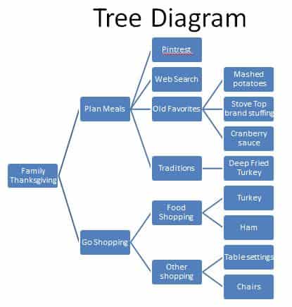
A Tree diagram helps you break down big concepts into progressively detailed units. The idea here is to systematically break down a concept into its constituent pieces.
You would progress from left to right with the highest order items / most important concepts on the left. You would start with the “whys” and progress to the “hows.” Alternately, you would start with the “goals” and progress to the “means” of achieving those goals.
How to create a Tree Diagram?
- Develop a statement about the project or an issue that needs to be resolved. Keep that statement in the left-hand box of the diagram.
- Ask the question “why,” which will lead to the next level of detail. By asking “why,” we categorize the causes that may contribute to the problem or issue.
- Keep these causes on the right side of the problem statement and then link them with a line to the causes.
- Perform necessary and sufficient checks. Repeat the above steps and identify more causes until root causes are identified.
Interrelationship Diagraph
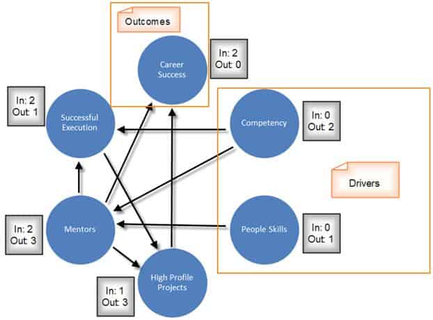
The Interrelationship Digraph is a 7M tool. It often uses inputs from other tools – like a Fishbone Diagram or an Affinity Diagram to define drivers and outcomes in a process. An Interrelationship Digraph helps you see relations and influences between several concepts – even if those concepts are very different. You can also use it to identify critical issues and key drivers of a problem.
How to create an Interrelationship Digraph?
- Draft a Statement – Draft a statement for the Interrelationship Diagraph to explore. Consider using your Problem Statement found from the Project Charter if available. Write the statement on a whiteboard for all participants to see.
- Brainstorm Key Factors – Next, have participants brainstorm key factors related to the statement. Each participant writes their ideas on a card or sticky note. You may gather ideas using the other 7M tools if created in advance.
- Categorize the Information – Once participants have finished brainstorming, place one idea on the work surface and determine the relationships between the other ideas. Be sure to plot similar ideas in the same vicinity. Repeat till all ideas are on the board.
- Analyze the Diagram – Ask the team, “How does this idea influence the other ideas?” Draw arrows from each idea to the one it influences. Ideas that have arrows going out from them are causes or X factors. Ideas that have arrows coming to them are effects or Ys. Consider writing an explanation alongside the arrows to validate connections.
- Count the Arrows – Last, count the arrows pointing to and from each idea and record the totals. The ideas with the highest arrow counts deserve special attention.
Process Decision Program Charts (PDPC)
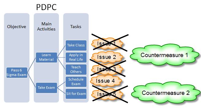
Process Decision Program Charts (PDPC) have two main uses: documents steps to completing a process and impact analysis. PDPC does this by systematically exploring a process and what could go wrong. This is a helpful project management tool in the Improve phase of DMAIC, before implementing your plan. However, I find it helpful in the analysis phase after process mapping to check my understanding of the current state.
How to Create a Process Decision Program Chart
- First, you start with a tree diagram of your process – Put your objectives on the first level, main activities on the second level, and the tasks on the 3rd level.
- Then, you brainstorm issues that could occur while performing those tasks.
- Cross off issues that are unlikely to happen.
- Identify countermeasures for the likeliest issues.
Matrix diagrams
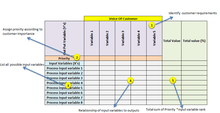
A Cause and effect matrix is a Six Sigma tool that is used to prioritize the key process input variables (KPIVs) based on the priorities of customer outputs (KPOVs). In other words, it establishes the correlation between the process input variables to the customer’s outputs during root cause analysis.
Cause and effect analysis, process flow map, and information about the voice of the customer are the prerequisites for the cause and effect matrix.
How to create a Cause and Effect Matrix?
- First, identify the customer requirements, or in other words, understand the voice of the customer. This can be collected by conducting surveys, organizing focus groups, and through many other means. Place those priorities at the top of the X-Y diagram.
- Assign a priority factor for each of the customer outputs. Generally, use a 1-10 scale, with 1 being the low priority and 10 being the high priority to the customer.
- List all the possible key input variables or the improvement factors of the process in each row. Those are the Xs in the X-Y diagram.
- Assess the relationship between key input variables and the customer outputs and rank each input variable accordingly. I recommend using a geometric progression scale (0,1,3 and 9), with 0 being no impact, 1-low impact, three medium impact, and 9- strong impact or correlation on output.
- Cross-multiply the customer output priority numbers with correlation rankings and sum each row at the extreme right column.
- Finally, determine the rank based on the highest total and highlight the critical few variables. This will help to identify the areas for improvement.
Prioritization matrices
A project priority matrix – also known as a prioritization matrix – can help you to work out and negotiate priorities for a project. It can also be used to prioritize projects themselves, although opinions are mixed on whether this usage is a good idea.
How to create a prioritization matrix
This is a very simple tool, but it requires good information to get good results. You should create this matrix before you start to develop a roadmap for the project.
- Gather your project’s stakeholders.
- Explain the concepts involved.
- Talk about what you all want the project to achieve.
- Come to a consensus on which factors to constrain, accept, and enhance.
- Draw up the matrix.
- Base your roadmap development on this matrix.

Activity Network diagram
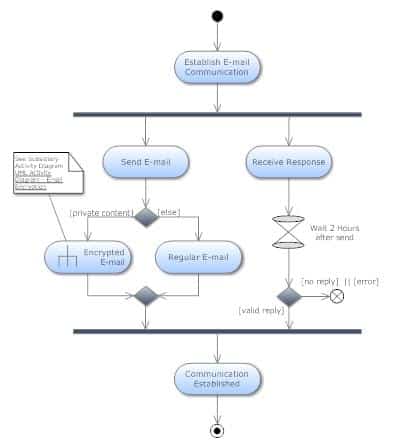
An Activity Network diagram is a 7M tool that graphically depicts your project timeline. You can gather great information on how to manage your project by mapping out tasks in order of occurrence and labeling each with the best, worst, and average case times it takes to complete them by incorporating PERT and CPM techniques into a flowchart.
How to make an Activity Network Diagram
Activity Network Diagrams help manage the development of projects – especially for organizations that have listed activities performed at a particular time.
- List all of the tasks in the project – The first thing you have to do is gather the list of the complete tasks of the organization that are required to complete the proposed project.
- Put them in chronological order- Have them arranged in chronological order- that is, according to the order of the execution of each task. If tasks can be executed simultaneously, draw them in parallel.
- Label Optimistic, Pessimistic, and Most Likely times
- Most-likely time. The time that you will likely need to complete the project.
- Most optimistic time. The shortest amount of time to complete the task.
- Most pessimistic time. The longest amount of time to complete the task.
- Calculate the Critical Path -The Critical Path is the longest time throughout the project executing tasks in the necessary order. This is important because the project will never be completed quicker than the critical path.
- Review and look for Efficiencies – Look for ways to shorten your critical path. Re-evaluate the task dependencies.
Difference between Basic 7 QC Tools and 7M Tools
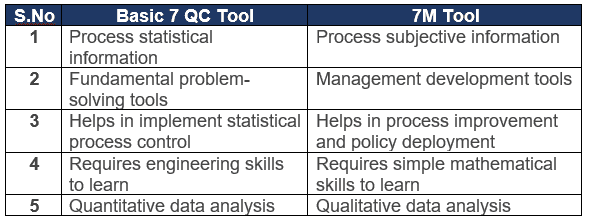
The basic 7 QC tools (scatter diagram, check sheet, flow chart, histogram, cause and effect diagram, Pareto chart, and control chart) are used for data collection and quantitative analysis. In contrast, the 7M tools are used for qualitative data analysis, which helps in planning and identifying problem solutions.
7M Tools/ 7 Management Tools Video
When you’re ready, there are a few ways I can help:
First, join 30,000+ other Six Sigma professionals by subscribing to my email newsletter. A short read every Monday to start your work week off correctly. Always free.
—
If you’re looking to pass your Six Sigma Green Belt or Black Belt exams, I’d recommend starting with my affordable study guide:
1)→ 🟢Pass Your Six Sigma Green Belt
2)→ ⚫Pass Your Six Sigma Black Belt
You’ve spent so much effort learning Lean Six Sigma. Why leave passing your certification exam up to chance? This comprehensive study guide offers 1,000+ exam-like questions for Green Belts (2,000+ for Black Belts) with full answer walkthroughs, access to instructors, detailed study material, and more.


Comments (6)
The concepts are well explained with minimal fuss. Many thanks.
Thank you for the kind words, Sumant.
Crisp and to-the-point explanation. Easy to understand.
Thank you for the kind words, Mahantesh!
Very clear and easy to understand.
What suitable tools can be use to improve mixed product. Can advice few
Hi Rozy,
Thank you for the compliment. What do you mean by a mixed product?
Best, Ted.