The Pareto Chart (Pareto Diagram) is a graphical tool to map and grade business process problems from the most recurrent to the least frequent. In other words, this helps to identify the most frequently occurring problems or separate the vital few from the trivial many.
Vilfredo Pareto, an Italian economist who discovered that 80% of Italy’s wealth was owned by 20% of the population, invented the Pareto Chart to depict these findings. Hence, this Analysis is also known as the 80/20 rule.
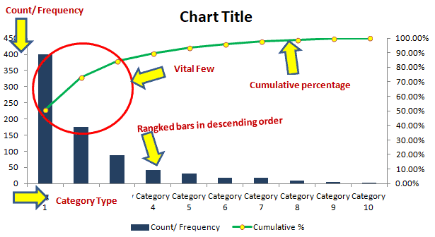
The Pareto Chart is a combination of both the bar chart and the line chart. The bar chart shows the frequency of occurrence or defects, whereas the line graph displays the cumulative data percentage in descending order.
A Pareto Chart (also known as a Pareto Diagram) is a bar chart that re-orders the categories, ranking them from the most significant total occurrences to the smallest.
In Process Analysis, this helps identify the most frequently occurring problems or defects – or separate the vital few from the useful many.
The correct ranking for the Pareto chart categories is from left to right; likewise, you can think of it as highest to lowest.
When You Should Use a Pareto Chart (Pareto Diagram)
- See Pareto Analysis for a fuller discussion.
- When analyzing the frequency of root cause data and focusing on the most significant contributors (the vital few).
- When wanting to understand a broad cause by looking at the component pieces.
- When you need an effective way to share a lot of information quickly.
How to Make a Pareto Chart (Pareto Diagram)
How to Construct a Pareto Chart
The primary purpose of the Pareto chart is to identify the most frequent defects and errors, which can then be counted and categorized. Below are the steps to create a Pareto chart using the Pareto Analysis.
- Determine the categories you wish to monitor, though be sure to pick one that impacts the business.
- Establish a measurement system, and also essential to use the same measure for all contributors.
- Determine the timeline that data covers for the Pareto for all the categories.
- Collect data for all the categories in two columns, categories (example: type of defects) in the first column and corresponding frequency (total count of each defect category) in the second column.
- Draw a bar graph with categories (for example, type of defects) on the x-axis and frequency on the y-axis.
- Re-order the categories in descending order (from largest to smallest categories).
- Then, calculate the cumulative percentage of each category in descending order, i.e., Individual defect count/ total defects count *100.
- Draw another vertical axis on the right side of the graph with values from 0 to 100%.
- Plot the cumulative percentage of each category on the x-axis.
- Now, join all the points, and it will form a curve.
- Analyze the graph. Identify the top 80% on the Y-axis. This point on the x-axis divides the vital few defects (left side) and many trivial defects on the right side.
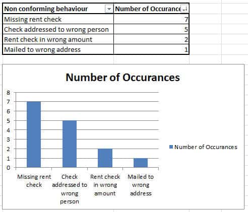
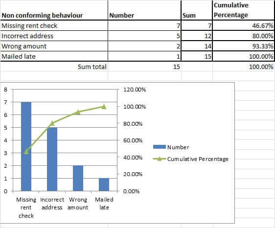
Example of a Pareto Chart in the DMAIC Process
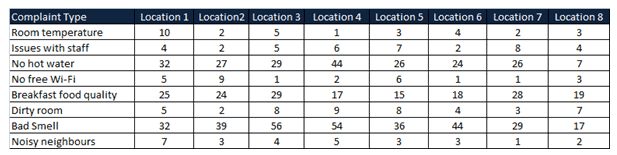
Example: A XYZ group runs franchised hotels across the USA. In this case, the hotel management collected customer stay experiences from the top eight revenue-generated locations via an online survey. The team then analyzed the results using Pareto analysis.
The following are the results from eight locations:
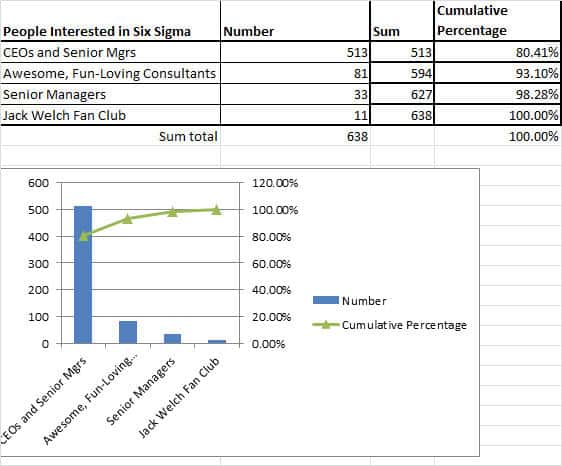
How to Make a Pareto Chart in Excel
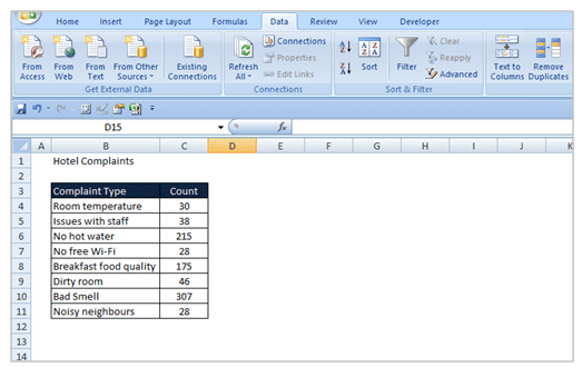
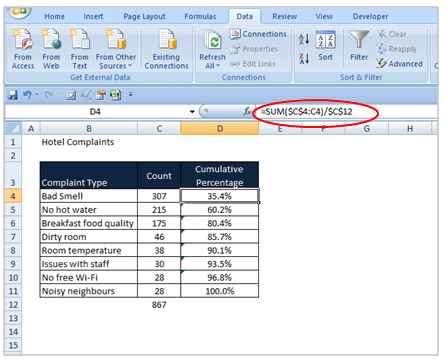
Step 1: Write “Complaint Type” in cell B3 and “Count” in cell C3. Below them, enter all the customer complaint categories and enter their respective total count in column C.
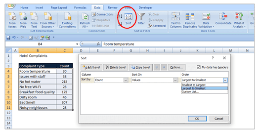
Step 2: Select the whole range (including titles). Go to Data ==> select sort and ensure that “My list has header row” is checked. In “Sort By” select “Count” and in the “Order” drop-down, select “Largest to Smallest”, then click on “Ok.” Now, it will sort the count in descending order.
Step 3: Add the total categories count in cell C12. Then, add the “Cumulative percentage” column next to the Count column and calculate the cumulative percentage as shown as per the formula in the D4 cell. Drag D4 below rows to apply the same formula for all the categories.
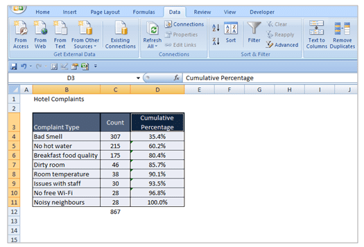
Step 4: Again, select complaint type, count, and cumulative percentage columns, including titles.
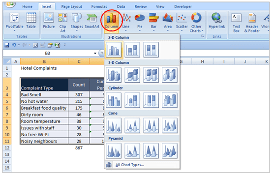
Step 5: Go to Insert ==> Chart. Make sure that “Column” is selected as the chart type, and then select the “Clustered column” chart from the 2-D Column chart.
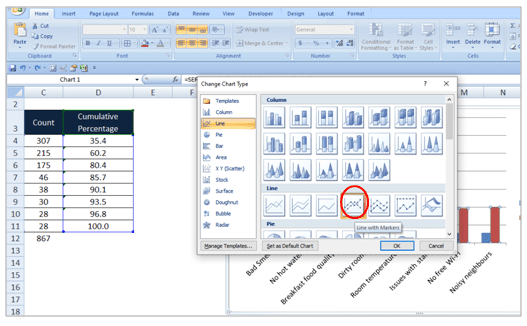
Step 6: Then, click on the cumulative percentage bar graph from the two bar graphs and right-click on it ==>select “change series chart type.”
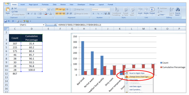
Step 7: On the “Change Chart Type” ==> Choose “Line with a marker” chart under Line type and then click on “ok.”
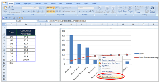
Step 8: Select the line graph and right-click on it ==> select “Format data series.”
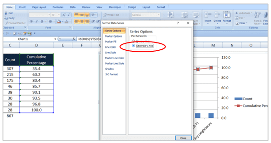
Step 9: Under “Series Option” ==>select the “Secondary Axis” radio button. Also, right-click on the secondary axis ==>select “Format Axis.” Under “Axis Options,” change the “Maximum” option to “Fixed” and then enter the value as 100.
Step 10: Add titles on the chart and also include axis labels. Analyze the data and identify top customer complaints. In other words, use the Pareto Analysis to find 80% of the customer complaints.
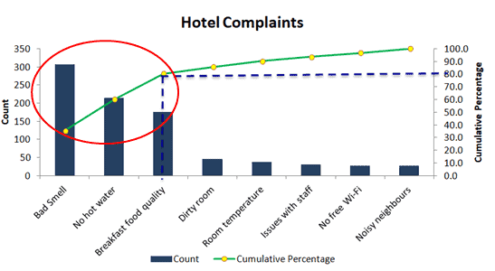
Interpret the Pareto graph:
The above diagram shows that the top three categories (bad smell, no hot water, and breakfast food quality) contribute to 80% of customer complaints.
Pareto Chart (Pareto Diagram) Example
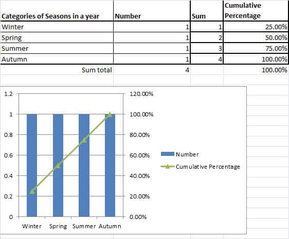
It can be easily created by tallying a check sheet, making a bar chart out of it, and re-ordering it.
Pareto Chart Template Download
Pareto Analysis
Pareto Analysis is a way of looking for the most common contributing causes to a situation to identify the biggest drivers of your process and appropriately prioritize your actions. Accordingly, using a Pareto chart to perform a graphical analysis of your data can help you achieve this goal.
Analysis with the Pareto Principle
Often called the 80-20 rule, the Pareto Principle is a common ‘rule of thumb’ that states that 80% of the effects of something can be attributed to 20% of the drivers.
Pareto Analysis Principle Example:
- Profits – In this case, many businesses discover that 80% of their profits are driven by 20% of their products. Thus, it makes sense for them to focus on that 20% of those customers because that gives them the best chance to drive profits.
- Errors – Occasionally, one aspect of your process delivers 80% of your errors. If you fix that one process, then you can achieve outsized results.
What if your data doesn’t show an 80-20 split?
Don’t worry. This happens all of the time in the real world.
Analyzing Multiple Groups in a Pareto Chart
Sometimes, you must add a few main items to make up 80% of the data. This is a good strategy if you have one or two main drivers like so:
If you have two or three main drivers, then you can decide if you want to work on all of them or just one. You might decide that for your current project, it makes sense to work on just one and lock in the savings with that improvement. Then you can attack the others after you have that win. Reducing your project’s scope is often a good strategy for when you have a short timeline.
However, at other times, it might be expensive to fix the root cause of an issue. In that case, I’d recommend creating a cost-benefit analysis to see if your project can generate the savings necessary to make doing the fix worth it. If it is, great! If not, you might see if you can either change your process to avoid the situation or focus on the other items.
What if the Pareto Chart Is Flat? (Or, what if nothing pops on the chart?)
Sometimes, the chart doesn’t show one item or even a few items as outsized drivers in a process. Sometimes, there is very little to distinguish one group from another.
This usually indicates that the variable you are investigating isn’t the right driver for the relationship. Try different categorizations or different data attributes in your analysis.
What to do when the ‘Other’ or ‘NA’ category is the biggest
This is a huge pet peeve of mine. Sometimes, people will not label their data correctly or at all. Then, when you make a Pareto chart, the other category, or NA, is the biggest one on the chart.
This reflects a lack of data. The only course of action is to go back and correctly label your data.
Pareto Analysis Example: 80% of defects as other.
Let’s say that a software development agency was mapping out the root causes of bugs in their software. Some bugs were found to be errors in the data, others in the user interface code, and others were missing requirements. But, in their error tracking software, people did not select the right root cause, and the system defaulted to ‘other.’
When the team tries to make process improvements, they are faced with a graph that looks like this:
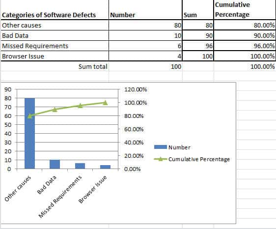
Sure, the three categories are represented, but the ‘other’ category dwarfs them.
It makes no sense to ignore the ‘other’ category. It’s just too big.
The only appropriate thing to do is to go through each tracked bug and update the status to the appropriate category.
Have you performed a Pareto analysis? What patterns have you seen?
Also, see Problem Identification. Pareto in daily lives, Solomon’s Pareto
Benefits of Pareto Chart
- The Pareto chart offers a visually effective means of conveying issues to various stakeholders.
- Pareto charts distinguish between the “vital few” and the “trivial many.”
- It helps in prioritize issue or problems by showing which ones have the most significant impact.
- Aid in root cause analysis by identifying the main factors contributing to the problems.
- Organizations can use Pareto charts to analyze historical data, helping to identify recurring issues.
- By focusing efforts on the most critical areas, Pareto charts help save time and resources that might be wasted on less impactful issues.
- Pareto charts facilitate data-driven decision-making through the clear and concise presentation of data, facilitating a better understanding of the situation.
Pareto Chart (Pareto Diagram) Videos
Six Sigma Green Belt Pareto Chart (Pareto Diagram) Questions
Question: When in the process of trying to identify the Critical X’s for an LSS project, a Belt creates a(n) _____________ because frequently, it is 20% of the inputs that have an 80% impact on the output.
(A) Pareto Chart
(B) FMEA
(C) Np Chart
(D) X-Y Diagram
Answer:
Question: Which of the following tools can be used to identify and quantify the source of a problem?
(A) Affinity diagram
(B) Control chart
(C) Pareto chart
(D) Quality function deployment
Answer:
When you’re ready, there are a few ways I can help:
First, join 30,000+ other Six Sigma professionals by subscribing to my email newsletter. A short read every Monday to start your work week off correctly. Always free.
—
If you’re looking to pass your Six Sigma Green Belt or Black Belt exams, I’d recommend starting with my affordable study guide:
1)→ 🟢Pass Your Six Sigma Green Belt
2)→ ⚫Pass Your Six Sigma Black Belt
You’ve spent so much effort learning Lean Six Sigma. Why leave passing your certification exam up to chance? This comprehensive study guide offers 1,000+ exam-like questions for Green Belts (2,000+ for Black Belts) with full answer walkthroughs, access to instructors, detailed study material, and more.

Comments (13)
What does a Pareto chart tells us?
A pareto chart tells us those occurances that make up 80% of the cumulative total which are the “significant many” to focus on identifying root cause.
Great reply! Thanks for taking the time to answer!!
A bar graph representation of a frequency distribution is commonly referred to as what?
A bar graph is commonly referred to as a histogram
What should a well constructed histogram reveal to you?
A well constructed histogram should tell you categories that make up the total of all occurances and the rank order of those categories.
Hello Ted,
Thanks for the post. Just wondering myself, why 80-20 and not 70-30 for instance? I see it is useful to prioritize and also to detect we’re not addressing the right attributes, but why these numbers, may it come from observation in nature, experimental?
All the best,
Ignacio
Good question, Ignacio.
Here’s a quote that I found on the history:
Attribution for quote.
This is a great way to visualize how many different tasks are being done.
Agreed. The Pareto chart is one of the best visual analysis tools out there.
This is a great overview of Pareto Charts! I appreciate how you explained their importance in identifying the most significant factors in a dataset. The examples you provided really helped clarify the concept. I’ll definitely be using this tool in my upcoming projects!
Glad it was helpful! Would love to hear about how you are applying in your projects.