As Jeremy has stated in our previous post (“How the Pareto Principle Can Give Us All the Wisdom of Solomon”), the Pareto principle has been used for many years, whether implicitly or explicitly. In that post, we showed how Solomon and others could have (and probably did) use the Pareto principle to make many of their decisions. Although this post focuses on current applications in our daily lives, it is important to begin with a couple of very brief technical points.
Returning to more recent history, we find Vilfredo Pareto observing the 80-20 principle in 1906 and publishing it in 1909. This 80-20 principle was later generalized and renamed the “Pareto principle” by Joseph M. Juran. In 1905, Max O. Lorenz came up with the Lorenz Curve, which is basically a graphical visualization of the Pareto principle, which was first used to show the distribution of the concentration of wealth. (Publications of the American Statistical Association, Vol. 9, No. 70). In 1920, the two principles were pulled together by Dalton. In 1992, Joseph Persky wrote a great article about this in The Journal of Economic Perspectives.
Goldratt pointed out that when a Pareto chart is created, we often create columns for options or problems (or causes of problems) that are linked. For example, in the previous charts, “increasing military spending” was needed by David and Solomon in order to secure an important copper mine just beyond the southeast corner of the Dead Sea, but having more copper mining was needed in order to lower the cost of equipping an army as well as for boosting the economy.
Goldratt explained that in these situations, squaring each contributor produces :
- a chart that is easier to read and
- more closely follows the mathematics used in statistics (such as ANOVA analysis and r2 that rely on the “sum of squares”).
Once each column is squared, a new 99-1 principle should be used instead of the 80-20 principle. Doing so produces the following enhanced Pareto Chart for King Solomon’s options. For further reading on the 99-1 rule and these “enhanced” charts, we recommend Dr. Lisa Lang’s website: http://drlisamaxprofit.blogspot.nl/2007/04/991-rule-vs-8020-rule.html and George’s own site http://www.tomm.nl/theory-of-constraints/ which contains a video of Dr. Goldratt.)
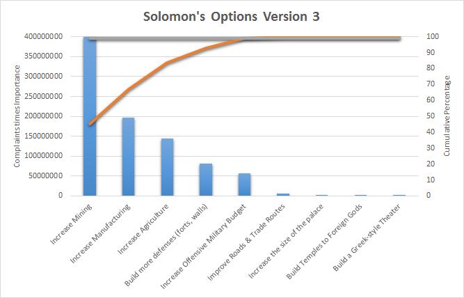
In this enhanced Pareto chart, “increasing mining” really stands out as the most important item, but “increasing the offensive military budget,” which is linked to mining, remains within the “critical few.”
As previously stated, these techniques are not simply for the past. High-quality decision-making is the heart of all project management systems. “Managing Successful Programmes (MSP)” is one such system. Its effectiveness is what convinced the British government to use this system (containing Pareto charts) as they planned and operated the 2012 Olympic Games in London. The Project Management Institute (PMI) also recommends using Pareto charts and requires knowledge of them as part of their certifications. Pareto charts are also part of the body of knowledge for ASQ’s and IASSC’s Six Sigma Certifications.
One point that was not brought up earlier is that when the Design of Experiments is possible (such as when optimizing control variables in a chemical factory), the multi-ANOVA analysis results can be directly used as the weighting factors. In situations like these, quality engineers and operations analysts do not have to estimate the importance or impact of a particular factor.
Let’s leave the theoretical history lesson and certification requirements – a lot has been written about these subjects. Wikipedia, www.pmi.org, https://www.axelos.com/, www.asq.org, www.opensourcesixsigma.com, and www.sixsigmastudyguide.com are some excellent sources for continued reading on these topics.
But, Pareto in daily life – now that should be interesting!
While brainstorming with Jeremy about this subject, I came up with some areas in business where the Pareto principle and chart are (and should) be used. I also thought of a fun non-business example!
For entrepreneurs, let’s start with a basic question. What do our customers value? Let’s build a questionnaire of about ten pointers that we think our customers might value about our company. Now, let’s send it out and see what we receive back. I’m confident that if the pointers are realistic and the number of respondents is large enough, there will be three-pointers that will stand out (matching the 80-20 principle). This can be a great way to refine and grow the positive aspects of a business image or to find areas for improvement. (For Six Sigma insiders, this is also known as the big Y that’s under hypothesis in the Define phase of DMAIC.)
For managers, why are my key performance indicators (KPIs) under pressure? This could be a tricky one. If we find that the reasons for the low performance are interconnected, we’ll also have to look at the 99-1 rule. If that happens (which is highly probable), then we need to:
- Carefully drill down to root causes and
- Use the “enhanced Pareto chart” methods described above.
In spite of that apparent difficulty, this is the area in which the Pareto charts are most needed and useful! This is true for many reasons, but the biggest is our inability to fix everything – decisions must be made to fit both the current budget and time constraints. This is also where most mistakes are made. As Jeremy has pointed out, we must carefully balance “long-term” and “short-term” solutions. Often, the current reality seems to be the worst we can imagine, so we try to use most of our resources to fix the NOW problems. Looking back over the past decade, many managers would’ve made different choices if they could’ve seen further over the horizon.
If you are a team leader or a coach, you might ask, “Which skills should be developed or enhanced within my group of employees?” You could begin by making an index of the skills your team needs and then determining the current skill levels for each of those skills (either for individual employees or the team as a whole). Then, comparing those levels to the desired levels would create a quick and easy Pareto chart showing where to focus employee training. (Note from Jeremy: I believe this is what my supervisors did at the end of last year when they designed this year’s faculty development days and when they selected which technologies to focus on during our technology training days. They began with a technology self-assessment survey.)
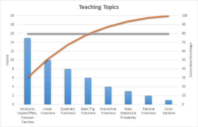
Following these lines, I asked Jeremy how his teaching philosophy had changed due to the new government teaching standards he had to follow. He explained that the new standards emphasize how mathematical functions relate to each other and how changing one small number in a function changes the resulting graph. He also explained that some topics (such as basic trigonometry) appear to be of low importance in his particular course’s standards but are, in fact, very important due to the high number of real-life problems that involve basic triangles. When I pushed him further, he explained that after discovering these ideas, he met with a coworker, and after their meeting, they used their new insights to rearrange the mathematics topics into a new order that neither of them had used before. Below is a Pareto chart showing the information that made him a better math teacher.
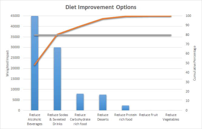
The following improved chart was created using weighting factors based on “how bad” a type of food is for a person. It clearly shows that removing alcoholic beverages (even just a few) is the most important place to begin, followed by sodas and sweetened beverages. Limiting greasy and starch-filled foods (like pizza) is still important, but it is no longer at the top of the chart.
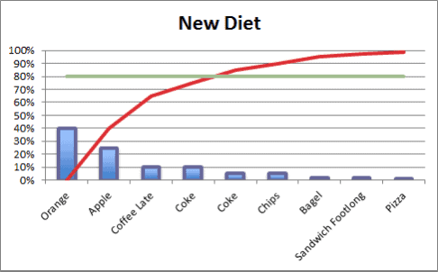
But Pareto charts do not have to be as technical as this! They can be FUN! Here’s a quick and fun one for people who want to lose weight. Simply eat 20% of your “regular food” and 80% of what currently makes up only 20% of your diet. For most people, this would mean that the pizza ratio would go from 1 every other night to 1 every other month. The same thing could happen with apples; switch from 1 every other week to two per day. I am sure this kind of diet switch will have a dramatic effect!
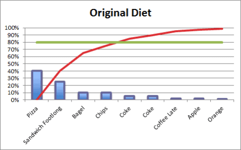
Please note that we are not recommending that coffee and coke each be 10% of a person’s diet – a balanced diet is important – but as the diagram shows, decreasing pizza and increasing fruit is good for a person’s health and makes for a great graph! In the Netherlands, I know of people who almost completely stopped eating things like meat and bread and drinking milk. Also, they stopped eating products that contained sugar. Aside from some “superfoods,” such as nuts and coconut products, they actually made the switch using the Pareto principle.
As shown here, Pareto charts can be a very powerful tool in any important decision-making process, and they can even be fun and easy! We (Jeremy and George) have shared many of our ideas with you, but we would love to hear more about your ideas and stories. Perhaps you used a Pareto chart to decide how to spend your money. When building (or remodeling) a house, perhaps you used one to decide which features to include and/or how many square feet to include in different home parts. Your thoughts, comments, stories, and ideas would benefit us all, please share and please feel free to ask either of us questions.
About the authors:
George Dekker is first and foremost a TOC evangelist, Lean enthusiast and lover of the human mind. He is an IASSC-certified Lean Six Sigma Black Belt. He also has TOCICO certificates covering many aspects of the Theory of Constraints (specifically DBR, TA, CCPM, and Thinking Processes). Following the footsteps of Eli Goldratt, he asks the questions that make you think. His recent articles were “Walls of Distrust, Apathy and Politics Are Signs of a Good Company”, “Resistance to Change Is Good” and “Is Efficiency Enemy Number one?” These and other powerful articles are available on his webpage at http://www.tomm.nl/articles.
Jeremy Garret is the author or co-author of several original posts in this series and a proponent of using quality assurance tools in new fields, especially in the education industry. He has a master’s degree in curriculum and instruction (with specializations in integrative STEM education and engineering design). He holds a second master’s degree in applied physics from Virginia Tech. He is also an ASQ-certified Quality Process Analyst. He is currently a mathematics teacher in the state of Alabama (in the USA).
When you’re ready, there are a few ways I can help:
First, join 30,000+ other Six Sigma professionals by subscribing to my email newsletter. A short read every Monday to start your work week off correctly. Always free.
—
If you’re looking to pass your Six Sigma Green Belt or Black Belt exams, I’d recommend starting with my affordable study guide:
1)→ 🟢Pass Your Six Sigma Green Belt
2)→ ⚫Pass Your Six Sigma Black Belt
You’ve spent so much effort learning Lean Six Sigma. Why leave passing your certification exam up to chance? This comprehensive study guide offers 1,000+ exam-like questions for Green Belts (2,000+ for Black Belts) with full answer walkthroughs, access to instructors, detailed study material, and more.


Comments (4)
sir,
you have given a good information
Anand, thank you sir.
how can i use or apply pareto principles in my daily life routine and in macro operations
In our daily lives, we can and should use this in many ways.
For example, when considering which of several repairs or upgrades to complete on a used car one should consider the price of the repair, the amount of improvement in the performance, reliability, and appearance that the repair or upgrade will produce. I once met someone who spent $300 on replacing a sensor that made the low fuel light come on. Since this light was a reminder of what was already/still indicated by the fuel level gauge, the amount of gain was very small. That same $300 would have paid for a cheap, but usable set of new tires for that same vehicle. The cost was the same, but the gains were very different. Even without making a chart, the underlying concept of the Pareto Chart / decision making process would have helped this friend “get the most for his money.”
I am not certain what you mean by “macro operations” in this context. If you tell me more about what you wish to know, I will try to help.