A Scatter Diagram shows a relationship between two variables and provides a visual correlation coefficient.
Why You Would Use Scatter Analysis and Scatter Plots
A Scatter Analysis is used when you need to compare two data sets against each other to see if there is a relationship. Scatter plots are a way of visualizing the relationship; by plotting the data points, you get a scattering of points on a graph. The analysis comes in when trying to discern what kind of pattern (if any) is present and what that pattern means.
We are talking about this kind of analysis when we are trying to get at the root cause of an issue.
Scatter Diagrams show the “cause-and-effect” relationship between two kinds of data and provide useful information about a production process.
Specific instances of when to utilize scatter diagrams:
- Pairs of numerical figures are present.
- Dependent variables have multiple values for each figure associated with the independent variable.
- Defining if there is a relationship between two variables.
What Kind of Data Should You Use for Scatter Analysis?
Scatter analysis generally makes use of continuous data. (See notes on the different data types here.)
Discrete data is best at pass/ fail measurements. Continuous data lets you measure things deeply on an infinite set and is generally make use in scatter analysis.
You could use discrete data on one scatter plot axis and continuous data on the other. For the discrete data, you’d have to put it into some kind of quantified band–like say 1-10 on a customer satisfaction score.
I suppose you also *could* put discrete data that comes out like pass/fail as one of two bands, but it would depend on whether or not you got any useful information out of the data.
The best bet is continuous data.
If you are looking for a way to do a graphical analysis of discrete data, you might try attribute charts.
Scatter Plots and Correlation
Scatter plots only show correlation. They do not prove causation. The example often used is shark attacks and ice cream sales. The two may be correlated, but ice cream does not cause shark attacks, the heat of the day does. In other words, more people are in the water on hot days when shark attacks occur, and more people are buying ice cream.
How to Make a Scatter Diagram:
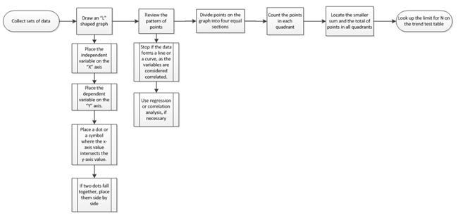
- Collect sets of data where a relationship is present.
- Draw a graph in the shape of an “L,” and make the scale even multiples (i.e., 10, 20).
- Place the independent variable on the horizontal (X) axis.
- Place the dependent variable on the vertical (Y) axis.
- Place a dot or a symbol where the x-axis value intersects the y-axis value.
- If two dots fall together, place them side by side so they are touching and both are visible.
- Review the pattern of points to determine if a relationship is present:
- Stop if the data forms a line or a curve, as the variables are considered correlated.
- Use regression or correlation analysis, if necessary. If regression or correlation analysis is not needed, complete steps four through seven below.
- Divide points on the graph into four equal sections. If X points are present on the graph:
- Count X/2 points from top to bottom and draw a horizontal line.
- Count X/2 points from left to right and draw a vertical line.
- If the number of points is odd, draw a line through the middle point.
- Count the points in each quadrant.
NOTE: Do not count points on a line.
- Locate the smaller sum and the total of points in all quadrants, and add the diagonally opposite quadrants:
A = points in upper left + points in lower right
B = points in upper right + points in lower left
Q = the smaller of A and B
N = A + B
- Look up the limit for N on the trend test table:
- If Q is less than the limit, the two variables are related.
- If Q is greater than or equal to the limit, the pattern may have originated from random chance.
Benefits of Scatter Diagram
- Scatter diagrams visually represent data points, making it easy to understand the relationship between two variables.
- The patterns, trends, or correlations in a scatter plot is valuable for decision-making
- Scatter plots can reveal clusters or groups within the data.
- Easy to identify the outliers, or data points using scatter diagrams.
- Help in identifying potential cause-and-effect relationships between variables, supporting root cause analysis.
- In manufacturing, scatter diagrams are generally used to assess whether a process is in control or needs improvement.
- Scatter diagrams are used to make predictions or forecasts based on observed data trends.
Scatter Plot Videos
What Is a Scatter Band?
A scatter band is a useful tool in Six Sigma to show how data points disperse around a central trend, typically a regression line. This helps visualize the relationship between variables and identify the variability in a process.
For example, here’s a scatter diagram with a regression line and a scatter band to illustrate process variation:
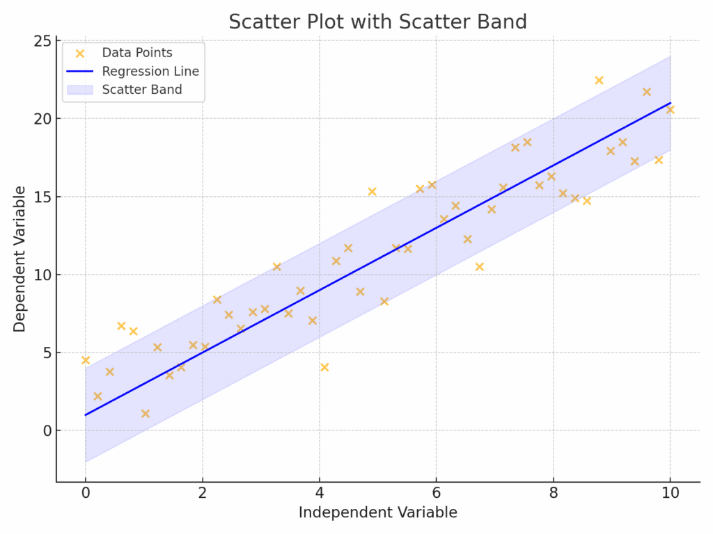
The shaded region (scatter band) reveals the spread of data around the trend line, helping practitioners understand whether the relationship between variables is consistent or erratic.
When you’re ready, there are a few ways I can help:
First, join 30,000+ other Six Sigma professionals by subscribing to my email newsletter. A short read every Monday to start your work week off correctly. Always free.
—
If you’re looking to pass your Six Sigma Green Belt or Black Belt exams, I’d recommend starting with my affordable study guide:
1)→ 🟢Pass Your Six Sigma Green Belt
2)→ ⚫Pass Your Six Sigma Black Belt
You’ve spent so much effort learning Lean Six Sigma. Why leave passing your certification exam up to chance? This comprehensive study guide offers 1,000+ exam-like questions for Green Belts (2,000+ for Black Belts) with full answer walkthroughs, access to instructors, detailed study material, and more.

Comments (10)
what data does scatter analysis uses, is it discreet data
Scatter analysis typically uses continuous data, not discrete data. That’s because it’s designed to show how two variables move in relation to each other (eg temperature vs. pressure, or speed vs. fuel consumption), where you can have many possible values along a range.
That said, you can use discrete data on one axis if you group it into numerical bands. For example, you could plot a customer satisfaction score (1–10) against response time. But if your data is purely binary (like pass/fail), a scatter plot might not be very useful — in that case, tools like attribute charts or bar graphs would be a better fit.
So in short:
-Best for continuous data
-Can use some discrete data if grouped-Not ideal for true yes/no or categorical data
On an linear pattern, Q will be mostly equal to greater than N.
Then these variables have some relation right.
Please explain “If Q is less than the limit, the two variables are related.
If Q is greater than or equal to the limit, the pattern may have originated from random chance.
Great question! This part can definitely be confusing at first.
Actually, if Q is large (close to or greater than N/2), that usually means the data points are evenly spread across the quadrants, which suggests the relationship might be due to random chance — not a strong directional trend.
On the other hand, if Q is small (less than the value in the trend test table), that shows the points are clustered along a diagonal, indicating a potential correlation between the two variables.
So in short:
Small Q → possible correlation
Large Q → likely random
The reason behind this is that when two variables have a strong relationship, most points will fall along one diagonal (either top-left to bottom-right or bottom-left to top-right), and the opposite diagonal will have fewer points. That imbalance is what the trend test is looking for.
Hope that clears it up!
Best, Ted
can you please give me a example on mechanical domain…
I can try. Could you provide an example?
i dont konw how to choose example for scatter plot in mechanical ….thats why im asking
Let’s say you’re working in a factory where you produce metal rods, and you want to understand if the temperature of the machine affects the length of the rods produced.
You could collect data like this:
X-axis (independent variable): Machine temperature (°C)
Y-axis (dependent variable): Rod length (mm)
Now, you create a scatter plot with this data. If you see that as temperature increases, rod length also increases (or decreases) in a consistent way, then there may be a correlation — and possibly even a root cause worth investigating.
This kind of analysis is useful in mechanical systems for understanding the relationships between machine settings and product quality.
Hope this helps spark some ideas!
can you give me an example that drawing a scatter band
much thanks
Not a problem, Mustafa.
I’ve updated the article above to include information on a Scatter Band.