The main effects plot is the simplest graphical tool used to determine the relative impact of a variety of inputs on the output of interest. In the Design Of Experiment or Analysis of variance, the main effects plot shows the mean outcome for each independent variable’s value, thus combining the effects of the other variables. In other words, mean response values at each level of the process variable.
When to use the Main Effects plots
The main effects plot’s basic purpose is to compare the changes in the means to identify the most categorical variable that influences the response. Following that logic, you can expect it to display the means for each group within a categorical variable.
The main effect is the effect of an independent variable on a dependent variable averaging across the levels of any other independent variables. The term is frequently used in the context of factorial designs and regression models in order to distinguish the main effects from the interaction effects relative to a factorial design. In the analysis of variance, the null hypothesis for the main effect will test whether there is evidence of an effect of different treatments. However, the main effect test is nonspecific and will not allow for a localization of specific mean pair-wise comparisons.
Interpreting the Main Effects plots
The main effect plots are the graphs plotting the means for each value of a categorical variable. This is used to determine whether or not the main effect is present for the categorical variable.
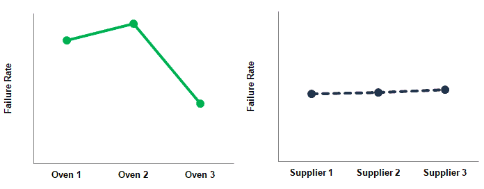
- If the line is horizontal, in other words, parallel to the x-axis, then there is no main effect exists. The response mean is the same across all factor levels.
- Similarly, if the line is not horizontal, then the main effect exists. In other words, the response mean is not the same across all factor levels. The slope determines the magnitude of the main effect.
- Though the plot shows the main effect, it is recommended to perform an ANOVA test to evaluate the statistical significance.
Interaction Plot
The effect of one independent variable depends upon the level of the other independent variable. An Interaction Plot is a powerful graphical tool that displays the means for the levels of one independent variable on the x-axis and a separate line for each level of another variable.
In Interaction Plots, there is no need for the lines to intersect each other for an interaction (refer below to example 2: 6 and 8 graphs). However, the lines should not be parallel. Likewise, for an interaction to exist, the slopes of the two lines should be different. The lines do not need to cross within the range of the data.
Similarly, if the two points intersect at the almost midpoint of lines (refer to example 2, graph 7). Often, it is called cross-over interaction. In this case, the average of the two lines is almost the same. So, there is no main effect existing for the two independent variables.
Types of Main Effects Plots
The main effects are the effects of one independent variable on the dependent variable. The sign of the main effect shows the direction of the effect. In other words, it shows whether the average response value increases or decreases. Basically, the main effect plot comes in three varieties.
- Positive: When you increase the level or manipulation of the independent variable, it also increases the level of the dependent variable.
- Negative effect: Increase in the independent variable decreases the dependent variable.
- No effect: No increase or decrease in the dependent variable depending on the independent variable.
Examples of Main Effects Plot
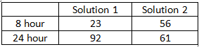
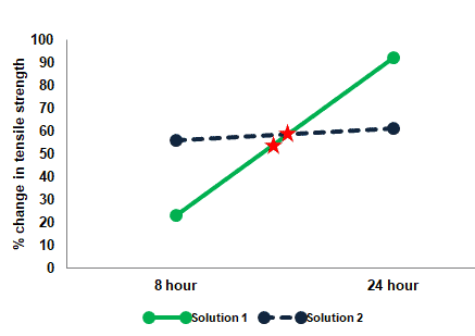
Example 1: An adhesive tape manufacturer examining the effects of soaking time and solutions.
% changes in tensile strength after soaking of tapes in two different solutions for 8 hours and 24 hours.
Draw a plot for solutions 1 and 2, with hours (8 and 24) on the X-axis & percentage change of tensile strength on the Y-axis.
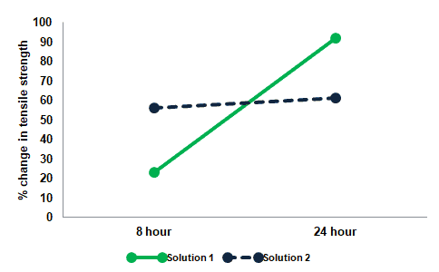
The green color represents solution 1 and the dotted blue color line represents solution 2
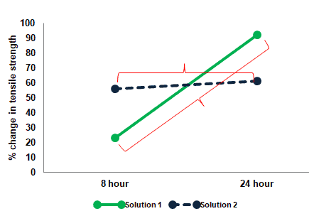
Step 1: Main Effects: Examine the main effects of the levels of one factor (Hours) while ignoring the levels of other factors (Solution).
Check whether the data for 8 hours is different from the data for 24 hours. While ignoring the data of Solution 1 or 2.
Take an average of 8 hours of data and an average of 24 hours of data. Mark it on the graph.
The above plot clearly indicates that there is a main effect of soaking time while ignoring solutions 1 or 2.
Step 2: Main Effects: Examine the main effects of the levels of one factor (Solutions) while ignoring the levels of other factors (Hours)
Check whether the data for Solution 1 is different from the data for Solution 2 hours. While ignoring the data of soaking time.
Take the average of Solution 1 data and an average of Solution 2 data. Then, mark it on the graph.
The above plot clearly indicates that there is no main effect of Solution 1 or Solution 2 while ignoring soaking time.
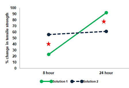
Interaction Effect
Step 3: Interaction Effects: Examine the interaction- Whether or not one factor affects the other factor’s performance. In other words, do the levels of one factor alter performance across the levels of the other factor?
Interaction is really examining the difference of differences. Calculate the difference between Solution 1, eight-hour data with 24-hour data. Similarly, calculate the difference between Solution 2, the eight-hour data with the 24-hour data. Then, mark it on the graph.
The difference between solution 1, eight-hour data, and 24-hour data is almost 69%, whereas the difference between solution 2 eight-hour data and 24-hour data is just 5%.
So, there is a huge difference of % in Solutions 1 and 2. Hence, we can conclude that there is an interaction.
Example 2: In a manufacturing plant, the two independent variables (Temperature and Pressure) at two levels impact the dependent variable (speed). Following are the different scenarios of Main effects and interaction effects.
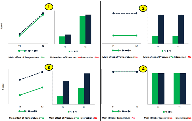
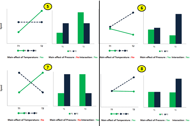
Each of the above graphs portrays the different scenarios with regard to the main effects of temperature and pressure and their interaction.
Main Effects Plot Videos
Six Sigma Green Belt Main Effects Plot Questions
Question: When doing a graphical analysis of DOE results a Belt frequently uses the Main Effects Plot to determine the relative impact of a variety of inputs on the output of interest. It is easy to identify the most impactful input because the slope of the line on the Main Effects Plot is __________________.
A) The steepest
B) Negatively correlated
C) Positively correlated
D) The shallowest
Answer:
The steepest. This is by definition. See article here: Main Effects Plot.