What Is A Matrix Diagram?
A Matrix Diagram, also called a Matrix Chart, is a project management tool that assists in investigating relationships.
Matrix Chart displays relationships within a single group or amongst two, three, or four groups (ex., project objective, methods, results, causes, people, etc.). It also provides information like the strength of relationships among the group, the roles played by various groups, etc.
Why use a Matrix Chart?
Project managers deal with various processes, people, and programs. It helps envisage and recognize the complex relationship between the data sets.
Management can organize data, prioritize resources, and make the right decision to keep the project on track.
When to use Matrix Chart?
A Matrix Chart is a planning and decision-making tool that is useful in various applications, primarily to assess the relations between two or more groups. Cause and Effect Matrices and QFDs use the Matrix Diagram.
- Determining the problem causes.
- Assigning the resources based on skills and requirements.
- Comparing the consequence of alternative solutions.
- Identifying the opportunity for improvements.
- Analyzing the requirement fulfillment.
What Would You Use a Matrix Chart?
Use the Matrix Diagram to discover the strength of relationships between a grid of rows and columns indicated by a number or symbol in the cell. A great example of this is the House of Quality in a Quality Functional Design (QFD).
How to Create a Matrix Chart?
- Define the objective: Identify the purpose of the Matrix Diagram, and determine the relationship between the data sets. This will help to select the team, data collection, and also selection of matrix chart.
- Select the team: Select the team who are expertise in the process and knowledgeable in collecting the data.
- Determine the appropriate Matrix Diagram: Based on the project’s objective and data source, the team has to select the appropriate matrix chart and what type of symbols to use to determine the relationship between the groups.
- Plan and collect the data: The team has to plan and collect accurate data for the different data sets.
- Document the relationship between the groups: This is one of the crucial steps; the team must use the appropriate symbols or methods to document the relationship between the groups and to get a consensus among the team members.
- Draw conclusions: Review the relationship between the groups and draw a conclusion based on the data. While the matrix diagram may be a time-consuming investment is well worth the effort.
Types of Matrix Diagrams
The selection of a matrix chart depends on the number of elements or groups to compare. Common matrix diagrams are L-Type, T-Type, X-Type, and Y-Type.

L-Type Matrix Diagram
What is an L-Type Matrix Chart?
L-Type Matrix Chart is the most basic and widely used matrix chart to compare only two data sets. It is in the shape of an upside-down L.
When You Would Use an L-Type Matrix Chart
An L-Type Matrix chart is a two-dimensional table (one element on the X-axis and another on the Y-axis) used to compare only two data sets or relationships within one group.
How to Make an L-Type Matrix Diagram
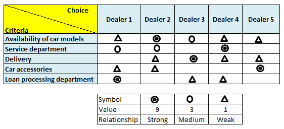
The elements of the one data set are placed on the left side of the table, while the other elements are listed on the top row. Use symbols to easily visualize the data and also to indicate the strength of the relationship between the elements in the intersecting cells.
Example of Using an L-Type Matrix Chart
Example: Selection of car dealer based on various parameters.

T -Type Matrix Diagram
What is a T-Type Matrix Diagram?
A T-Type matrix is two L-type matrix charts joined by a single list. While an L-type matrix compares the two data sets, a T-type matrix compares the two data sets with the third primary list.
When You Would Use a T-Type Matrix Diagram
The T-type matrix diagram compares two data sets with one main list (i.e., third data set).
How to Make a T-Type Matrix Diagram
In a T-type matrix diagram, there are two elements on the Y-axis and one element on the X-axis that splits the Y-axis.
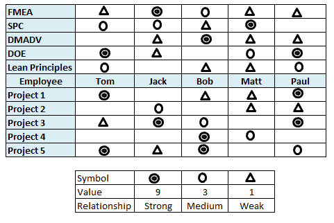
Place the primary list in the middle of the sheet (X-axis), and list the one data set on the top side of the primary list (on the Y-axis) and another data set on the bottom side of the primary list (same on the Y-axis). Compare the strength of the relationship with the primary list.
Example of Using a T-Type Matrix Diagram
Example: Comparing the individual skills on various subjects and project execution performance.

X Type Matrix Diagram
What is an X-Type Matrix Diagram?
An X-type matrix chart extends the T-type matrix chart to include one more data set.
When You Would Use an X-Type Matrix Diagram
An X-type matrix chart typically shows the significant relationships of four data sets and compares the adjacent groups’ relationships.
How to Make an X-Type Matrix Chart
There are two elements on the Y-axis and two elements on the X-axis.
Similar to the T-type matrix, place the two groups of data sets on the Y-axis and one data set on the X-axis (middle of two Y-axis data sets), and the other data set on the left side of X-axis.
Example of Using an X-Type Matrix Chart
Example: Volume of cars: Plant-Model-Supplier- Deliver service.

Y Type Matrix Diagram
What is a Y-Type Matrix Diagram?
A Y-type matrix chart compares the relationship between three groups of data sets.
When You Would Use a Y-Type Matrix Chart
In the T-type matrix chart, we are not comparing the two groups listed in the Y-axis, whereas in the Y-type matrix chart, we compare the three strong groups in a circular form.
How to Make a Y-Type Matrix Chart
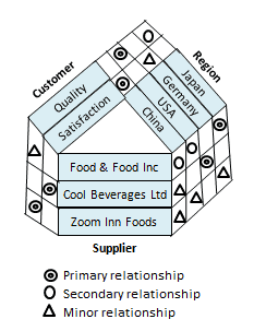
The Y-type Matrix chart is a 3-Dimensional grid with two L-type matrices joined at the Y-axis.
Example of Using a Y-Type Matrix Chart
Example: Customer Experience in flight: Customer requirements – Regional food and beverage supplier.


Comments (3)
Can you insert picture of the type of matrix diagrams you mentioned. Eg. L,T and X type.
good observation!!!
Hi John Snow,
Was really upset to see how things ended for you on the show.
In the meantime the page has been updated per your request. I hope you like the examples!
Best, Ted.