If you’re like me and you thought the spelling of Digraph was an error, it’s not. The difference between a digraph and a diagram is that a digraph is a graph emphasizing direction. A diagram can be any image outlining a plan or how something works. However, many articles on the web relate Interrelationship Digraph and Interrelationship Diagrams as the same thing. Other names for this tool include Relations Diagram, Network Diagram, or Matrix Diagram.
The Interrelationship Digraph is a 7M tool. It often uses input from other tools, like a Fishbone Diagram or an Affinity Diagram, to define drivers and outcomes in a process. An Interrelationship Digraph helps you see relations and influences between several concepts, even if those concepts are very different. You can also use it to identify critical issues and key drivers of a problem.
Uses of Interrelationship Digraphs
Interrelationship Digraphs encourage participants to view processes outside of a linear framework. Unlike a Fishbone Diagram, which singles out the main input to a process, the Interrelationship Digraph encourages multiple inputs and outputs. As a result, multiple root causes are drawn from the digraph.
Interrelationship Digraphs are best deployed in groups for the purpose of brainstorming ideas. Also, heavily consider drafting digraphs within a cross-functional team to capture everyone’s point of view. If done alone, the digraph may come across bias with limited function.
When to Use an Interrelationship Digraph
The strength of an Interrelationship Diagram comes from its ability to visualize relationships between complex processes. As arrows are plotted on the board, participants will see connections between ideas.
Because Interrelationship Digraphs identify multiple drivers and outcomes in a given scope, this tool is best used for complex issues. The interrelationship Digraph helps team members break down the complexity of the subject at hand. When properly used, Interrelationship Digraphs will provide the team with more avenues to explore critical x-factors. X-Factors are any variables that cause something to occur.
Should Affinity Diagrams, Tree Diagrams, or Fish Bone Diagrams Proceed with Interrelationship Digraphs?
The more, the merrier, in my opinion! Each of these visual aids is a tool to define your objective. Creating an Interrelationship Digraph will more fully explore how ideas connect after conducting an Affinity, Fishbone, or Tree Diagram. Also, the need for each of these tools depends on how well your team understands the project. Always consider how you can prove to stakeholders that your team completely understands the project.
Steps to Construct an Interrelationship Digraph
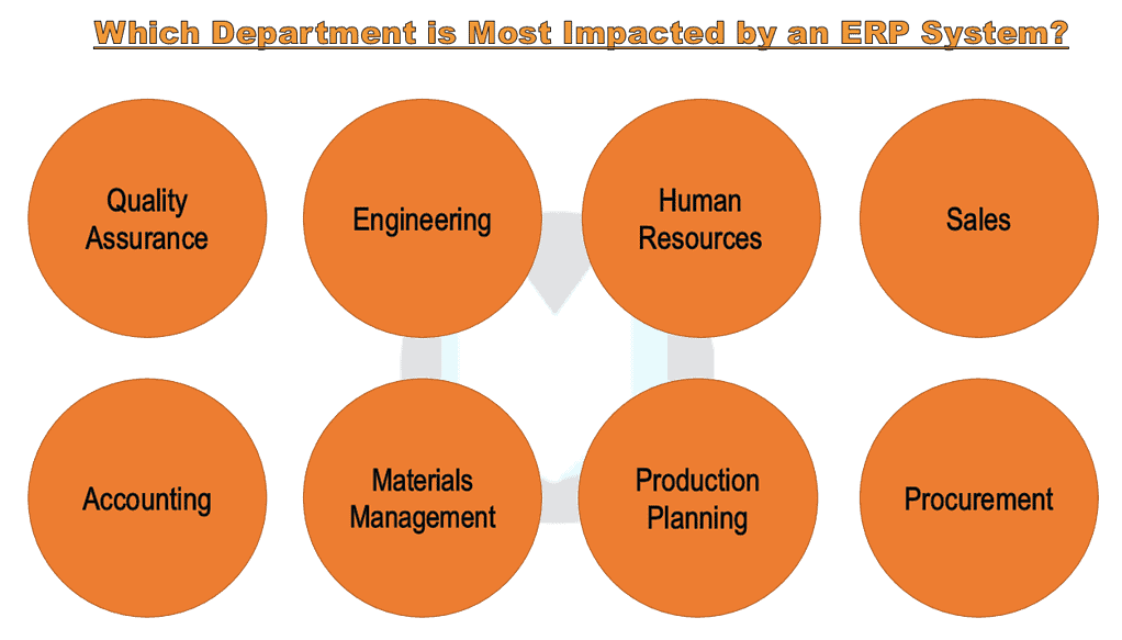
Let’s consider an example of a company that wants to source a new Electronic Resource Planning System (ERP). ERPs are databases used in large businesses to organize information and create reports across multiple departments. In this example, we will consider eight different departments found in a manufacturing environment.
Step 1: Draft a Statement
Draft a statement for the Interrelationship Diagram to explore. Consider using your Problem Statement found from the Project Charter if available. Write the statement on a whiteboard for all participants to see.
In this case, the statement is “Which Department is Most Impacted by an ERP System?”

Step 2: Brainstorm Key Factors
Next, have participants brainstorm key factors related to the statement. Each participant writes their ideas on a card or sticky note. You may gather ideas using the other 7M tools in advance.
In the case of our ERP system, participants brainstormed eight departments that are primary users of the ERP system.
Step 3: Categorize the Information
Once participants have finished brainstorming, place one idea on the work surface and determine the relationships between the other ideas. Be sure to plot similar ideas in the same vicinity. Repeat till all ideas are on the board.
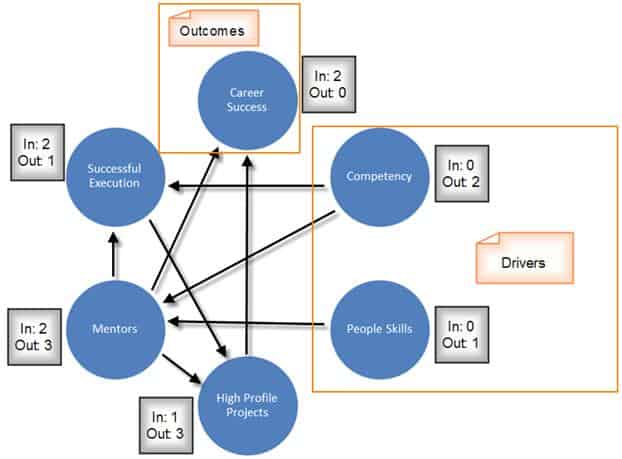
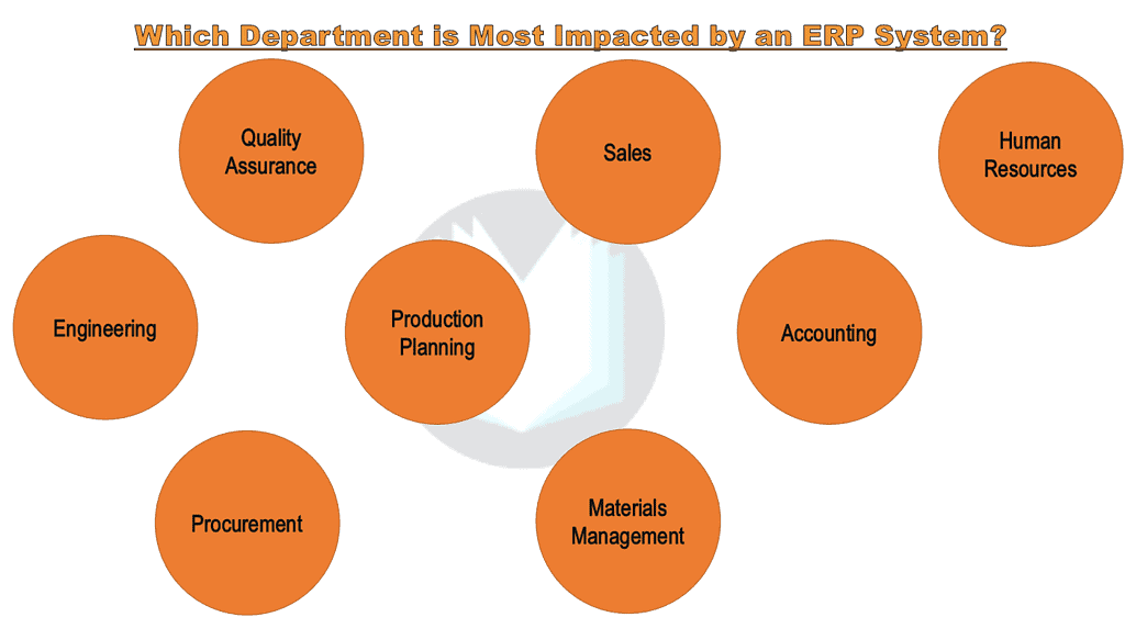
In our example, the team placed departments in the same vicinity based on how regularly they interacted with each other. Note how Production Planning and Accounting are centralized on the board. This shows that most departments have a hand in either of those two groups.
Step 4: Analyze the Diagram
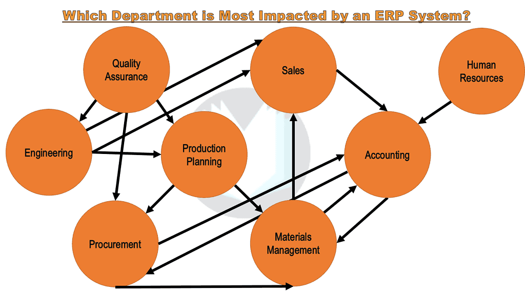
Ask the team, “How does this idea influence the other ideas?” Draw arrows from each idea to the one it influences. Ideas that have arrows going out from them are causes or X factors. Ideas that have arrows coming to them are effects or Ys. Consider writing an explanation alongside the arrows to validate connections.
Repeat for all ideas. In the example below, the team has drawn their arrows. Team members begin to see which departments are drivers or outcomes. The concepts with only arrows going out are considered drivers, and the concepts with only arrows coming in are considered an outcome. With that said, we find there is only one true driver: Quality Assurance. All other departments are nested between causes and effects.
Step 5: Count the Arrows
Last, count the arrows pointing to and from each idea and record the totals. The ideas with the highest arrow counts deserve special attention.
Back to our example, we see that Quality Assurance is one of the main drivers, which means the new ERP system must consider how QA will operate with the new program. We can also see that Accounting is the most affected department. We can conclude that the most important stakeholder in the new ERP system is Accounting, so buy-in from finance is crucial.
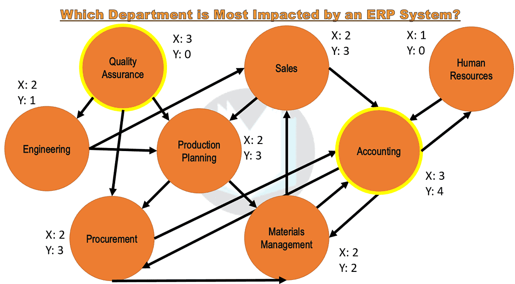
All in all, Quality assurance is the main driver. Accounting will experience the greatest outcome of the ERP system. Lastly, all departments, except for HR, impact one another to some degree. Although each department has a say in the new ERP system, QA and Accounting hold the greatest weight when deciding capabilities and functions.

Comments (2)
Hey Ted,
It seems that a Interrelationship Digraph seems to be very similar to a Process Map. I was looking at your Process Map article, but it seems to show more on its construction and not as much on its utility. and I’m wondering if they are the same thing or similar structures that map different things or processes? Can you elaborate please?
Thanks
Great question Alex.
Though a Process Map and Interrelationship Digraph may look similar, they each have a different purpose. For example, a Process Map always has a sense of direction. Arrows methodically follow steps in a process until the process is over. Process Maps also include a variety of differnent symbols that mean different things whereas a Interrelationship Digraphs are simply shapes to write down ideas.
An Interrelationship Digraph is much broader than a Process Map since it is exploring a cluster of ideas and asks how each of those ideas are related to each other. An interrelationship Digraph can include multiple processes and their relationship to one another.
I hope this helps! Feel free to ask more questions and I’ll do my best to answer.